News & Views
 Print This Post Print This Post
May 17th, 2014
The Unique Style of
A Venetian Artist:
Carlo Crivelli &
His Golden Paintings
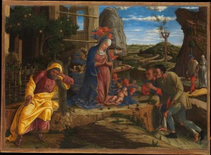
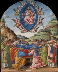
 Andrea Mantegna, Adoration of the Shepherds (c. 1450, tempera on canvas, transferred from wood, 15¾″ x 21⅞″ [40 x 55.6 cm]). The Metropolitan Museum of Art, New York.  Bartolomeo Vivarini, The Death of the Virgin (1485, tempera on wood, 74¾″ x 59″ [189.9 x 149.9 cm]). The Metropolitan Museum of Art, New York. Gallery 606 at The Metropolitan Museum of Art bears the title Venice and North Italy in the 15th Century. Included on its walls are paintings by Andrea Mantegna ( Adoration of the Shepherds) and Bartolomeo Vivarini ( The Death of the Virgin). Some distance from those works, in Gallery 627 under the heading North Italian Gothic Painting, The Met grouped Carlo Crivelli’s paintings, including his 1476 Pietá, with artists from “The centers of Northern Italian painting…,” deliberately excluding Venice. 1
Yet in almost all the work Crivelli signed, he made a point of reminding the world that he was “Veneto” (Venetian).2 Born in Venice in the early 1430s, he left little material evidence of his life there before 1457 court records note his status as an independent master. Sentenced at that time for his affair with a married woman, the young artist spent six months in prison and then, probably not long after his release, left the city. Over the course of his artistic career, Crivelli traveled among and worked within an assortment of cities in the north and Dalmatia, ultimately becoming closely associated with the Marches. He was never again documented in Venice.3
 Andrea Mantegna, Ovetari Chapel, Padua (1447-1456, fresco). The Met has separated Crivelli from contemporaries linked to his development via Antonio Vivarini’s workshop on Venetian Murano, where he probably received his early training, and Francesco Squarcione’s studio school in Padua, where Mantegna was a rising star.4 As the university town of Venice, Padua was for a time during the mid-1400s “the most creative centre of Renaissance art in all of northern Italy.”5 It drew artists like Vivarini and Mantegna, who worked opposite each other on the Ovetari chapel between 1447 and 1450, and it might have been a stopover for Crivelli as well.6
 Antonio Vivarini, Saint Peter Martyr Healing the Leg of a Young Man (1450s, tempera and gold on wood, 20⅞″ x 13⅛″ [53 x 33.3 cm]). The Metropolitan Museum of Art, New York. For his multi-panel altarpieces, Crivelli preferred ornate frames, relied heavily on gold over raised gesso as background for single-figure compositions of saints, and rendered naturalistically plants and other still-life objects. These elements echo the work of Antonio Vivarini, who (unlike his younger brother Bartolomeo) was never completely won over by the Renaissance practices taught in Squarcione’s school–techniques that soon caught on in Venice. This connection is acknowledged at The Met by the display in Crivelli’s gallery of Antonio’s 1450s tempera-and-gold Saint Peter Martyr Healing the Leg of a Young Man.
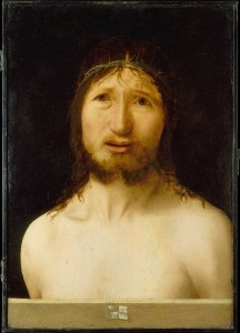
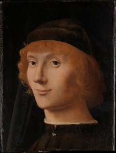
 Antonello da Messina, Christ Crowned with Thorns (n.d., oil, perhaps over tempera, on wood, 16¾″ x 12″ [42.5 x 30.5 cm]). The Metropolitan Museum of Art, New York.  Antonello da Messina, Portrait of a Young Man (c. 1470, oil on wood (10⅝″ x 8⅛″ [27 x 20.6 cm]). The Metropolitan Museum of Art, New York. The segregation of these four artists into two different galleries seems to reflect differences in their responses to the advent of a new kind of painting. In fact, in the same gallery as Bartolomeo and Mantegna are two panel paintings by Antonello da Messina ( Christ Crowned with Thorns and Portrait of a Young Man), both done in the oil medium he is credited with popularizing in Venice on his visit there in 1475-76. 7
Although Crivelli absorbed some of the lessons of the Renaissance, he remained steadfast in his commitment to tempera, a fast-drying medium that lends itself–even requires–a style reminiscent of pen-and-brush ink drawings. Finding in Mantegna’s work a powerful example of the expressive power of line only served to reinforce Crivelli’s personal preference for outlining forms and using hatch marks to create shadows.
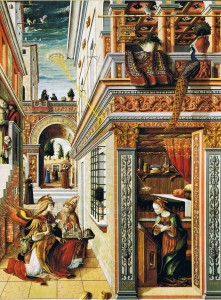
 Carlo Crivelli, The Annunciation with Saint Emidius (1486, egg tempera and oil on canvas, 81½″ x 57¾″ [207 x 146.7 cm]). The National Gallery of Art, London. Contemporary in his use of perspective–most dramatically in the 1486 Annunciation with Saint Emidius–and in his illusionistic naturalism–noticeable in the profusion of still life objects in so many of his paintings (especially the enthroned Madonnas), Crivelli took what he liked and leaving the rest perfected an inimitable style that attracted few followers. 8 With a fastidiousness for decorative detail bordering on obsessive-compulsivity, he created visual feasts for the eye.
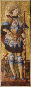
 Carlo Crivelli, Saint George (1472, tempera on wood, gold ground (38″ x 13¼″ [96.5 x 33.7 cm]). The Metropolitan Museum of Art, New York. Just two paintings down the wall from the much quieter Pietá, Crivelli’s 1472 Saint George, aglow in his blue, white and gold armor accented with red straps, holds a candy-cane-striped lance. The artist designed a stunning cuirass that sports lion-headed shoulder protectors and includes a leonine face on the breastplate. Sharp blue rays emanate from the knee plates and lions’ mouths, finding resonance in the pointed incisors and long snout of the slain dragon who lies dying behind St. George, the broken-off tip of the saint’s lance lodged in its head. Crivelli’s relish for bright colors, gleaming gold and intricate design is obvious here, but so are the foreshortened feet, one of which protrudes over the marble ledge into the viewer’s space, reminding onlookers of the artist’s keen interest in three-dimensional space.
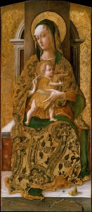
 Carlo Crivelli, Madonna and Child Enthroned (1472, tempera on wood, gold ground, 38¾″ x 17¼″ [98.4 x 43.8 cm]). The Metropolitan Museum of Art, New York.  Bartolomeo Vivarini, Madonna of Humility (c. 1465, tempera and gold on wood, 23″ x 18″ [58.4 x 45.7 cm]). Saint George’s graceful hand-on-hip contraposto pose reflects a closer affinity to the work of Bartolomeo Vivarini than that of his older brother Antonio, whose figures lack the animation with which Crivelli imbues his. Similarly, in the 1472 Madonna and Child Enthroned panel painting attached to the Saint George, the elaborately embroidered gold brocade with which Crivelli adorned his Madonna looks strikingly like the fabric with which Bartolomeo decorated his 1465 Madonna of Humility.
 Antonio Vivarini, Pesaro Polyptych (1464). Pinacoteca Vaticana. For his 1476 Pietá, a scene of profound grief, Crivelli retained the gold-over-gesso background but toned down his colors in keeping with the somber subject matter. Originally part of a polyptych altarpiece in the church of San Domenico at Ascoli Piceno in the Marches,9 this lunette-shaped panel painting once occupied the position usually reserved for a Christ-Man of Sorrows, as in Antonio Vivarini’s 1464 Pesaro Altarpiece.
 Carlo Crivelli, Pietà (1476, tempera on wood, gold ground, 28¼″ x 25⅜″ [71.8 x 64.5 cm]). The Metropolitan Museum of Art, New York. In this representation of Christ after his crucifixion, Crivelli posed the dead body in a seated position in front of a ledge that makes more sense as a compositional device than as the sarcophagus assumed in The Met’s online catalog entry. 10 That the artist elected not to place the dead Christ’s body in its usual supine position on Mary’s lap suggests he might have purposely conflated the Pietá with a Christ-Man of Sorrows.
Here, the left arm of the dead Christ is draped over Mary’s left shoulder while she looks up into his lifeless face with its closed eyes and pallid skin. Her open mouth reveals upper teeth and tongue, as if caught in the middle of an agonized wail, and three large teardrops spring from her right eye. She wears a blue garment edged in reddish gold, damage to the paint surface of which reveals a higher-chroma-blue underpainting and Crivelli’s intentional muting of the overall color key of the painting.
Mary Magdalen appears at Christ’s right, the most colorfully attired of the four figures. Yet her green-lined red cloak, cool-blue dress with gold-embroidered edges, and gold-trimmed red bodice and sleeve were all rendered in a subdued manner appropriate to the narrative. Her golden-red hair cascades in rhythmic ripples from its central part. As she looks down at the wound in Christ’s left hand, three tears drop across her left check and one over her right. Creases form around the left corner of her mouth as she purses her lips, perhaps in the middle of a restrained sob.
In the background, a curly-haired male figure whose youth indicates he is John the Evangelist, opens his mouth and extends his tongue in an almost audible cry. With furrowed brow, lowered eyelids, and three tears coursing from his left eye and one from his right, he looks heavenward as if for an explanation of why this happened to his friend.
Crivelli bunched together his figures, confining them between the arch of the frame above and the horizontal line of the marble ledge below. Only the pierced hand of Christ escapes this claustrophobic space, drawing focus by breaking through the picture plane.
The four figures appear collaged onto the painting’s surface rather than situated in a three-dimensional space. With no indication of the structure on which it sits, the body of Christ mysteriously supports the weight of his mother Mary who throws herself at him in a desperate embrace as his lifeless head leans against hers. On the right, Mary Magdalene holds but does not quite lift Christ’s weightless left forearm. Behind the three-quarter-length figures, St. John the Baptist’s head floats free of a body barely hinted at by its neck and the white-trimmed collar of a brown garment. The flatness of the decorative gold backdrop–including the haloes–presses from behind, leaving little room for the unseen parts of the actors in this drama.
In keeping with his love of line, Crivelli created in this Pietá a symphony of visual rhythms, most obvious in the wavy hair of Christ and Mary Magdalene, the curly hair of John and the narrow bands of folds on Mary’s white head wrap. A spike on the far right of the crown of thorns perfectly overlaps one of the rays of Christ’s halo, and the pointy leaves of the golden background floral pattern further elaborate this theme. Lines pick out the form, with parallel hatching in areas of shadow but also in details like the random, curved lines of Christ’s pubic hair.
Despite Crivelli’s reliance on aspects of an increasingly out-of-fashion Gothic style, he showed interest in contemporary painting practices by using an external light source, which models form better, and dispensing with the use of a spiritual light emanating from one holy figure or another. With the hatch marks typical of tempera painting, he placed shadows strategically. Those below Mary’s right arm fall across Christ’s rib cage and bury in darkness the mildly bloody gash from the soldier’s spear. Those on Christ’s left arm provide a dark ground against which the left hand of Mary Magdalene stands out. Crivelli also used color to direct the eye, relating the green lining of the Magdalene’s cloak to the green of Christ’s crown of thorns, and the white of Mary’s head wrapping to that of the cloth across her son’s thighs.
While the grimacing, teary expressions depict emotional distress, Crivelli understated the traumatic nature of the event by cleaning up the blood from Christ’s forehead where the thorns penetrate below the skin on his forehead and leave evidence of their sharp presence by the mounds they raise. An area of redness is all that remains around the perfectly drawn spike hole on Christ’s left hand, hardly the evidence of torn flesh that would be expected under the circumstances. From Christ’s chest wound–painted to emulate the open mouths of Mary and John–seeps a narrow, transparent stream of blood that trickles down his torso, dividing into three lines that run down his abdomen.
 Michele Giambono, Man of Sorrows (c. 1430, tempera and gold on wood, 21⅝″ x 15¼″ [54.9 x 38.7 cm]). The Metropolitan Museum of Art, New York. Crivelli’s Pietá tells a story about suffering. In contrast, Michele Giambono’s 1430 Man of Sorrows evokes in the viewer empathy for the afflicted. In this tempera-and-gold panel painting that sits in a vitrine just a few feet away from Crivelli’s work in the North Italian Gothic gallery, the older Venetian artist used gesso to model in relief the crown of thorns and the blood that flows copiously from the victim’s wounds. The faces of Christ and St. Francis are realistically rendered, further contributing to the image’s emotional pull. In comparison, Crivelli’s faces take on a highly stylized appearance that creates a comfortable distance between the painful subject matter and its audience.
Like Bartolomeo’s faces in The Death of the Virgin, those in Crivelli’s Pietá convey the idea of emotion rather than its actual appearance (note the calculated number of tear drops), perhaps in keeping with the humanistic trend of the time. More curious is the lack of believable space in a painting by an artist who established it in other works. Perhaps Crivelli’s goal here was to bring the narrative action as close as possible to the worshiping public by pressing the figures up against the picture plane.
Whatever Crivelli had in mind, in this Pietá he combined the best of his earlier influences with his own unique vision. In this, one of his sparer compositions, he arranged three mourners around the body of a recently tortured and murdered loved one. Their grief-stricken expressions reveal the pain that wracks their bodies while the oddly serene look on the victim’s face shows that unlike them, he is now free of human suffering. It is a picture that could only have been painted by Carlo Crivelli, Veneto.
____________________________
1 Gallery 627 description, The Metropolitan Museum of Art, New York.
2 Zampetti, Pietro, Carlo Crivelli (Florence: Nardini Editore, 1986), 12.
3 Lightbown, Ronald, Carlo Crivelli (New Haven: Yale University Press, 2004), 3.
4 Ibid, 4.
5 Humfrey, Peter, Painting in Renaissance Venice (New Haven: Yale University Press, 1995), 53.
6 Lightbown, 3.
7 Hills, Paul, Venetian Colour (New Haven: Yale University Press, 1999), 162.
8 Rushforth, G. McNeil, Carlo Crivelli (London: George Bell and Sons, 1908), 78.
9 Zampetti, 140.
10 The Metropolitan Museum of Art. Catalog entry for “Pietà, Carlo Crivelli (Italian, Venice [?], active by 1457-died 1495 Ascoli Piceno),” 2011. Accessed February 16, 2014. http://www.metmuseum.org/Collections/search-the-collections/436053.
Posted in Art Historical Musings |
 Print This Post Print This Post
December 1st, 2013
Through Spanish Eyes
Ribera
by Javier Portús
[To view the slide show in a separate tab while reading the text, place the mouse pointer over the first slide, right click, select <This Frame>, then <Open Frame in New Tab>.]
http://www.slideshare.net/DFeller2/ribera-28721572?from_search=5
[Image 1: Book cover.]
When the Chief Curator of Spanish Painting (up until 1700) at the Prado Museum in Spain decides to write a monograph on Jusepe de Ribera as part of that institution’s series spotlighting several of its art stars, it’s a given that he assumes the artist belongs in his country’s pantheon. Lest there be any doubt, the note on the inside front dust jacket of Javier Portús’s Ribera claims the painter and printmaker as a “leading figure in the baroque Spanish tradition–alongside El Greco, Velázquez and Zurbarán,” and names him José rather than the more Italian, Jusepe.
In the very first paragraph, under the chapter heading “In Search of an Identity,” Portús acknowledges this inherent bias and addresses the tradition of categorizing Ribera as a Spanish painter even though the artist left Spain when he was barely twenty and never returned to the land of his birth. Aware of the exalted status of artists in Italy, Ribera chose it over a Spain that was “‘a pious mother to foreigners but a very cruel stepmother to her own native sons.’”
[Image 2: Map of Iberian Peninsula, 1270-1492.]
Born in Xátiva, Valencia, in 1591, Ribera vanishes in the record for the next twenty years. No documentation has so far been uncovered beyond his baptismal certificate, dated February 17, 1591, that indicates his whereabouts prior to June 11, 1611, when a record of payment for a painting places him in Parma, Italy.
There are, however, documents indicating that when Ribera was six years old, his father remarried and did so again ten years later. It’s likely that the reasons for the remarriages were the deaths in childbirth, or from illness, of the boy’s first two mothers. Perhaps the second loss, before the boy was sixteen, prompted the fledgling artist to leave home and seek his fortune where his work would be more highly regarded, a possibility that squares with recent scholarship that pushes back the date of his arrival in Italy–specifically Rome–by several years.
By 1613, Ribera was well enough established to receive an invitation to a meeting at the Accademia di San Luca in Rome. During his subsequent three years in that city, he came in contact with the legacy of Caravaggio, an artist who had fled the city by 1606, leaving behind many followers and plenty of artwork to impress and influence the young Spanish immigrant. That Ribera led “a disordered life” there suggests that he fell in with the artists who once accompanied Caravaggio on his nightly rounds and got into street brawls and entanglements with the law.
Portús picks up his narrative in Rome, laying out his position regarding Ribera’s national affiliation, first by noting how the painter’s style evolved from Caravaggesque tenebrism and undefined space to lighter-colored, multi-figured compositions in architectural settings, and then by drawing attention to the manner in which the artist signed his name.
[Image 3:
–Denial of St. Peter (c. 1614, oil on canvas, 64.2″ x 91.75″ [163 x 233 cm]). Galleria Corsini, Rome.
-Michelangelo Merisi da Caravaggio, Denial of St. Peter (c. 1610, oil on canvas, 37″ x 49.4″ [94 x 125.4 cm]). Metropolitan Museum of Art, New York.
-Michelangelo Merisi da Caravaggio, The Calling of St. Matthew (1599-1600, oil on canvas, 127″ x 130″ [322 x 340 cm]). San Luigi dei Francesi, Rome.]
That Caravaggio’s tenebrism had a strong impact on Ribera’s early works is readily accepted by Portús, who finds in the younger artist’s “painterly technique and…enthusiasm for chiaroscuro effect” a direct link. He seems to miss the other commonalities between the master and the newly minted artist that continued well into Ribera’s later years, similarities that include more than just the raking light that originates on the left. Caravaggio’s theatrical compositions placed gesturing, three-quarter-length figures, wearing dramatic facial expressions, in an undefined space, characteristics evident in the paintings Portús selects to connect the two painters.
In his Denial of St. Peter (c. 1614), Ribera borrows the denying saint’s pose directly from Caravaggio’s painting of the same name (about 1610) and includes figures around a table, a common theme among the Caravaggisti and traceable to Caravaggio’s The Calling of St. Matthew (1599-1600), which is also the source of Christ’s pointing finger in the younger painter’s Resurrection of Lazarus (c.1616), which Portús mentions in his comparison of the two artists’ work.
[Image 4:
–The Resurrection of Lazarus (c.1616, oil on canvas, 55″ x 90½” [171 x 289 cm]). Museo del Prado, Madrid.
-Michelangelo Merisi da Caravaggio, The Calling of St. Matthew (1599-1600, oil on canvas, 127″ x 130″ [322 x 340 cm]). San Luigi dei Francesi, Rome.
-Michelangelo Merisi da Caravaggio, Raising of Lazarus (1608-9, oil on canvas, 149.6″ x 108.3″ [380 x 275 cm]). Museo Nazionale, Messina.]
The curator, in noting the power of tenebrism to heighten emotions, sees a qualitative difference between the “tumult and anxiety” in Caravaggio’s Raising of Lazarus (1608-9) compared with the toned down emotional content of Ribera’s version, observing too the contrast between the “deliberate crowding” in the former and a “clear distinct space” for each figure in the latter. It seems strange, though, that the writer would choose a painting with a compositional format so removed from Ribera’s and from the more relevant Caravaggios with their three-quarter-length figures in shallow space.
[Image 5: The Communion of the Apostles (1651, oil on canvas, 157.5″ x 157.5″ [400 x 400 cm]). Certosa di San Martino, Naples.]
Having compared and contrasted Ribera’s early Caravaggesque style with that of its originator, Portús goes on to illustrate how that style gradually evolved over time, retaining its naturalism. He uses the large-scale Communion of the Apostles (1651) done the year before Ribera’s death to chart those changes, particularly in the way the painter has brightened his palette and opened up space with a blue sky populated by flying angels and an arcade receding to some unspecified place. Portús sees the drapery across the top as the artist’s allusion to the painting’s artificial nature, though it could just as easily be read as a stage curtain pulled back to reveal the dramatic event. Marveling at Ribera’s skill, the writer points out the interplay of the five hands’ participating in this first offering of holy communion, as well as the parallel action of the kneeling St. Peter’s left hand with the right foot of the standing Christ.
[Image 6: The Immaculate Conception (1635, oil on canvas, 67.7″ x 112.2″ [502 x 329 cm]). Church of the Convento de las Agustinas Recoletas de Monterrey, Salamanca.]
To further note Ribera’s gradual move away from a Caravaggesque style, Portús cites two other paintings–The Immaculate Conception (1635) and St. Januarius Emerges Unscathed from the Oven (1646), both undeniably different in appearance from early works. The reader will discover in a matter of pages, however, that these paintings were contemporaneous with others that continued to include many elements from Ribera’s Rome years.
[Image 7:
–St. Januarius Emerges Unscathed from the Oven (1646, oil on copper, 126″ x 78.75″ [320 x 200 cm]). Real Cappella del Tesoro di San Gennaro, Naples.
-Michelangelo Merisi da Caravaggio, The Martyrdom of St. Matthew (1599-1600, oil on canvas, 127.2″ x 135″ [323 x 343 cm]). San Luigi dei Francesi, Rome.]
In fact, a closer look at the composition and figures in the St. Januarius demonstrates Ribera’s memory of Caravaggio’s Martyrdom of St. Matthew (1599-1600), which he would have seen in the chapel where it did (and still does) reside in the church of San Luigi dei Francesi in Rome. First and most obvious is the quote of Caravaggio’s open-mouthed boy, wearing white and looking back over his shoulder at the impending execution. Ribera mirrors that expression and pose in his young man in red on the left, who looks out at the viewer. Less direct but clearly related is the placement of a foreground figure in each lower corner to frame the action. Like Caravaggio, Ribera positions one with his back to the audience and the other stretched out on the ground, body facing forward and head turning back toward the unmarred saint. Tumult abounds in both pictures.
The debate about Ribera’s nationality takes on new complexities once he relocates to Naples, where he is documented by 1616. The bustling city, capital of a Spanish viceroyalty, offered the artist opportunities to market himself to his compatriots, particularly the procession of viceroys who came and went during the 36 years Ribera lived there. Through commissions and sales to patrons who moved between Naples and Spain, the painter spread his influence to at-home Spanish artists, the names of which Portús lists as he picks up the thread about nationality with a focus on Ribera’s signature.
[Image 8: Balthasar’s Vision (1635, oil on canvas, 20.5″ x 25.2″ [52 x 64 cm]). Palazzo Arcivescovile, Milan.]
In Spain, writers like Francisco Pacheco claimed the artist as their own; in Italy, he was known as lo Spagnoletto, a nod to his place of origin. A diminutive with negative connotations, the nickname translated to the Spanish el españoleto but was bypassed by Ribera when he settled on signature styles. Portús points out how the painter signed an unusually large number of works compared to other artists of that time and chose the more dignified español over the well-known españoleto to emphasize his association with Spain.
The curator delves into a variety of signature issues in trying to discern whether Ribera identified himself as first and foremost Spanish. Whatever else the proliferation of signed works might indicate, they show that Ribera was “greatly concerned with leaving written evidence of the authorship of his work,” and Portús finds plenty of examples to prove that point.
Often the signatures call attention to themselves as integral parts of the composition. In the small canvas, Balthasar’s Vision (1635), Ribera painted “Jusepe de Ribera español F. 1635″ in the same script used by the hand that writes on the wall.
[Image 9:
–Drunken Silenus (1626, oil on canvas, 72.8″ x 90.2″ [185 x 229 cm]). Museo di Capodimonte, Naples.
-Detail of signature. Drunken Silenus (1626, oil on canvas, 72.8″ x 90.2″ [185 x 229 cm]). Museo di Capodimonte, Naples.]
In the Drunken Silenus (1626), in the lower left corner, a snake–that symbol of envy–tears apart a scrap of paper on which is written the artist’s name.
[Image 10: The Communion of the Apostles (1651, oil on canvas, 157.5″ x 157.5″ [400 x 400 cm]). Certosa di San Martino, Naples.]
In The Communion of the Apostles, in the lower left, the piece of paper is so large as not to be missed.
[Image 11:
–Large Grotesque Head (1622, etching, 8.5″ x 5.7″ [21.7 x 14.5 cm]). Graphische Sammlung Albertina, Vienna.
–Head of a Man with Little Figures on His Head (c. 1630, pen and brown ink with brown wash over some black chalk on paper, 611/16″ x 41/16″ [17 x 10.4cm]). Philadelphia Museum of Art.]
Signed works like these are more abundant after 1625, but the desire to publicize his prowess as an artist is already evident several years earlier in etchings Ribera created and circulated to advertise his wares and generate income. Unlike paintings, prints lend themselves to mass production and widespread distribution, and Ribera exploited both attributes to reach potential customers throughout Europe.
These mostly signed works also constituted a showcase for the artist’s drawing skills and his command of the printmaking process. Portús sees the etchings, seventeen in number and created prior to 1630, as vehicles for Ribera’s “highly questing creative spirit,” observing in them “an unequivocally Riberesque world…of narrative resources, human types, varied subject matter and different emotional climates.” In the Large Grotesque Head (1622), the artist explores a particular type and in the drawing of a Head of a Man with Little Figures on His Head (c. 1630) he displays a touch of whimsy and playfulness, though a darker meaning might lurk nearby. Might those little men represent obsessional thinking and/or auditory hallucinations?
[Image 12:
–Calvary (c. 1618, oil on canvas, 132.25″ x 90.5″ [336 x 230 cm]). Collegiate Church, Osuna.
-Michelangelo Merisi da Caravaggio, Martha and Mary Magdalen (1595–96, oil and tempera on canvas, 39⅜” x 53″ [100 x 134.5 cm]). Detroit Institute of Arts.]
If Ribera identified himself as Spanish, his paintings anchor him firmly in the Italian Baroque and were seen as such by two practiced connoisseurs, Philip IV and Diego Velázquez, when they selected his artwork while redecorating El Escorial in the late 1650s. His “thoroughly Italianate” style qualified him as the only Spanish painter to be displayed in the company of such Italian masters as Titian and Veronese.
Straddling both worlds began to pay off for Ribera soon after he landed in Naples, with commissions for paintings that arrived at their destination–the Collegiate Church in Osuna, Spain–by 1627. Among these was a crucifixion, Calvary (c. 1618), a tour de force in tenebrism and emotion, whose colorful fabrics bring to mind those in Caravaggio’s Martha and Mary Magdalen (1595-96).
[Image 13:
-View of the nave of the Certosa di San Martino, Naples.
-Paintings of the prophets Joel and Amos above the church arches in the Certosa di San Martino, Naples.]
A decade later, Ribera would execute in Naples a series of prophets for the Certosa di San Martino, a monastery on a hill overlooking the city. The painter met the challenge of devising compositions that conformed to the irregular spaces into which they were to be placed by relating each figure to its surrounding architecture. Portús mentions that although a number of Ribera’s paintings did find their way to religious institutions like the Osuna church and Carthusian Monastery, commissions like these were rare. Instead, the artist specialized “in medium-size and small paintings, conceived for private collections and chapels and easily transportable,” mostly of a sacred nature.
[Image 14: St. Bartholomew (c. 1613, oil on canvas, 49.6″ x 38.2″ [126 x 97 cm]). Fondazione Roberto Longhi, Florence.]
Portús soon delves into the “Riberesque” world depicted in those compositions, one “in which joy or happiness is hard to find, in which laughter creates a sinister effect and tenderness is rare.” At the same time, themes of “piety, stoicism, devotion, austerity, meditation and drama abound,” with “cruelty and the grotesque” an integral part of much of his work. Most of those qualities, particularly the last two, are quite evident in the bloodless but flayed St. Bartholomew (c. 1613) who holds in his right hand the instrument of his torture and drapes over his left arm his recently removed skin, replete with facial features and hair. The theme of flaying remains of interest to Ribera, who comes back to this saint in future paintings and also explores the myth of Marsyas and Apollo.
Of Ribera’s style, Portús notes its naturalism, as seen in the specific human types that populate the artist’s compositions, and its “precise and descriptive pictorial idiom.” He describes how the painter clothes his humble characters in earthy-colored, outdated garments that emphasize their poverty, and gives them bearded–they are mostly male–expressive faces with wrinkled, weatherbeaten skin. Portús traces this rejection of the prevailing Renaissance preference for idealization to certain antique Roman sculpture, while missing the possible influence of Caravaggio’s depiction of religious figures as ordinary people who sometimes reveal their dirty feet.
[Image 15:
–Smell (c. 1615, oil on canvas, 45.25″ x 34.65″ [115 x 88 cm]). Private collection, Madrid.
–Sight (c. 1615, oil on canvas, 44.9″ x 35″ [114 x 89 cm]). Museo Franz Mayer, Mexico, DF.]
Among Ribera’s secular subjects, a series of the five senses dates to his early years in Rome and reappears in later paintings that dramatically demonstrate the evolution of his style. A long-standing traditional theme in Western art, the senses presented opportunities for innovation that, according to Portús, Ribera exploited by situating all the figures behind a table, directing their gaze toward the viewer (except for the blind man in Touch [1615]), and giving them objects and behavior that illustrate the pictured sense. Light streams in from the upper left, illuminating the detailed depiction of still-life objects, facial features and cloth. Portús notes that in Sight, Ribera equipped the character with a telescope, a device only recently invented by Galileo.
[Image 16:
–Touch (1615, oil on canvas, 44.85″ x 35″ [114 x 89 cm]). Norton Simon Museum, Pasadena, California.
–Touch (1632, oil on canvas, 49.2″ x 38.5″ [125 x 98 cm]). Museo del Prado, Madrid.]
When the painter returned to the theme of the senses some fifteen years later with his 1632 Touch, he retained the trope of using a blind man perceiving a sculpted head to emphasize the absence of sight. What Portús calls the “unnecessary” portrait painting on the table in the 1615 version, echoed by a similar object in the later one, is ascribed to Ribera’s need to keep the composition of this sense parallel with that of the others in the series. It might also refer to the paragone, that age-old competition between sculpture and painting for highest artistic honors.
The most immediate differences between the two paintings occur in the lighting, range of color, pose, attire and detail with which Ribera renders it all. The raking light from the left that divides the background diagonally in the first work is replaced by a mostly dark backdrop that lacks any direct relationship to the light that picks out the details in the face, hands and sculpture. Where the blind man, wearing what might be a sculptor’s smock, turns from the viewer in the earlier version, he now wears tattered clothing and faces front, handling a less classical head. Finally, Ribera has aged him by greying his beard and wrinkling his skin.
[Image 17: Protagoras (1637, oil on canvas, 48.88″ x 38.75″ [124 x 98 cm]). Wadsworth Atheneum Museum of Art, Hartford, Connecticut.]
The general layout the painter devised for picturing the senses became a handy template to be used freely in subsequent single-figure paintings. Using a limited palette, Ribera represented three-quarter-length philosophers and saints against a dark background, sitting or standing behind or near a table adorned with still-life objects symbolic of the subject–all depicted with remarkable detail.
Counting over thirty paintings of philosophers done by the artist, Portús writes about them at length, concluding that anyone standing before them “might believe they are in the presence of a collection of ragged ‘secular saints.’” In comparing a couple of Ribera’s philosophers to similarly presented saints, he observes that the clothing of the saints is considerably neater.
[Image 18:
–Democritus (1614, oil on canvas, 40.15″ x 29.9″ [102 x 76 cm]). Private collection, London.
–Democritus (1630, oil on canvas, 49.2″ x 31.9″ [125 x 81 cm]). Museo del Prado, Madrid.]
In revisiting one philosopher in particular, Ribera again provided an opportunity to compare the changes over time in his thinking about his subject and his art. The Democritus (1614) from his Rome years has a similar palette and lighting scheme as the contemporaneous Touch, while the Democritus executed in 1630 displays changes comparable to those associated with the 1632 Touch. In both renditions of Democritus, Ribera has associated philosophy with poverty by emphasizing the torn clothing.
[Image 19: St. Jerome and the Angel of Judgment (1626, oil on canvas, 142.5″ x 64.5″ [362 x 164]). Museo di Capodimonte, Naples.]
Having focused mostly on paintings from Ribera’s years in Rome, Portús now moves with him to Naples, where the painter relocated around 1616, married and added to his repertoire large-format canvases of saints, many of which are shown at the moment of their martyrdom in various stages of exposure. As the writer puts it, Ribera “discovered one of the methods he would apply with great frequency and success [to transmit] feelings of religious devotion: description of flesh…[that endows] the human body with special significance as the scenario of saintliness.” Portús attributes this change of focus to Ribera’s encounter with a different client base, by implication less sophisticated.
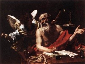
An early example of Ribera’s exploitation of flesh’s potential for expressiveness is his St. Jerome and the Angel of Judgment (1626). In this vertical composition, the artist has raised the saint’s arms to expose his brightly illuminated bare torso, making it the center of interest and a testament to the vulnerability of the body, appropriate for a scene where St. Jerome is being called to his maker. The lighting, gestures and threatening dark clouds heighten the drama and make practically audible the trumpet’s ominous blare.
[Image 20:
–Magdalena Penitent (1637, oil on canvas, 38.2″ x 26″ [97 x 66 cm]). Museo del Prado, Madrid.
–St. Mary the Egyptian (1641, oil on canvas, 52.4″ x 41.75″ [133 x 106 cm]). Musée Fabre, Montpellier.]
Two paintings of penitent women–their creation separated by just a few years–demonstrate the impact bare skin can have on the expressive tone of a composition. In Magdalena Penitent (1637), a fully clothed Mary is shown with the furrowed brow and lowered upper eyelids of sorrow as she leans her head on her prayerfully clasped hands, which in turn are supported by a skull they partially embrace. Her remorse is as evident as her beauty.
In the starkly different St. Mary the Egyptian (1641), who is often confused with Mary Magdalene, Ribera places this patron saint of penitents in a barren environment near a skull and crust of bread. Hands joined in prayer, Mary of Egypt gazes upward, her ascetic penance underscored by the heavy brown cloth that doesn’t quite cover her weathered skin. By exposing her flesh, Ribera infused the scene with the same sense of vulnerable mortality that he did in his St. Jerome and the Angel of Judgment, a feeling absent from his lovely Magdalena Penitent.
[Image 21: The Martyrdom of St. Philip (1639, oil on canvas, 92.1″ x 92.1″ [234 x 234]). Museo del Prado, Madrid.]
Further exploiting the expressive potential of nakedness, as Portús observes, Ribera arrived at a formula for his martyrdom narratives, key elements of which are nude or partially draped male saints whose nakedness and expressions of meditative acceptance stand in sharp contrast to those of their clothed torturers, intent on their murderous tasks with sadistic glee. In some of these paintings, figures populate the background, variously watching or not.
In one example, The Martyrdom of St. Philip (1639), two diagonals bisect the picture and meet at the saint’s spotlighted rib cage, which comes into view as his body is slowly hoisted up–his wrists tied to the crosspiece of his crucifixion. Among the spectators, expressions range from the amused interest of the man on the right who supports his head on his hand to the knowing look on the woman in the lower left who holds a baby and stares out at the viewer, implicating all in this act of torture.
[Image 22:
–Scene of Torture (1637-1640, pen and brown ink, brown wash, 5⅜” x 10⅝” [13.6 x 27.2 cm]). Teylers Museum, Haarlem.
–Torture Scene (N.d., drawing, no dimensions). Museo Civico, Bassano del Grappa.]
Ribera’s personal interest in such scenes of torture shows up in drawings he executed “for which no sources have been found in the Scriptures.” An undated one, apparently in pen and brown ink with brown wash, shows a tree festooned with miniature figures–easily mistaken for acrobats–involved in a hanging. A man in a small audience, with a child hanging onto him, indicates the performance to a newcomer who tips his hat in friendly greeting. No one seems troubled by the unfolding events. In another ink drawing, the executioner is about to hack into his defenseless victim who is stretched out between, and tied to, two sets of posts.
[Image 23: The Martyrdom of St. Bartholomew (1617, oil on canvas, 70.5″ x 52.75″ [179 x 139 cm]). Collegiate Church, Osuna, Spain.]
As mentioned earlier, flaying held a particular fascination for Ribera who explored that form of torture in at least five versions of The Martyrdom of St. Bartholomew. The Rome 1613 portrait of the saint holding his skin was followed in 1617 by perhaps the artist’s first Naples edition, which has an almost clinical quality to it.
[Image 24: The Martyrdom of St. Bartholomew (1628, oil on canvas, 57″ x 85″ [145 x 216 cm]). Palazzo Pitti, Galleria Palatina, Florence.]
Over the years, Ribera would create additional compositions portraying St. Bartholomew, each exemplifying his stylistic preferences at the time.
[Image 25: The Martyrdom of St. Bartholomew (1630, oil on canvas, 79.5″ x 60.2″ [202 x 153 cm]). Museu Nacional d’Art de Catalunya, Barcelona.]
[Image 26: The Martyrdom of St. Bartholomew (1634, oil on canvas, 40.9″ x 44.5″ 104 x 113 cm]). National Gallery of Art, Washington, DC.]
In the 1634 version, he simplified the composition by eliminating figures and zooming in on the face of the emotionally detached executioner who regards his victim with curiosity as he sharpens his knife. St. Bartholomew looks heavenward as if seeking out some source of comfort in this moment where his faith is being tested.
[Image 27:
–Apollo and Marsyas (1637, oil on canvas, 71.6″ x 91.3″ [182 x 232 cm]). Museo di Capodimonte, Naples.
-Detail of Marsyas’s face, flipped.
-Detail of Study of Noses and Mouths (c. 1622, etching). Graphische Sammlung Albertina, Vienna.]
In discussing Ribera’s treatment of emotions, Portús isolates his special interest in those “related to devotion, piety, cruelty and pain,” recalling drawings and prints like the Study of Noses and Mouths (c. 1622) to illustrate the artist’s “penchant for these themes and for the grotesque.” The curator connects the wide-open mouth of that etching to the victim’s scream in Apollo and Marsyas (1637), a distinctly different response to the slicing knife from that of St. Bartholomew in the 1630 version of his ordeal.
[Image 28:
-Detail of Marsyas’s face, flipped, Apollo and Marsyas (1637, oil on canvas, 71.6″ x 91.3″ [182 x 232 cm]). Museo di Capodimonte, Naples.
-Detail of face, flipped, The Martyrdom of St. Bartholomew (1630, oil on canvas, 79.5″ x 60.2″ [202 x 153 cm]). Museu Nacional d’Art de Catalunya, Barcelona.]
Portús observes that in Ribera’s depiction of mythological subjects, “their facial expressions…invariably reveal all the horror…[while] the attitude of the saints is always one of piety and acceptance of torture,…a highly effective means…to convey religious feeling.” This difference is apparent in the faces of Marsyas and St. Bartholomew; the former screams in agony and looks directly at the viewer, while the latter contains his anguish and rolls his eyes upward in an attempt to mentally escape his pain.
[Image 29: The Trinity (1635, oil on canvas, 89″ x 46.5″ [226 x 118 cm]). Museo del Prado, Madrid.]
Using the emotionally expressive figures in the colorful St. Januarius Emerges Unscathed from the Oven as a bridge back to his opening thesis about Ribera’s later change in direction toward a less tenebristic style, Portús attributes the appearance in the 1630s of an “extension of the artist’s palette toward warm, sumptuous tones…[and] an engaging, relaxed, expansive piety…expressed through marked chromatic sensuality” to the Neo-Venetianism that was sweeping across Italy, and with the arrival in Naples during that decade of a number of classicizing artists. He cites The Trinity (1635) as one of several works that exemplify this shift.
A close look at that painting reveals more about the fluidity with which Ribera moved among his stylistic options than about any fundamental transformation in his artistic practices. Warm, high-value colors distinguish the heavenly sphere from the lower-register darkness out of which angels emerge and carry the body of Christ, whose pale skin and white shroud contrasts dramatically with the shadowy background.
[Image 30:
–St. Jerome in His Study (1613, oil on canvas, 48.4″ x 39.4″ [123 x 100]). Art Gallery of Ontario, Toronto.
–St. Jerome Penitent (1652, oil on canvas, 30.4″ x 28.3″ [77.2 x 71.8]). Museo del Prado, Madrid.]
Ribera’s style continued to mature with time and practice and while there are noticeable differences between St. Jerome in His Study (1613)–his first signed painting–and St. Jerome Penitent (1652)–the last signed one completed before his death in 1652 (a comparison with which Portús ends his discourse), he never abandoned the tenebrism of his youth.
In St. Jerome Penitent, the saint bares a softly-modeled, anatomically descriptive right shoulder and boasts a head of shaggy grey hair with matching beard. Even at this late date, Ribera found uses for his earliest technique of zooming in close on brightly lit, half-to-three-quarter-length figures accompanied by identifying still-life objects. In this St. Jerome, he applied paint with short, confident brushstrokes that follow the contours of forms and animate the hair, hallmarks of the adept and brilliant painter he had become.
The mature Ribera sharply contrasts with the younger one, however, in the degree to which his subject now engages with the viewer, as Portús astutely points out. In the 1613 St. Jerome in His Study, the saint is occupied with his writing, unaware of the observer. In the later St. Jerome Penitent, the figure is positioned closer to the picture plane and looks through it–if not directly at the audience at least in its direction. The 61-year-old Ribera seems to have evolved not just as an artist but also as a man far more conscious of the power of relationship.
[Image 31: Magdalena Ventura (The Bearded Lady) (1631, oil on canvas, 77.2″ x 50″ [196 x 127 cm]). Exhibited at the Museo del Prado, Madrid.]
The life of Jusepe de Ribera came to an end on September 3, 1652. No contemporary writer chose to immortalize this Spanish-Italian artist with a biography that would have preserved vital facts about his life. In the absence of such a record, posterity has been left with no information about his psychologically formative childhood years nor about his early training as an artist–where or with whom that might have been. Perhaps a new generation of art historians will be inspired to rummage around the archives of Xátiva and Valencia in search of the missing pieces that will finally fill in the blanks of this great artist’s life. Meanwhile, art lovers can continue to marvel at the enigma who painted with such veracity the stunning portrait of Magdalena Ventura (The Bearded Lady) (1631).
References
Brown, Jonathan. Paintings in Spain: 1500-1700. New Haven: Yale University Press, 1998.
_____________. Velázquez: Painter and Courtier. New Haven: Yale University Press, 1986.
Marandel, J. Patrice, ed. Caravaggio and His Legacy. New York: Prestel Verlag, 2012.
Peréz, Alfonso E., and Nicola Spinosa. Jusepe de Ribera 1591-1652. New York: Metropolitan Museum of Art, 1992.
Portús, Javier. Ribera. Barcelona, Spain: Ediciones Poligrafa, 2011.
[A version of this review with footnotes is available. If interested, contact deborahfeller@verizon.net.]
Posted in Art Book Reviews |
 Print This Post Print This Post
November 24th, 2013
Doing Together
What Can’t Be Done Alone:
An Integrative Approach to
Raped by Käthe Kollwitz
***********************************************
The Blind Men and the Elephant
by John Godfrey Saxe (1816-1887)
It was six men of Indostan,
To learning much inclined,
Who went to see the Elephant
(Though all of them were blind),
That each by observation
Might satisfy his mind.
The First approach’d the Elephant,
And happening to fall
Against his broad and sturdy side,
At once began to bawl:
“God bless me! but the Elephant
Is very like a wall!”
The Second, feeling of the tusk,
Cried, -“Ho! what have we here
So very round and smooth and sharp?
To me ’tis mighty clear,
This wonder of an Elephant
Is very like a spear!”
The Third approach’d the animal,
And happening to take
The squirming trunk within his hands,
Thus boldly up and spake:
“I see,” -quoth he- “the Elephant
Is very like a snake!
“The Fourth reached out an eager hand,
And felt about the knee:
“What most this wondrous beast is like
Is mighty plain,” -quoth he,-
“‘Tis clear enough the Elephant
Is very like a tree!”
The Fifth, who chanced to touch the ear,
Said- “E’en the blindest man
Can tell what this resembles most;
Deny the fact who can,
This marvel of an Elephant
Is very like a fan!”
The Sixth no sooner had begun
About the beast to grope,
Then, seizing on the swinging tail
That fell within his scope,
“I see,” -quoth he,- “the Elephant
Is very like a rope!”
And so these men of Indostan
Disputed loud and long,
Each in his own opinion
Exceeding stiff and strong,
Though each was partly in the right,
And all were in the wrong!
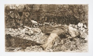
 Raped (Vergewaltigt) (1907/08, etching on heavy cream wove paper, 11¾″ x 20⅝″ [29.9 x 52.4 cm)]. Plate 2 from the cycle Peasant War. Proof before the edition of about 300 impressions of 1908. Knesebeck 101/Va. Photo © Kollwitz Estate. The way to the blockbuster show led through a long corridor that at its beginning widened into an area whose walls the museum exploited for temporary exhibitions of works on paper too light-sensitive for permanent display. Attracted by the drawings and prints in this accidental gallery, some visitors slow for a more sustained look.
One image, which looked like an ill-kept garden, revealed itself via the wall text to be a 1907/8 etching called Raped by a German artist named Käthe Kollwitz,1 who lived between 1867 and 1945. Viewers who took the time to look more closely would detect amid the foliage a woman with legs splayed and head thrown back, the subject of the picture’s title. At that point most would move on to look at other works. Some few would linger, wanting to learn more about this depiction of sexual assault.
The only other information available at that moment–the description nearby on the wall–identified the brown-ink print as a plate from the Peasant War series executed on heavy cream wove paper. Although unschooled in art historical methods, an intrigued viewer might intuitively know that much could be gained by exploring every aspect of this simply-framed etching.
Drawing the viewer’s immediate attention and bisecting the bottom of the almost-double-square (approximately 12-by-21-inch) composition, the woman’s foot–set off from lighter surroundings by its dark sole–meets the picture plane and beckons the onlooker to follow its arch to the foreshortened, thick-set leg that disappears under a skirt. The eye continues along an arc, through the torso and extended neck, stopping at the chin beyond which lies the shadowed face with its features distorted by the angle of view.
Searching for the rest of her, the observer discovers behind a bent-over, wilted sunflower the right leg, forming a horizontal line with the top edge of the skirt and ending in a foot that points toward the upper left corner. Assisted by a nearby still-upright flower slanted at an angle running parallel to it, the foot directs the gaze to a blossoming sunflower in the background’s deep shadow, the form of which echoes the head of a barely discernible child with a pony tail (or braid) who drapes her right arm over a fence and looks down at the body before her. Faintly silhouetted against a patch of open space, the young girl can easily be missed by all but the most attentive viewers as she blends in with the leafy plants around her.
Once noticed, the child leads the eye to a structure suggested by two sets of vertical lines hiding in the dark recesses of the upper register–perhaps a house. Across the rest of this small patch of verdant landscape, damaged plants and flowers tell a story of struggle and recent destruction in what might have been a well-tended, backyard vegetable garden.
A shadow originating from outside the picture plane on the left ends in a point that meets the prone woman’s right foot and relates to her dark skirt. Cast by a structure with straight edges and therefore of human origin, its top boundary becomes one side of a flattened diamond, the other three edges of which are the overgrown part of the fence that supports the girl, its dark extension to the right, and the left side of the woman on the ground. Ominous in nature, the sharply angled shadow seems a stand-in for the recently-fled rapist.
Following the perimeter of that diamond shape brings the inquisitive observer to the figure’s left hand, the fingers of which curl around the edge of her torn garment near some trickles of blood on her torso and provide the final clue to the story. A peasant woman working in her garden has been raped and stabbed, then left for dead. Hearing the commotion and perhaps some screams, her daughter has come to see what happened and now stares sadly at the sight of her mother, wondering what to do.
Having followed the trail of clues and figured out the narrative, the formerly-naive tourist, seduced by a compelling work of art, has unwittingly entered the empirical world of the connoisseur. Questions tumble forth about the decisions that went into creating the etching. Who was Käthe Kollwitz? What was the Peasant War and why did the artist choose it as a subject? Why did she make a print instead of a painting? If this is a series, what does the rest of it look like? Most curious, why didn’t Kollwitz just tell her story directly and not force her audience to work so hard?
As often happens in exhibits, another visitor approaches and, noticing the engrossed tourist with nose scant inches from the print’s protective glass, engages in conversation about the piece. An art historian by trade, the newcomer eagerly offers information about a favorite artist, her work and her art. An exchange ensues.
First they talk about the etching itself. When the tourist points out the little girl in the background and the trickles of blood near the victim’s left hand, the art historian is surprised, having never before engaged closely enough with the image to notice these elements. More concerned with Kollwitz’s subject matter in general and how it relates to the context in which the artist lived and worked, the art historian appreciated this new insight and resolved to be more attentive in the future to the object itself.
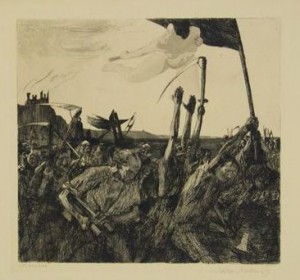
 Uprising (1902-03, etching on heavy beige wove paper, 20¼″ x 23⅜″ [51.4 x 59.4 cm]). Plate 5 from the cycle Peasant War. From the 1908 edition of approximately 300 impressions. Knesebeck 70/VIIIb. Private collection. Courtesy Galerie St. Etienne, NY. Familiar with most of Kollwitz’s oeuvre, this knowledgeable viewer knew that Raped was the second plate of seven in the print cycle Peasant War, commissioned by the Association for Historical Art in Germany following submission for consideration of the first completed etching of the series, Uprising (originally called Outbreak).2 In that print, a powerful woman, Black Anna, leads a contingent of fellow peasants armed with makeshift weapons against their feudal lords.3
 Revolt (1899, etching on heavy cream wove paper, 11⅝” x 12½” [29.5 x 31.8 cm]). First concept for plate 5 (Knesebeck 70) from the cycle Peasant War. Knesebeck 46/V. Private collection. Courtesy Galerie St. Etienne, NY. The idea for the cycle began in 1899 with a plate Kollwitz etched, variously translated as Uprising and Revolt, that pictured a rag-tag but triumphant mob of scythe-wielding farmers accompanied by a nude woman flying above, carrying a torch from which a flame leaps into the distant background to set ablaze the manor house, home of the oppressors. Coming from a long line of socialists, 4 Kollwitz had already explored the topic a few years earlier in her gold-medal-winning first cycle, A Weaver’s Rebellion.
From childhood, when the young Käthe had enacted barricade scenes with her father and brother, she had imagined herself a revolutionary. It followed that as an artist she would draw strong women into her narratives, depicting them as they sharpened scythes, galvanized men into action, cared for the wounded and identified the dead. When Kollwitz read Wilhelm Zimmermann’s 1841 General History of the Great Peasants’ War and discovered Black Anna, an actual participant in the 1525 revolt by peasants against their overseers, the idea for this cycle was born.
Answering the tourist’s questions about Kollwitz’s choice of printmaking, the art historian explained that after struggling unsuccessfully to master color in her studies at a Berlin academy for women and later in a painter’s studio, and being introduced in 1884 to the work of master printmaker Max Klinger, the young artist finally gave up on painting and in 1890 took up etching, a technique at which she soon excelled. Although Kollwitz later devoted herself to the medium of sculpture, in which she modeled emotionally compelling figurative pieces, she never abandoned printmaking. Expanding her practice to include lithographs and woodcuts, she valued the reproductive capabilities inherent in these mediums, guaranteeing the widest possible audience for her socio-political ideas.
The composition of Raped differs markedly from Kollwitz’s usual images of women who are shown in active roles, not supine on the ground. It is also the only instance where she tackled landscape with enough details to identify cabbage leaves, sunflowers and other plants.5 As for its narrative, in correspondence about this print the artist referred to Raped as “the next to the last plate,” which would have made it the sixth out of seven (though it was published as Plate 2) and described it as “an abducted woman, who after the devastation of her cottage is left lying in the herb garden, while her child, who had run away, looks over the fence.”6
Knowing the artist’s intentions and how she came to etch Raped served only to whet the tourist’s appetite for more information. Just then someone else approached, walking directly up to the two viewers who were blocking access to the print. As chance would have it, the latest arrival turned out to be a psychotherapist who worked with trauma survivors and had a long-standing interest in art depicting sexual abuse and other forms of personal violence.
Käthe Kollwitz, whose work is permeated with meditations on struggle and death, naturally aroused the psychotherapist’s curiosity, especially with respect to how the artist came to focus on those themes. Joining the already in-progress discussion, the clinician related how the printmaker’s son, Hans, had nagged his mother into writing about her life and her development as an artist, and how despite her initial objections, she had surprised him with a manuscript in 1922 that he later augmented with diary entries and letters, and published in 1955.7 Hearing what had already been learned by exploring the image and its creation, the therapist added to the discourse aspects of Kollwitz’s psychosocial history crucial to understanding her choice of subject matter for the etching.8
In recounting her early years, Kollwitz described seeing a photo of her stoic mother holding her firstborn son, “‘the holy child,’” who had died within a year of his birth. Her mother lost a second son before Kollwitz’s older brother Konrad was born. When Käthe was nine, her mother had Benjamin, who also failed to survive beyond his first year, dying from the same meningitis that took the firstborn.
The artist remembered how one night, during her baby brother’s illness, the nurse had burst into the kitchen where her mother was dishing out soup and yelled that the infant was throwing up again. Her mother had stiffened and then went on serving dinner, her refusal to cry in front of her family failing to conceal her suffering from her young daughter, to whom it was obvious.
After that dinner, Käthe–with her younger sister Lise–was sent to play in the nursery where she built with her blocks a temple to Venus and began preparing a sacrifice to a goddess she had learned about in a book on mythology, and who she had chosen to worship over the Christian “Lord”–a stranger to her despite her family’s devotion to him. When her parents walked into the room to convey the bad news that her little brother had died, Käthe was certain “God had taken him” as punishment for her disbelief and sacrifice to Venus.
Because the family’s way was to grit teeth and carry on, with no discussion or even expression of loss and grief, Käthe carried the burden of guilt for her brother’s death into her adult years. Her mother’s unexpressed sorrow suffused their home and her oldest daughter lived in fear that her parents would come to harm.
Stopping the story at that point, the psychotherapist retrieved an ebook reader from a handbag and read from Kollwitz’s autobiography. “I was always afraid [my mother] would come to some harm…If she were bathing…I feared she would drown.” Reflecting on watching through the apartment window as her mother walked by, Kollwitz continued, “I felt the oppressive fear in my heart that she might get lost and never find her way back to us…I became afraid Mother might go mad.”
As the clinician tucked away the ebook reader, the trio of observers turned back to the etching Raped. Suddenly they understood what the artist might not have known herself, that the young girl looking over the fence was nine-year-old Käthe and the woman on the ground was her mother, finally felled by a trauma too insistent to be repelled.
As the three viewers continued contemplating the poignant image before them, another person approached. They eagerly began sharing their recent discoveries as they made room for the newcomer who, noticing the dates of the artist’s life, explained that Käthe Kollwitz was not a twentieth century artist but a woman born, raised and educated in the second half of the nineteenth century.9 Living in Germany in the late 1800s must have affected her art, they all agreed.
But that’s a story for another time.
____________________________________________________
1A print of the etching was displayed for a while in the Drawing and Print Gallery of The Metropolitan Museum of Art several years ago. The work under consideration, a proof, is in the private collection of the writer.
2Martha Kearns, Käthe Kollwitz: Woman and Artist (New York: The Feminist Press at The City University of New York, 1976), 85.
3See Elizabeth Prelinger, Käthe Kollwitz (New Haven: Yale University Press, 1992), 30-39, for a description of the evolution and content of The Peasant War cycle.
4See Jane Kallir, “Käthe Kollwitz: The Complete Print Cycles” (Galerie St. Etienne, exhibit essay, October 8 through December 28, 2013) for additional information about Kollwitz’s print cycles.
5 Hildegard Bachert, “Käthe Kollwitz: The Complete Print Cycles,” gallery talk (Galerie St. Etienne, November 7, 2013).
6Käthe Kollwitz, quoted in Käthe Kollwitz: Werkverzeichnis der Graphik, by Alexandra von dem Knesebeck, trans. James Hofmaier (Bern: Verlag Kornfeld, 2002), 291. Relevant excerpt of text included in provenance documents accompanying the proof.
7The Diary and Letters of Kaethe Kollwitz, ed. Hans Kollwitz, trans. Richard and Clara Winston (Evanston, Illinois: Northwestern University Press, 1955).
8See Ibid., 18-20, for information about Kollwitz’s childhood experiences of loss.
9Bachert, gallery talk.
Käthe Kollwitz: The Complete Print Cycles
The Galerie St. Etienne
24 West 57th Street
New York, NY 10019
(212)245-6734
Now till December 28, 2013.
Posted in Art Historical Musings, Art Reviews |
 Print This Post Print This Post
October 17th, 2013
A Case Study of
Psychoanalysis as an
Art Historical Method

Turn-of-the-nineteenth century Vienna was a fertile time for scientists, intellectuals and artists as the planets aligned to create what has been called “The Age of Insight.” The mind became an object of intense scrutiny for practitioners of medicine, psychiatry, psychology, and the literary and visual arts. New methods that were developed in pursuit of understanding human nature from a biological perspective found usefulness in the study of art and artists.
One resident of the city, Sigmund Freud, created a system of indirect investigation into the psyche using personal experiences like dreams, fantasies, slips of the tongue, and artistic productions. Calling his method psychoanalysis and taking it beyond the confines of his medical practice, Freud applied it everywhere without reservation, writing about jokes and everyday missteps, romance and war, and creativity and art.
Ever curious about Italy and its artists, Freud wrote a book-length analysis of Leonardo da Vinci based on a memory the artist had included in his Codus Atlanticus. In Leonardo da Vinci and a Memory of His Childhood, the doctor uses psychoanalysis with great conviction to answer intriguing questions about this Renaissance master and scientist.
The first German edition of the book, published in 1910, was followed by four more (1919, 1923, 1925 and 1943). An English translation titled simply Leonardo da Vinci appeared in 1916, followed by an additional two (1922 and 1932) before the one under consideration here. In 1964 Alan Tyson, working under the general editorship of James Strachey with Anna Freud and Alix Strachey for The Standard Edition, translated the text with an expanded title for this first American edition.
In his book-length essay, Freud takes as his starting point Leonardo’s description of an event from his childhood, using a flawed German translation of the original Italian, to understand why Leonardo traded art for other inventions and took off in pursuit of scientific knowledge. In typical Freud writing style, the psychoanalyst anticipates all manner of resistance throughout the piece, beginning by assuring those who would question his motives that his intentions are not “‘[t]o blacken the radiant and drag the sublime into the dust’” but rather to further understand a man that he referred to as “among the greatest of the human race.”
Before he tackles the childhood memory, Freud describes Leonardo’s struggles with his art, beginning with the perfectionism that made each painting a major endeavor of upwards of several years and left more than a few unfinished. He cites Vasari and later art historians who quote Leonardo’s contemporaries on the subject, and mentions several specific paintings as examples, including the Last Supper, where the artist’s frustration with the rapid execution required of fresco painting resulted in the technical disaster that has challenged conservationists ever since.
From there Freud begins an elaboration of Leonardo’s personality based on observations by those who knew him in some way, maneuvering closer to his primary thesis by proposing that the artist “represented the cool repudiation of sexuality.” He finds evidence for this in Leonardo’s own words as quoted by Edmondo Solmi, an Italian philosopher of Freud’s time. Soon enough the psychiatrist addresses Leonardo’s homosexuality, declaring that even though the fledgling artist had gotten into trouble with the law for it when he was in Verrocchio’s studio and surrounded himself with beautiful young boys once he was a master, for sure he never actually engaged in sexual activity.
In another secondary source, Freud finds Leonardo averring that “[o]ne has no right to love or hate anything if one has not acquired a thorough knowledge of its nature.” Applying that to the artist’s assumed abstinence, he notes that in this case “[t]he postponement of loving until full knowledge is acquired ends in a substitution of the latter for the former.” Thus, for Leonardo, investigating took the place of creating art and of producing much of anything else.
In his element now, Freud asserts that around age three most children go through a period of “infantile sexual researches” usually precipitated by the advent of a new sibling, which invites the question: whence babies? When repression puts an end to this phase, various outcomes are possible. Freud believed that Leonardo’s unconscious resolution was perfect; by channeling his sexual drive into non-practicing homosexuality and allowing his investigative instinct to reign supreme, the artist-scientist avoided a neurotic resolution, freeing his libido to “act in the service of [his] intellectual interests.”
After establishing this psychoanalytic foundation, Freud provides information about Leonardo’s childhood, noting that the artist was illegitimate, initially lived with his mother, and when five years old went to live with his father, who had recently married. That these inadequate bits of biographical data are poor substitutes for having the analysand before him doesn’t seem to deter the doctor from basing his conclusions on them.
Finally Freud presents the memory, translated for this book from the German text he quotes, Marie Herzfeld’s translation of the Italian original as it appeared in Nino Smiraglia-Scognamiglio’s edition of the Codex Atlanticus. Her version erroneously rendered nibio as vulture when in fact it means kite, a much smaller, non-carrion-eating raptor with the ability to hover in the air due to its long, forked tail. She also omitted dentro (within), which alters the action of the all-important tail. These changes have been indicated in brackets in the rendering of Leonardo’s words that follows.
It seems that I was always destined to be so deeply concerned with vultures [kites]; for I recall as one of my very earliest memories that while I was in my cradle a vulture [kite] came down to me, and opened my mouth with its tail, and struck me many times with its tail against [within] my lips.
After extolling the virtues of psychoanalysis as a tool for deciphering this passage, Freud points to the obvious erotic content, noting that “tail” (coda in Italian) is a common slang term for penis. He then goes on to construct an interpretation of the memory that defies Occam’s razor.
Although he acknowledges the similarity between Leonardo’s memory and the dreams and fantasies of women and passive homosexuals, Freud opts to see it as a symbolic representation of the baby suckling at its mother’s breast. He supports this hypothesis by pointing out that in Egyptian mythology a mother goddess, whose name was Mut (similar to the German mutter for mother), was pictured with a vulture’s head, adding that at the time all vultures were believed to be female.
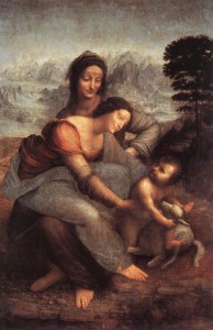
Freud concludes that the memory represents the overdependence on, and eroticization of, Leonardo by his mother, who used him when he was quite young as a substitute for his missing father. In the rest of the essay, Freud looks first for confirmation of his ideas to Leonardo’s art–in the special smiles that grace the faces of his women and in The Virgin and Child with St. Anne, with its hidden vulture.
As further support, the psychoanalyst pulls in his theories on infantile sexuality, the phallic mother, homosexuality and the Oedipal complex. He finds indirect evidence in Leonardo’s writings for a negative relationship with his father, linking it to the artist’s homosexuality and his rejection of religion. Freud even finds meaning in Leonardo’s obsession with flying machines, citing the connection between dreams of flying and sexual performance.
In the final chapter of the book, feigning humility, Freud addresses possible objections to his “pathographical review of a great man,” admitting the limitations of applying psychoanalysis to the biography of someone about whose early life so little is known. He nonetheless confidently asserts that he has accomplished what he set out to do, showing how the circumstances of Leonardo’s childhood, combined with his inherent capacity to repress and sublimate his primitive instincts, resulted in a celibate artist-scientist forever torn between his art and science. Although Freud was well satisfied with his conclusions, their unfavorable reception seems to have discouraged him from tackling other art historical subjects.
Freud came to this particular project via a long-standing interest in Leonardo–once remarking in a letter to his friend Wilhelm Fliess on the artist’s celibacy and left-handedness–and had read Dmitry Sergeyevich Merezhkovsky’s historical novel, Leonardo da Vinci, which he cites in the text as though it were a historical document. His other bibliographical resources include volumes written on Leonardo by an assortment of scholars as well as a long list of his own publications.
Not unlike Leonardo, Freud was enticed away from his original career path by his curiosity. Born in Moravia in 1856 but resident in Vienna from age three until he fled Austria for London in 1938, Freud studied biology and medicine, qualifying as a doctor in 1882. Three years later, a trip to the Salpêtrière Hospital in Paris and time spent with the celebrated expert on hysteria, Jean-Martin Charcot, changed his professional direction from clinical neurology to medical psychology. With his Interpretation of Dreams, published in 1900, Freud moved even further away from the laboratory, confining his research to observations of his psychiatric patients and reflections on his own experiences and psyche. Out of that work, he developed the practice of psychoanalysis and his theories about the unconscious.
When he decided to pursue an analysis of Leonardo da Vinci, Freud turned to writings by prominent art historians, among them the German Jean Paul Richter (1847-1937) and the Frenchman Eugène Müntz (1845-1902), whose methods happened to be at odds with each other. Richter, a disciple of Giovanni Morelli (who believed art was best studied by looking at objects with a well-practiced scientific eye), published in 1883 The Literary Works of Leonardo da Vinci, a two-volume work, first in Italian, then German and English, the last of which Freud consulted. Müntz, on the other hand, believed in the importance of archival research and, opposing Morelli’s focus on connoisseurship, based his studies on documents he unearthed in Italian archives. His monograph Léonard de Vinci, released in 1899, was one of Freud’s references.
If the psychoanalyst was aware of the caldron of ideas that simmered close by, especially in the Vienna School but also elsewhere, about how best the discipline of art history should be practiced, his bibliography doesn’t reflect it. The ideological stew included empiricists who looked to science as a model for the investigation of artworks as physical entities in documented contexts, philosophers who approached the study of art from a metaphysical perspective–more concerned with ideas than things, and a new breed of cultural historians, who occupied a middle ground between the two, finding value in each and adding ethnography and psychology to the mix.
 Leonardo da Vinci, The Virgin and Child with St. Anne (c. 1508, oil on wood, 66″ x 44″ [168 x 112 cm]). Musée du Louvre, Paris. [
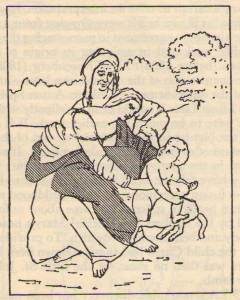
 Sketch of The Virgin and Child with St. Anne from Leonardo da Vinci and a Memory of his Childhood, page 66. Freud seems to have gravitated toward outliers like Walter Pater (1839-1894), a British aesthete whose Studies in the History of the Renaissance, a collection of essays published in 1873, had to be recalled because of their anti-religious nature. In his discussion of specific artwork by Leonardo, the analyst relied on those essays plus the work of two others: Oskar Pfister (1873-1956), a Swedish minister with an interest in philosophy and psychology with whom Freud maintained regular correspondence for many years, and whose discovery of a vulture in The Virgin and Child with St. Anne provided critical evidence for the hypothesis expounded in the book; and German-born Richard Muther (1860-1909), an emotionally expressive writer whose description of images tended toward the “lurid and erotic.” In fact, Freud’s insufficient knowledge of art history and the scholarship on Leonardo made mistakes inevitable and stood in the way of producing “a meaningful art historical essay on the artist.”
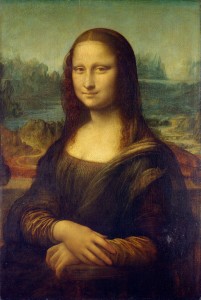
 Leonardo da Vinci, Mona Lisa (1503-17, oil on poplar, 30″ x 21″ [77 x 53 cm]). Musée du Louvre, Paris. Freud referred to the more mainstream writers earlier in the book when introducing Leonardo, his practices and milieu, but switched over to the others later on when analyzing the latent meaning he espied in the artist’s words and images. For the Mona Lisa, he liked Pater’s perception that it contained “a presence…expressive of what…men had come to desire…the unfathomable smile, always with a touch of something sinister in it, which plays over all Leonardo’s work.” And he turned to Muther for observations on the physical relationship among the mothers and baby, and St. Anne’s perpetual youth in The Virgin and Child with St. Anne.
Because his interest was primarily psychological, Freud could be expected to seek out those who approached the study of art from a similar perspective. While there is surely much to be gained through the understanding of artists’ intrapsychic development and interpersonal relationships, Freud’s system of thought–psychoanalysis–contains many flaws, not the least of which is his attribution of adult sexual feelings to infants and children.
In explaining Leonardo’s memory, the doctor first must explain how the vulture’s tail comes to be symbolic of the artist’s intense erotic attachment to his mother and how that desire later morphs into homosexuality. He does this by invoking the phallic mother who is imagined to possess a penis by the little boy appalled at the thought that someone he loves so dearly should lack such a precious appendage. This intense mother-son bond is reinforced by Leonardo’s oversolicitous mother and absent father, and the child’s unconscious identification with the idolized mother. The boy grows up to be a man who love boys in the same way his mother loved him. Here Freud confuses homosexuals with pedophiles; the former are attracted to other men while the latter prey on vulnerable children.
Because Freud’s reasoning about such Leonardo mysteries as his perfectionism, depiction of smiling women, and turn from art to scientific research depends so heavily on the Oedipus complex and other aspects of his theory of infantile sexuality, it’s important to know how he came to substitute those assumptions for his empirically based seduction theory of hysteria.
In his work with women suffering from what would now be called Post-Traumatic Stress Disorder but was then diagnosed as hysteria, Freud came to the unavoidable conclusion that their symptoms stemmed from “one or more occurrences of premature sexual experiences…[in] the earliest years of childhood,” incidents forced upon them by adults in their immediate family environment. Since most of his patients were women whose fathers came from prominent Viennese families, his observations were met with a chill that forced him to retract his basic premise and instead attribute his patients’ symptoms not to memories but to fantasies growing out of infantile sexual desires for their fathers. The construction of the Oedipus complex followed. Boys, Freud asserted, coveted their mothers, wished to do away with the competition, and feared castration at the hands of vengeful fathers.
Had Freud held to his original discovery, perhaps he would have understood Leonardo’s memory of a visit from a bird that places its long tail in his mouth as a screen memory for oral rape. On that stronger foundation, the doctor could have constructed a different theory about Leonardo’s homosexual activity in Verrocchio’s workshop and his later predilection for boys.
In The Aetiology of Hysteria, Freud observed a link between adult hysterical symptoms and adolescent trauma, which he then traced to childhood sexual assaults. Rather than seeing Leonardo’s interest in younger males as a manifestation of his over-identification with his mother, the analyst might have chosen the simpler conclusion, that to avoid intolerable feelings of victimization, the artist unconsciously took the role of perpetrator and re-enacted his abuse with others, a common outcome of early sexual trauma. With that far less complex connection, Freud might then have been able to link Leonardo’s perfectionism with his need to compensate for the shame he carried as a result of being sexually abused.
In addition to those missed opportunities, Freud was led on a wild vulture chase by a significant error in translation. His excursion into Egyptian hieroglyphics and mythology in support of his contention that Leonardo’s memory of the bird and the appearance of its image in The Virgin and Child with St. Anne (as illustrated by his good friend Pfister) proved the artist’s erotic attachment to his mother, while fascinating, must be disregarded.
It would be unfortunate if at this point one concluded that psychoanalysis has little if anything to contribute to the study of art and the artists who create it, for when Freud briefly left behind his obsession with Leonardo’s “vulture-fantasy” and sexualized relationship with his mother and looked instead at his paintings, he had much to offer. In associating the enigmatic smile of the Mona Lisa with Leonardo’s memory of his mother’s adoring gaze, and the mother-and-daughter dyad of The Virgin and Child with St. Anne with the five-year-old boy’s relationship with his adopted mother and paternal grandmother, both of whom lived in his father’s house and took over his care from his single mother, Freud kept it simple and raised intriguing questions. In expounding on those connections, he assumed kindness and tenderness on the part of the pictured women, but one could just as easily see in these images an unconscious wish for an ideal that never was.
In either case, in directly encountering Leonardo’s art, drawing upon limited but salient biographical data and applying the principals of psychoanalysis, Freud introduced to the study of art a potentially powerful tool. Had he not abandoned his initial discoveries about childhood trauma and spent his genius on devising convoluted theories to explain hysterical symptoms, he might have come to more convincing conclusions about the life of Leonardo da Vinci and made an important contribution to the field of art history.
Bibliography
– Fermi, Eric. Art History and its Methods. New York: Phaidon Press, 2011.
– Freud, Sigmund. Leonardo da Vinci and a Memory of His Childhood. Translated by Alan Tyson. New York: W. W. Norton & Company, 1964.
– _____________. On Creativity and the Unconscious: Papers on Art, Literature, Love, Religion. Edited by Benjamin Nelson. New York: Harper & Row, 1958.
– _____________. “The Aetiology of Hysteria.” In The Assault on Truth: Freud’s Suppression of the Seduction Theory, by Jeffrey Moussaieff Masson. New York: Penguin Books, 1984.
– Italian-English Dictionary. New York: Barron’s Educational Series, 2007.
– Kandel, Eric R. The Age of Insight: The Quest to Understand the Unconscious in Art, Mind, and Brain, from Vienna 1900 to the Present. New York: Random House, 2012.
– Kultermann, Udo. The History of Art History. New York: Abaris Books, 1993.
– Onians, John. Neuroarthistory: From Aristotle and Pliny to Baxandall and Zeki. New Haven: Yale University Press, 2007.
– Sorensen, Lee, ed. “Eugéne Müntz” in Dictionary of Art Historians, www.dictionaryofarthistorians.org.
– _______________. “Jean Paul Richter” in Dictionary of Art Historians, www.dictionaryofarthistorians.org.
– _______________. “Walter Pater” in Dictionary of Art Historians, www.dictionaryofarthistorians.org.
– Simmons, Laurence. Freud’s Italian Journey. New York: Rodopi B. V., 2006.
– Wikipedia. “Oskar Pfister.” Last modified September 21, 2013. http://en.wikipedia.org/wiki/Oskar_Pfister.
[A version of this review with footnotes is available. If interested, contact deborahfeller@verizon.net.]
Posted in Art Historical Musings, Art Book Reviews |
 Print This Post Print This Post
August 26th, 2013
Childhood’s Edge (painting)
Catharine Lorillard Wolfe Art Club
117th Annual Open Exhibition

The painting, Childhood’s Edge, has been accepted into the Catharine Lorillard Wolfe Art Club’s 117th Annual Open Exhibition.
The show, held at the National Arts Club, begins October 1st and concludes on October 25th (2013).
National Arts Club
15 Gramercy Park South
(between Park Avenue & Irving Place)
New York, NY
(212)475-3424
Hours:
Monday to Friday, 12N-6pm
Saturday & Sunday, 1-6pm
(call in advance to confirm gallery availability)
Posted in Currently on View |
 Print This Post Print This Post
August 25th, 2013
From Bad Boy to Artist
Eric Fischl Finds His Way

- Book jacket front. Photo of Eric Fischl © 1993 by Gérard Rondeau.
In consciousness raising groups in the early 1980s, women uncovered rape and incest as common themes in their lives. During the same period, adult children of alcoholics, supported by alcoholism treatment professionals, began meeting to explore their shared trauma of growing up in dysfunctional families. Around the same time, unrelated to either movement, illustrations of these survivors’ stories graced the walls of an art gallery in midtown Manhattan.
As he later revealed, Eric Fischl–the artist who created these works–gained his terrible knowledge about such experiences at home as a child. In an earlier book on his work,1 he described at length the split between what his family looked like from the outside (white, upperclass, suburban) and how tumultuous and ugly it was behind closed doors.
Fischl’s new book explores in greater depth life with a mother whose drinking dissolved boundaries between her and her son and created tension with her husband that violent outbreaks served to discharge. Written with Michael Stone, Bad Boy–My Life On & Off the Canvas charts the artist’s journey from tumultuous childhood to the relatively peaceful life the artist now enjoys.
Fischl never intended to write an autobiography; that was Stone’s idea. It grew out of their conversations about the art world in the 1960s when Fischl was attending CalArts with guys whose names would later become synonymous with high-priced, hyped products that most critics came to call art. Encouraged by his publisher to feature an artist, Stone convinced his friend to be the subject.2
 Bad Boy (1981, oil on canvas, 66″ x 96″ [168 x 244 cm]. Courtesy of the artist. The title of the book comes from a 1981 painting that established Fischl as an artist of note–and notoriety. By the time he painted Bad Boy, he had already developed what would be his usual method of approaching a canvas. Starting with “an image or the scrap of an idea” 3 he would ask himself journalistic questions to set motivated action within a scene, adding objects and/or characters as answers emerged.
Working in the time-honored tradition of arranging figures in a narrative context, Fischl dared to be different at a time when novelty for its own sake ruled and abstraction was ascendent. Unable to emotionally connect to nonrepresentational imagery, he struggled dejectedly for several years before painting his way into a more authentic style4 while teaching art at a school in Halifax in the early 70s.
Fischl writes about the inevitability of that transition with the self-reflection of someone who has done enough personal work to achieve the necessary distance from his process of healing to comment on it. “Feelings lodged in my subconscious were driving my work toward a form of expressiveness that was raw and graphic and troubling–and sometimes cathartic…images would pop out that were increasingly recognizable both as people and things, avatars of my buried past.”5
With the local fishing community of Halifax to provide inspiration, Fischl began painting stories about a fictional family he called the Fishers who eventually morphed into the Fischls. Using smooth glassine sheets, he would begin by painting in black an object–or person–then ask himself what/who else was present and what might be going on, letting his unconscious lead his brush.
In his explanation of effective narrative painting, Fischl inadvertently also describes the impact of trauma. “Working toward that moment…the frozen moment…pregnant with some special kind of energy…Finding where to arrest the action…to stop time…The most dramatic moments are the moments just before or just after something happens.”6
With much the same power, a traumatic event freezes time for anyone trapped within it, especially a child. Overwhelmed by a flood of emotions–primarily terror–and unable to safely integrate within the psyche the awful truth of the moment, the victim’s brain sequesters this unknowable information within the amygdala (a brain organ that among other related functions regulates negative emotions) and effectively stops time, dissociating fragments of the experience in the service of survival.
Those traumatic memories, because they have not been metabolized, are subject to spontaneous, experiential recall. When Fischl writes, “[m]y portrayals of the Fisher family and their daily dramas had begun to trigger memories of my own childhood,”7 he was describing how something in the present reminiscent of the original traumatic event can call out the raw feelings–sensory and emotional–and hurtle the survivor back in time, forcing the body to react as though it were happening all over again.
Fischl’s creative process, which evolved over time to include photographs that he manipulated in much the same was as he used the glassines, provided a way for him to process and integrate the dissociated memories of a boyhood spent in a violent, alcoholic family, and an entry into manhood marked by the suicide of his mother when he was 21. The material that found its way onto his canvases was ambiguous enough to enable him to paint it and relevant enough to his own history to give meaning to experiences that can never really make much sense.
Bad Boy and its companion paintings of a darkly erotic nature soon attracted the attention of the art-buying world and Fischl, joining Mary Boone’s stable of artists, found himself hobnobbing with celebrities and making money. He describes at length the unfortunate transformation beginning in the 80s of an art-appreciating art world into a highly commercial art market; art became a commodity, to be bought and sold like any other investment. In his coverage of that period, Fischl critiques the novelty-based productions of other artists whose work, like his, was selling like hotcakes.
Thrown into the social and quite artificial environment of art openings, feeling undeserving of the accolades and financial rewards that were accruing, Fischl ran into serious trouble with alcohol and the then ubiquitous cocaine. How he wrenched himself free of addiction’s grip after a road rage encounter, the story of which opens the book, owes a great deal to his relationship with April Gornik, an artist in her own right, his girlfriend at the time and now his wife.
Fischl’s clumsy initial attempt to score with this woman of his dreams (by insulting her work) reflects how wounded he still was from the turmoil he had not that long ago escaped. Not surprisingly, within a few paragraphs of that anecdote he writes about his father’s attempts to keep the family together after his mother’s death.
The artist does eventually get the girl who, once won over, remains loyal. Not an easy thing for two artists to couple and remain so, particularly when the career of one (often the man) advances faster than that of the other. That Fischl and Gornik have managed to forge a lasting relationship speaks to their love for, and commitment to, each other. Eric’s feelings are quite clear throughout the book, the very last word of which (not counting the useful index) is “APRIL.”8
Of great value for art historians and other aficionados, Bad Boy chronicles the development of Fischl’s major projects, from initial idea to final execution. An artist whose work is always evolving, Fischl early on took to photography and eventually acquired enough photo editing skills to add that tool to his kit. One day he picked up some clay to get through a block and ended up producing exciting (and sometimes controversial) sculptures. Influenced by his two-dimensional creations, the sculptures in turn became inspirations for new drawings and paintings.
 Eric Fischl. Photo © Oliver Abraham. Along the way, Fischl has forged lasting friendships with others who share his passion for maintaining integrity in artistic expression and are successful in their own areas of expertise. Many became the subjects of portraits. Not unrelated to this honing of interpersonal skills, for the writing of this book he reached out to his three siblings, to friends from his early years, to other artists who knew him way back when and to those who have known him in more recent times, asking each to pen a short piece about him.
Not one to shy away from the truth, Fischl took some risks with those invitations, the results of which are interspersed throughout the chapters under the heading of “Other Voices.” Reminiscent of what partially motivates attendance at high school reunions, he undoubtedly discovered even more about his younger (and older) self than the demands of autobiographical writing ordinarily reveal.
Fischl’s fearless self-scrutiny stands out in his exploration of a painting session that was about to end in frustrated disaster the summer before he transferred to CalArts. It began as an abstraction but soon “ground to a halt.” After “weeks of struggle…[it] culminated in a tantrum.” The artist, from his current vantage point of considerable recovery, links the “frustrating sense of paralysis and unreasoning anger” with “the same feelings [he’d] experienced watching [his] parents fight, being pummeled and tossed aside when [he] got between them.”9
In a fit of rage, Fischl obliterated with white primer the offending area. When he stepped back to take stock of the damage, he saw that he had “painted a white cartoon floating bed,” introducing representation into an originally abstract painting but also eliciting from his unconscious an image that would recur years late in canvases like Bad Boy. Of this he astutely notes, “…the bed alludes to the womb, the birthplace of childhood memory, the place where dreams occur, the setting for sexual fantasies and encounters,”10 but stops short of uttering the still unspeakable word, incest.
At the end of that summer as Fischl continued his struggle to extricate himself from the suffocating confines of his mother’s escalating alcoholism by moving to San Francisco in advance of the school term, his mother, unable to tolerate the departure of her favorite son and close companion, crashed her vehicle into a tree. Having quickly returned home, the young Eric stood helplessly at his mother’s hospital bedside, in time to exchange a few last words with her before she died. Overwhelmed by undescribable feelings, the fledgling artist “vowed that [he] would never let the unspeakable also be unshowable. [He] would paint what could not be said.”11
True to his word, Fischl has painted his way out of the darkness of his early years by adhering to that original promise. In doing so he has given the world a wide array of disturbing images that force confrontation with, and contemplation of, the darker side of human nature.
__________________________________________________
1 Danto, Arthur C., et al. Eric Fischl 1970-2007 (New York: The Monaceli Press, Inc.), 2008. Fischl acknowledges in Bad Boy incorporating about 2,000 words from the interview with Danto.
2 Fischl, Eric. Bridgehampton Library Lecture, August 2, 2013.
3 Fischl. Eric, and Michael Stone. Bad Boy: My Life On & Off the Canvas (New York: Crown Publishers), 2012, 150.
4 Ibid, 85.
5 Ibid.
6 Ibid, 101.
7 Ibid, 95.
8 Ibid, 346.
9 Ibid, 35.
10 Ibid.
11 Ibid, 38.
Posted in Art Book Reviews |
 Print This Post Print This Post
August 4th, 2013
An Unlikely Master,
Caravaggio Brings Light
To the World of Painting
 Michelangelo Merisi da Caravaggio, The Taking of Christ (detail) (1602, oil on canvas, 135.5 x 169.5 cm). National Gallery of Ireland. Courtesy of the Jesuit Community, Leeson St. Dublin. Photograph © National Gallery of Ireland. In 1610 in the Italian coastal city of Port’Ercole, at the all-too-young age of 38, Michelangelo Merisi da Caravaggio succumbed to either malarial fever (historically preferred version) or violence (supported by newer research).1 He left behind several paintings on a boat wending its way without him (another story) to his patrons in Rome and more critically, a new way of painting that had already changed the practices of many of his contemporaries, and would continue to inspire artists in the near and distant future.
In the spring of 2013, Hartford’s Wadsworth Atheneum Museum of Art hosted the final stop on an international tour of the exhibition, Burst of Light: Caravaggio and His Legacy. The multi-venue show, which grew out of a collaboration among the Los Angeles County Museum of Art, the Atheneum and several French museums, displayed a selection of works by Caravaggio and his many followers that could be seen in its entirety in the finely illustrated catalog but only enjoyed in part at each site.
For the movie-going, novel-reading public, facts and fantasies about Caravaggio’s tumultuous social life might be better known than the significance of his contributions to the practice of figurative painting. Two well-attended gallery talks in the space of a few hours on a beautiful Saturday afternoon in June demonstrated that given the opportunity, a contemporary audience could be captivated by the images that centuries ago first attracted fans.
A visitor asking at the Atheneum information desk for directions to the exhibit was told that straight ahead at the top of the grand staircase was a room with the Caravaggios and on either side of it, ones with the work of other artists. Unlike with the usual blockbuster that sprawls over an endless succession of galleries, the close proximity of these 32 paintings allowed for comparisons among them via a short walk from one to the other.
Only four of the five Caravaggios originally slated for the show were on display. Apparently the Metropolitan Museum of Art had decided to hold onto its jewel, The Denial of Saint Peter (1610), for the spring opening of its new European painting galleries. A late work, the painting demonstrates how far the master had gone in his ability to pick out light from darkness with just a few deftly applied swipes of high-value color.
 Michelangelo Merisi da Caravaggio, Saint Francis of Assisi in Ecstasy (c.1595–96, oil on canvas, 36⅜″ x 50¼″ [92.5 cm x 127.8 cm]). Wadsworth Atheneum Museum of Art, Hartford, Connecticut. Caravaggio’s potential to do a lot with a little was already evident fifteen years earlier when he created Saint Francis of Assisi in Ecstasy (c.1595–96). In a three-by-four composition with a sweeping diagonal, an angel with a highlighted bare left shoulder supports the weight of Saint Francis, whose head is thrown back in dreamy contentment as he indicates with his right hand a chest wound similar to the one inflicted on Christ when he was crucified.
In the right half of the painting, Caravaggio’s light draws attention to the action as it lands on the angel’s face, upper body and right hand (which tugs on the rope around the saint’s habit), and Francis’s face and hands. Following the sweep of the brown cloth brings the viewer to a bright spot that opens up the rest of the scene where a man curled in a fetal position leans against a tree and props up his head with his hand, perhaps sleeping, unaware of the drama taking place nearby.
Behind him several much smaller figures gather around the bright spot–a fire–intent on something outside the picture on the left. Further back, light of unknown origin, either from an unseen full moon or a spiritual presence, illuminates a body of water.
The tenderness with which the spiritual being gazes upon and cradles in his arms the ecstatic mortal borders on a far more profane tableau of post-coital bliss. The barely open, unfocused eyes, slightly upturned corners of the mouth, and limp body of the saint remind the viewer of the thin line between religious ecstasy and sexual arousal.
That double entendre was probably not accidental. Caravaggio ran with a wild bunch of like-minded painters in Rome and when not working in his studio to “destroy the art of painting”2 with his rebellious naturalism, managed to repeatedly come into conflict with the law. As unconventional with his sexual behavior as he was with his brush, the great iconoclast enjoyed an intimate relationship with one of his young followers nicknamed Cecco del (as in belonging to) Caravaggio. An accomplished artist in his own right, Cecco modeled for his master and accompanied him on his travels.3
Caravaggio, having lost his father at age six and a brother several years later, sent by the time he was thirteen to live in the house of the painter with whom he apprenticed, then having his mother die when he was nineteen,4 arrived in Rome at age twenty–a young man with a history of many losses and maybe even exploitation. Born in Milan in 1571 as Michelangelo Merisi da Caravaggio, this fledgling artist soon after his mother’s death cashed in his inheritance and headed to Rome where, within the next few years, he found a wealthy supporter and developed a revolutionary style of painting.
Proclaiming Nature as his teacher, Caravaggio painted from life; he found his models among the street people he met on his usual rounds and portrayed them as they appeared–without idealization. Using a single source of light that raked across figures placed in a shallow, dark space without an identifying context, the artist sometimes encountered outright rejection of his in-your-face realism when one patron or another refused to accept a commissioned piece (usually one bound for a church). But the look caught on and others emulated it, though none except perhaps Jusepe de Ribera came close to wielding a brush the way this virtuoso could.
 Michelangelo Merisi da Caravaggio, Martha and Mary Magdalen (1595–96, oil and tempera on canvas, 39⅜″ x 53″ [100 x 134.5 cm]). Detroit Institute of Arts. In what was to become that signature style, in another early work, Martha and Mary Magdalen (1595–96), Caravaggio again used light to differentiate between the spiritual and material. Bright spotlighting on the compositionally central Magdalen’s face emphasizes her enlightenment at the same time it draws attention to her cleavage-revealing low-cut dress, a reminder of her former attachment to worldly things. A bright island amid an area of dark colors, her left hand points to an almost pure white rectangle in a mirror that supports her arm. While probably meant to represent the presence of the Divine, the reflection also suggests Caravaggio’s light source: a small (basement?) window high up in an otherwise very dark room.
The curve of Mary’s red-satin-clad right arm leads to a white flower held close to her heart and onwards to the yellow sash that ends at a sponge in a bowl near a comb, all of symbolic value. Open-mouthed Martha, in the midst of a debate with her sister, enumerates her first point with brightly defined hands. Her shadowed face and far more sober attire attest to her attachment to good deeds as the path to spiritual attainment in contrast to Mary’s preferred life of contemplation.
The purple of Mary’s dress, green of the cloth near the mirror, and variety of hues of Martha’s attire, painted in large areas of local color, would continue for a while in Caravaggio’s early paintings and later be supplanted by mostly monochromatic images with an occasional bright red section, perhaps because of the high cost of other pigments.
 Michelangelo Merisi da Caravaggio, Salome Receives the Head of Saint John the Baptist (c. 1606–10, oil on canvas, 36″ x 42″ [91.5 x 106.7 cm]). The National Gallery, London. The late work Salome Receives the Head of Saint John the Baptist (c. 1606–10) is a good example of the way Caravaggio eventually distilled his style to a tenebristic scene of light and dark with few hints of color. In a setting lacking description, three half-length figures joined by the head of another are caught in the moment immediately following a decapitation. Looking at something outside the picture frame, Salome turns her head away from the platter she holds on which the executioner places that part of Saint John she had requested, while an elderly, ghost-like woman behind her rests head on clasped hands and looks downward. The grim-faced executioner, with his characteristically Caravaggio light-bathed bared shoulder, extends his arm to deliver Salome’s trophy, as if to create distance between himself and his deed.
Similar in style and format to The Denial of Saint Peter, the Salome seems to have been cut off on the left. A few more inches on that side would bring it closer to the three-by-four proportion of the Denial and other Caravaggio paintings. Also, although identified as Salome, the woman receiving the head is entirely too dressed down to be the seductress of myth.
At this point in his career, Caravaggio painted with light. Notorious for having left behind few if any drawings, he scratched his ideas directly onto a wet underpainting and built upon that with observations from life. In the Salome, unhesitant brush strokes of almost pure white describe the folds in the cloths and pick out the highlights on the cross-like sword. The few notes of warm color can be seen in the slight blush on Salome’s face and in the sun-exposed visage of the executioner, in the still-flushed ear of the saint’s head and the neat little trickle of blood below it, pooling in the dish. The artist’s true genius can be found in his ability to model barely perceptible form in very dark shadows.
Early on, Caravaggio’s rapid rise to artistic prominence in Rome, along with his notoriety, attracted the attention of the many other young artists who had come to the ancient city in search of fame and fortune. Among them was Bartolomeo Manfredi (1582-1622), who adopted his teacher’s tenebrism and half-length figures set in dramatic, often violent, tableaux, and eventually influenced future generations of artists with what came to be known as the Manfrediana methodus.5
 Bartolomeo Manfredi, Christ Crowned with Thorns (c. 1620, oil on canvas, 33″x 44″ [82.6 x 110.5 cm]). Michele and Donald D’Amour Museum of Fine Arts, Springfield, Massachusetts. Caravaggio’s influence on this older artist was especially evident in one of the two Manfredi paintings at the exhibit, Christ Crowned with Thorns (c. 1620). In a zoomed-in view of Christ’s tormentor yanking on a rope that seems to simultaneously force his captive to bend over while at the same time embedding the wreath of thorns securely into the skin, Manfredi emulated Caravaggio’s use of dramatically lit half-length figures–even including a spotlighted bare shoulder–and the latter’s often imitated head-bowed Christ as seen in his The Crowning with Thorns (1604).
Neither Manfredi nor most of the others desirous of cashing in on this much-in-demand new style of painting could approach Caravaggio’s drawing ability and paint handling. Where the master’s brushstrokes demonstrate the same swaggering self-confidence that was his undoing in the streets, Manfredi’s reveal the effort required to accurately render his intentions.
 Orazio Riminaldi, Daedalus and Icarus (c. 1625, oil on canvas, 52″ x 37″ [132 x 96.1 cm]). Wadsworth Atheneum Museum of Art, Hartford, Connecticut. Another member of the club was Orazio Riminaldi (1593-1630), whose Icarus with open mouth, red lips and come-hither expression in the homoerotic show stopper Daedalus and Icarus (c. 1625) shares an affinity with the lute player in Caravaggio’s The Concert (c. 1595), who presents himself to the onlooker in much the same way.
Ostensibly, Riminaldi has illustrated the myth of the architect of the Labyrinth, imprisoned with his son in his own creation, who fashioned wings from wax and feathers to enable their escape, and is here seen affixing them to the boy, who will fly too close to the sun and perish. Interpreted by some as an allegory of the risks of creative genius,6 the subject affords this artist an opportunity to exquisitely contrast the freshness of youth with the weathered appearance of maturity.
The wrinkled skin on the forehead of the older man, his tan and muscular right arm, and the prominent veins on the hand holding the wing are set against the curly hair, silky smooth pale complexion and less developed musculature of the boy. The brightly lit, perfectly painted flesh of the latter’s thigh, the softness of which is alluded to by the nearby downy feathers, invites the viewer to caress it.
Taking away the wings and the title, one sees a much older man about to embrace a rather fey, nude, prepubescent boy who supports himself with his right arm as he leans back, perhaps in response to the pressure of the other between his legs. Riminaldi discreetly draped a red cloth down the front of the man’s body to avoid the appearance of skin-to-skin contact in the area of the youth’s genitals. The boy’s raised arm, which provides freer access to his body, parallels that of the man’s and avoids direct contact with it.
Riminaldi’s compositions indicate substantial knowledge of Caravaggio’s paintings, primarily via Orazio Gentileschi (1565-1639) and Manfredi but also from Simon Vouet (1590-1649).7 Much more challenging to trace was how Jusepe de Ribera (1591-1652) came to incorporate in his own work the tenebrism and brute naturalism of Caravaggism.
 Jusepe de Ribera, Protagoras (1637, oil on canvas, 48⅞″ x 38¾″ [124 x 98 cm]). Wadsworth Atheneum Museum of Art, Hartford, Connecticut. A Spanish artist working for a while in Rome and later in Naples–called Lo Spagnoletto by the Italians–Ribera produced a large body of work during his stay in the birthplace of Caravaggism, enough to push back his dates of residence to those contemporaneous with Manfredi and his cohorts (as early as 1604-5), and allow for at least eight of his formative years for absorbing their influence. 8
Tucked away in a small room where visitors could thumb through the exhibition catalog and other relevant books was Ribera’s Protagoras (1637), a prime example of Roman lessons well learned. Luminescent thanks in part to direct lighting, this exquisitely drawn and painted oil places in a nondescript setting a three-quarter length figure whose hands hold a book that abuts the picture plane. Other black-infused canvases from these later years, epitomized by the 1637 Apollo Flaying Marsyas, demonstrate the continued appeal to Ribera of Caravaggio’s use of starkly lit figures in the depiction of suffering, martyrdom and death.
 Simon Vouet, The Fortune Teller (c. 1620, oil on canvas, 47″ x 67″ [120 x 170 cm]). National Gallery of Canada, Ottawa. Another arrival from foreign shores, Simon Vouet (1590-1649) built a very successful career in Rome by cashing in on the Caravaggism craze, initially with portraits of spotlighted subjects and later with amusing genre subjects like The Fortune Teller (c. 1620), the subject of which was popularized by Caravaggio with at least two versions of The Gypsy Fortune Teller (1595). In these scenes, costume-clad characters enact comical scripts of chicanery for the entertainment and perhaps instruction of the viewer, not unlike theater performances.
In Vouet’s reading, the shining smile of the fancily dressed woman on the right, who makes eye contact with the audience, directs attention to the unfolding events. An astounding interplay of five hands in the center of the composition distract the eye from the missing three hands of the expected eight possible among four actors.
The scruffy looking guy with the strange mouth rests his right hand on the lady’s shoulder in a too-familiar gesture, points at her with his other hand, and looks toward the other man who raises a finger in a just-a-moment pose while ransacking the gypsy’s shoulder bag for means of payment. The lack of jewelry (other than a simple ring) on the well-dressed woman adds yet another clue that she is not some wealthy woman visiting a poor neighborhood to find out her future. The fortune teller seems poised to drop a coin into the extended hand while looking across at its owner with the slightly raised eyebrows of curiosity and expectancy.
Lest anyone miss the joke, Vouet painted a red sash on the brown-skinned woman’s bag, leading the eye straight to the action. Likewise, the high-value white of the fortune teller’s blouse in contrast with the dark tone of her skin draws focus to the right side of the painting and the man in the shadows behind her. Each facial expression adds to the drama played out by three-quarter length figures set close to the picture plane in an indeterminate setting lit in typical Caravaggesque fashion.
 Simon Vouet, Saint Jerome and the Angel (c. 1622, oil on canvas, 57″ x 70″ [144.8 x 179.8 cm]). The National Gallery of Art, Washington DC. Picking up on another well-known Caravaggio theme, Vouet painted his own Saint Jerome and the Angel (c. 1622), a tour de force of gesture and facial expression with even more dramatic lighting accenting the action. The same red garment, exposed torso, balding head and white beard that characterize the protagonist in Caravaggio’s Saint Jerome Writing (c. 1606) appear in Vouet’s rendition of the story. The debt to his predecessor is further evident in the angel’s right hand, which takes its pose from the left hand of the Boy Bitten by a Lizard (1595), an early painting by Caravaggio.
Arriving trumpet in hand to announce to Jerome his imminent death, the curly-haired angel with its sweet smile of compassion encounters the busy scholar in the midst of his work transcribing ancient Greek and Hebrew biblical texts into Latin.9 Jerome turns from his work, makes eye contact with his visitor and raises his left hand as if to say, “Give me a break! I’ve barely made a dent in this stuff.”
Vouet choreographs the figures within a diamond shape, the top point of which is the angel’s left wing and the bottom the foremost corner of the table, lying just beyond the picture plane. All but one of the their combined four arms synchronize with each other in their movement upwards. The rebellious exception remains adamantly planted on the desk, its hand poised to continue writing if given the chance.
Despite wrinkles, receding hairline and long white beard, Jerome sports the musculature of a much younger man. The red drapery against which his left arm must work to achieve levitation serves to define part of the lower left side of the diamond while doing nothing to cover that by-now-familiar, well-lighted, bare male shoulder.
Some of the abilities that made Vouet so successful in Rome are apparent in his modeling in the dark of the angel’s face and his skill in rendering a great variety of textures, especially the characters’ hair and skin. Never fully wedded to Caravaggism, however, this artist went on to paint in other styles.
 Nicolas Tournier, The Denial of Saint Peter (c. 1625, oil on canvas, 63″ x 94″ [160 x 240 cm]). High Museum of Art, Atlanta, Georgia. In contrast, Nicolas Tournier (1590-1639) completely adopted the current fashion of painting in Rome when he arrived there sometime around 1619 10–quite obvious in The Denial of Saint Peter (c. 1625), his one work in the exhibit. Eager to demonstrate his skill at depicting the prevailing themes among the Caravaggisti, Tournier combined two separate stories in his one large canvas.
On the left, Peter denies to the soldier about to arrest him that he knows Christ. On the right, another soldier watches three colorfully dressed men in a game of dice. The beautifully painted sword that adorns the one in the skin-tight leggings and blousy, yellow shirt, and the hilt of another peaking out from the dice player who stares with wide-eyed, open-mouthed alarm at the events unfolding nearby, bring to mind the artists who originally ran with Caravaggio; they also carried blades and often got into street brawls. Perhaps Tournier’s idea was to show on one side a biblical scene a la Caravaggio and Manfredi, and on the other, the artists who looked closely at their work.
This multi-figured composition contains plenty of action along an arc that begins with the head of the sleeping disciple on the left and travels through all the heads to the back of the young man on the far right. Tournier adeptly portrays facial expression and packs into the painting lots of opportunity to display his talent for depicting texture, from hard, shiny armor to coarse cloth, and throws in a pail of very convincing burning coals for viewers’ enjoyment. While his artistic model was Caravaggio, unlike the master, Tournier applied paint in thin and carefully applied layers to slowly build up form and define surfaces.
 Francisco de Zurbarán, Saint Serapion (1628, oil on canvas, 475/16″ x 4015/16″ [120.2 x 104 cm]). Wadsworth Atheneum Museum of Art, Hartford, Connecticut. A Spanish artist with a much thinner connection to the crowd in Rome, Francisco de Zurbarán (1598-1664) might have been chosen by the Atheneum’s curators because a stunning example of his work, Saint Serapion (1628), already hung on their walls. Studying in Seville when awareness of Ribera’s work ran high, 11 he seems to have incorporated the tenebristic lighting of Caravaggism, if little else.
Zurbarán brilliantly summarizes the martyrdom of Serapion–by crucifixion, beheading and quartering–in the pose. The slumping saint’s body held up by ropes that fix his outstretched arms above his head represents death on the cross. His head falling to the side, disconnected from his body by the hood of his habit, suggests decapitation. And the securely tied rope around his right wrist references his quartering.
Lacking the usual bloody drama of Caravaggesque martyrdom scenes, Zurbarán’s almost square composition provides a sense of stability. His placement of the saint’s head in repose on his right shoulder and the calm look on his face have little in common with the theatrics found among other works in the exhibit.
By affixing to the canvas with a tromp l’oeil pin a torn scrap of paper with his signature in ultra thin lettering, and rendering the red and yellow shield of Serapion’s monastic order in a decidedly unrealistic fashion, Zurbarán calls attention to the artifice of painting. Unlike the three-dimensional drapery folds, and the hands and head of the figure, the shield–with its central placement and sole use of color in this monochromatic picture–loudly calls attention to the two-dimensional nature of the canvas by appearing to float on the picture plane rather than be attached to the robe.
 Gerrit van Honthorst, Christ Crowned with Thorns (c. 1617, oil on canvas, 51⅜″ x 67⅜″ [146 x 207 cm]). Los Angeles County Museum of Art. Unlike Zurbarán with his attenuated connection to Caravaggio’s circle of followers, Gerrit van Honthorst (1592-1656) lived and painted in Rome starting in 1616. Part of a small community of other Dutch artists, he quickly adapted the latest style of painting, especially apparent in Christ Crowned with Thorns (c. 1617), one of three of his paintings in the exhibit.
Taking compositional ideas from Manfredi and company, particularly in his choice of subject matter,12 tenebristic lighting, undefined background and zoomed-in view, van Honthorst followed his own path in the material execution of the painting. Figures are contained within their own contours. Fabrics are devoid of identifying details. And brushstrokes are barely detectable. He differed too in his choice of body types for his figure of Christ, which lacks the buff male body with its bared shoulder(s) so popular among the Roman crowd.
Instead, van Honthorst’s mocked man, with sad resignation, gracefully submits to the humiliation and physical pain being forced upon him; though he bows his head, he doesn’t resist the thorns being implanted there. Slightly slumped forward, Christ accepts the stick placed in his hand by one of his tormentors, a man whose open-mouthed laugh, wrinkled brow and wide-open eye express a sadistic enjoyment rarely depicted among Christ’s torturers.
 Georges de La Tour, Old Man (c. 1618–19, oil on canvas, 35⅞″ x 23″ [91 x 60.5 cm]). The Fine Arts Museums of San Francisco, California.  Georges de La Tour, Old Woman (c. 1618–19, oil on canvas, 35⅞″ x 23″ [91 x 60.5 cm]). The Fine Arts Museums of San Francisco, California. Awareness of the work of northern European artists like van Honthorst contributed to the spread of Caravaggism beyond the Alps and might have been how Georges de La Tour acquired knowledge of this new way of painting. Whether or not he ever made it to Rome remains indeterminable and his inclusion seemed like an afterthought, quite literally since his were the last three works in the exhibit.
Unlike the first of those (de La Tour’s much later candlelit scene of The Magdalen with the Smoking Flame [1638-40]), the other two–a pair of full length figures, Old Man and Old Woman (c. 1618–19)–were far from Caravaggesque. These striking portrayals of an elderly couple lack most of what had come to be associated with artists inspired by the works of Caravaggio.
The man, whose painting was displayed to the left of the woman’s, supports his weight on a walking stick, leans over as if to peer around the picture frame, and casts a sidelong glance at the woman in the other picture. The object of his gaze stands with hands on hips–perhaps removing the apron that falls away as her left hand slips under it–and looks back at him with her mouth open, as if in midsentence.
De La Tour made the man the more colorful subject, with his green jacket, orange-red pants, yellow leggings and suntanned skin, and indicated his age with a bald head, grey hair, white beard and need for a stick to prop him up. For the woman, the artist used stark white for her hat and blouse without benefit of modifying colors, a flat green with revealing bits of brown underpainting for the bodice of her dress, and a golden hue for the fold-creased apron that covers most of a burgundy skirt, a sliver of which turns lavender under the light on the left. Giving her far fewer wrinkles than her mate, the artist somehow still managed to convey her seniority.
In each painting, de La Tour made the background dark for the lighted area of the figure and lighter for the shadowed side. The man’s right leg hides the point where diagonal lines meet convincingly to indicate a corner at the base of the walls. The woman’s body covers most of the edge where dark walls meet light ones, but the horizontal line running along their base would destroy any illusion that this is a corner were one to look too closely at it. In his skillful rendering of an elderly woman in the midst of an interaction, de La Tour manages to provide enough distractions for the viewer not to notice.
The inclusion of de La Tour in an exhibit on Caravaggism demonstrated just how far afield Caravaggio’s groundbreaking approach to figurative painting reached, extending its spread throughout Europe over the next few hundred years. One man’s impulse to transmute his inner turmoil into art resulted in a new way of constructing images, one still practiced in the present by artists who place emotionally expressive, ordinary characters within tenebristically lighted settings, and assign them roles in emotionally and/or spiritually significant stories, hoping to engage their audience in the contemplation of the often violent drama of human relationships.
_________________________________
1 Spike, John T. Caravaggio (New York: Abbeville Press, 2001), 239.
2 Papi, Gianni. “Some Reflections and Revisions on Caravaggio, His Method, and his ‘Schola’” in Caravaggio and His Legacy, ed. J. Patrice Marandel (New York: Prestel Verlag, 2012), 14.
3 Ibid., footnote 21, 30-31.
4 All biographical information from Spike, Caravaggio.
5 Marandel, J. Patrice. “Caravaggio and His Legacy” in Caravaggio and His Legacy, 13.
6 Zafran, Eric. “Orazio Riminaldi, Daedalus and Icarus” in Caravaggio and His Legacy, 62.
7 Ibid.
8 Papi, 24-26
9 Exhibit object label.
10 Caravaggio and His Legacy, 78.
11 Ibid, 109.
12 Ibid, 118.
Burst of Light: Caravaggio and His Legacy
The Wadsworth Atheneum Museum of Art
600 Main Street
Hartford, Connecticut 06103
(860) 278-2670
Catalog available.
Posted in Art Reviews |
 Print This Post Print This Post
June 11th, 2013
Childhood’s Edge,
The Painting,
Completed June 11, 2013
The professional photograph of the completed painting, Childhood’s Edge, can now be found on the Paintings page under the heading of Still Lifes.
Stay tuned for my next project, a series of self-portraits that will appear from time to time over the next few years. I plan to do both drawings and paintings in a variety of styles–just for the fun of it.
Posted in Currently on View |
 Print This Post Print This Post
June 2nd, 2013
In Search of George Bellows
 Self Portrait (1921, lithograph, 10½″ x 7⅞″ [26.67 x 20 cm]). Collection of Max and Heidi Berry. Courtesy Board of Trustees, National Gallery of Art, Washington. Photograph by Ric Blanc. In his 1921 lithograph, Self Portrait, George Bellows poses in formal attire: white shirt with link-adorned cuffs, bow tie and large-buttoned jacket. Calling attention to the artistic process, he includes the mirror that reflects back his image and draws the sketchbook in which he works. His proper right hand–the one that would hold the lithograph crayon and here holds a cigarette–casually rests on something, perhaps the back of a chair.
The 39-year-old Bellows of this self-portrait, concentrating intensely on the task at hand, had already achieved major recognition and can be forgiven for such self-aggrandizement. He shows off not just with his fancy clothes but also with the way he plays with space, from the mirror frame as picture frame and the placement of the artist in the viewer’s space to the background view of a terrace or window overlooking an outdoor scene–beyond the artist and behind the viewer.
This sophisticated urbanite, who in the following year would have the resources to build his own house in Woodstock, New York, began his career with far more earthy fare. Born in 18821 in Columbus, Ohio, Bellows dropped out of college there in 1904 and headed to New York City to pursue an art career. Checking into the YMCA and wandering around the city, he discovered a demimonde that became the subject of his art for a number of years. He was encouraged by his teacher, Robert Henri (pronounced hen-rye), who espoused a manner of working (practiced by a group of artists who came to be known as the Ashcan School) that began with the inner spirit and reached out to encompass the grit of life.
Turn-of-twentieth-century New York City provided abundant material for artists bored with classical subject matter. For Bellows, it was its teeming hoards. Children on the streets and in the rivers seeking relief from overcrowded tenements, crowds in Times Square waiting for results on election night, and spectators at sporting events and revival meetings, all came to life in his drawings, paintings and prints as he set out to establish his artistic identify.
 Kids (1906, oil on canvas, 32″ x 42″ [81.3 x 106.7]). James W. and Frances G. McGlothin. © Virginia Museum of Fine Arts. Photograph by Katherine Wetzel. The painterly canvas Kids (1906) was among the earliest of Bellows’s paintings on display at a ten-room retrospective held during the winter of 2012-13 at The Metropolitan Museum of Art, organized in association with the National Gallery of Art (Washington, DC) and Royal Academy of Arts (London). The first comprehensive review of the artist’s work in over 30 years, the exhibit gave the viewer an opportunity to track Bellows over time as he struggled to find the perfect way to conceptualize, construct and execute a work of art.
In Kids, Bellows quickly sketched a scene of children hanging around, tussling with each other, sharing some food, smoking and on the left–emphasized by highlighting on a street cart behind him, a boy painting a wooden object, perhaps destined to be a wagon. Bellows’s adept draftsmanship guides his sure application of paint as he craftily relates the two discreet groups by having the blond girl in the white dress and her canine companion stare at the action to their left. These are not portraits of individuals so much as they are portrayals of types engaged in defining activities.
 River Front No. 1 (1915, oil on canvas, 45⅜″ x 63⅛″ [115.3 x 160.3 cm]). Columbus Museum of Art. In Bellow’s time, the New York waterfront–of which there is plenty–hosted large groups of swimmers from all socioeconomic classes depending on the level of amenities provided. For children looking to escape overcrowded Lower East Side tenements in the sweltering summer, the broken-down piers and under-development docks became their beaches. Where they went, Bellows followed.
 Forty-two Kids (1907, oil on canvas, 42¼″ x 60¼″ [106.7 x 153 cm]). Corcoran Gallery of Art, Washington. Photograph by Mark Gulezian. Like Thomas Eakins’s not-so-innocent composition of six male Swimmers (1884-5), Forty-two Kids (1907) is a pedophile’s paradise. Mostly nude, young boys in assorted poses unabashedly bare their asses to an unseen audience and frolic among themselves, in and out of the water. Bellows’s voyeuristic fascination with males naked together finds a reprise in the more upscale oil, River Front No. 1 (1915) and the later lithograph, The Shower-Bath (1917), the latter perhaps a revery on his brief stay at the YMCA.
With the boys indicated by just a few strokes of color, in Forty-two Kids Bellows massed the figures on the left side of the dilapidated dock to open up the space on the right, directing the eye through the diver to the swimmers, the dark river and the rowboat in the background. Were one to trace the strong diagonals of the wooden planks and draw the horizontal and vertical lines where they intersect, one would glimpse the underlying geometry that already had Bellows in its thrall.
Spontaneity in paint application would ultimately lose ground to a driving need for structure–and perhaps legitimacy–that eventually drained the life from much of this gifted artist’s work. Bellows succumbed to untreated appendicitis at age 42 when some of his work held hints that he might once again throw paint freely. Nonetheless, for connoisseurs of the less fettered work, the exhibit at The Met offered much to admire.
 Paddy Flannigan (Winter 1908, oil on canvas, 30¼″ x 25″ [76.8 x 63.5 cm]). Erving and Joyce Wolf. Chief among those paintings was a Ribera-like portrait of one of the street kids who posed for Bellows. Intentional or not, Paddy Flannigan (1908) pays homage to that old master’s portrayal of St. Jerome (1640) with its exposed flesh, semi-draped upper torso and elongated brushstrokes that follow the length of the arm. While Jusepe de Ribera’s saint–poised to pound his chest with the rock he grasps–turns his eyes heavenward, Bellows’s street urchin looks out at the viewer/painter from under almost-closed lids; with one hand on his hip and the other in his lap, this young model broadcasts both an invitation and a challenge.
Bellows infused the face with sun-toned red and gave Paddy’s ear the same color as the drapery he holds. Here again, underlying what appears to be a free-wheeling application of paint reminiscent of other American portraitist of that time (think John Singer Sargent and Cecilia Beaux), a geometric system determined the placement of the arms and the cut of the torn shirt in relationship to the frame of the composition.
Robert Henri extolled the virtues of “a thorough knowledge of geometry” for “the artist whose ideas are to be expressed in apparently magical proportions.”2 Following his teacher’s suggestion probably came easily for Bellows, who seemed to find renewed inspiration from every freshly encountered scientific theory about color and composition, though after a while each new ideology proved insufficient to carry him through self-doubts and frustrations about his work.3
Regarding composition, Bellows drew from a long history of proportional schemes,4 including rebatment, the Golden Section and its close relative, the Fibonacci Spiral. Likewise, he could choose among a plethora of approaches on setting up the perfect palette, one guaranteed to insure repeated success.
In his early explorations of composition and color, Bellows’s inner vision remained paramount as he trawled the streets of his newly adopted city in search of subjects. He must have found irresistible the eight-acre pit covering more than two full blocks that began to appear in midtown the same year the artist arrived in New York. By 1909, the hole was occupied by Pennsylvania Station, a magnificent beaux-arts building later sacrificed for a succession of structures culminating in the current eyesore.
A major attraction for both complaint and celebration, the magnificent feat of engineering that became the first Penn Station served as the foundation for several oils in The Met’s exhibit, the best among them being Excavation at Night (1908). The image is a masterpiece of composition but like any fine painting, the thought behind it takes a back seat to its visual lushness.
Bellows masterfully uses light to direct the eye from the brightly illuminated wall–white on the right and steamy blue on the left–contrasting with and leading to the warmly lit tenements in the background, the orange and yellow of which brings the eye to the foreground and the fire where workers attempt to get warm. Once here, the gaze finds the other light spot in the front, a patch of snow on the left from which a track travels back to streaks of snow in the middle ground that lead right back to the cliffs.
In Excavation at Night, it’s easy enough to see the rebatted squares. Measure the horizontal length along the bottom from first one lower corner and then the other. Where each point falls imagine a vertical line ascending from it. Notice the way Bellows has arranged the composition to fit those vertical lines.
 Pennsylvania Excavation (1907, oil on canvas, 33⅞″ x 44″ [86 x 111.8 cm]). Smith College Museum of Art, Northampton. In another view of the pit, Pennsylvania Excavation (1907), the emphasis seems to be on diagonals forming a diamond shape that, along with the bright white steam originating from behind some massive machinery in the foreground, brings the onlooker right down into the belly of the beast. Deploying a nearly monochromatic palette, Bellows conveyed the shivering grey cold of the city in winter. In the lower right, set against a triangle of bright snow, two men bundled up in stone-hued clothing work at something in the ground, their size an indication of the distance separating them from the laborers below.
In both excavation canvases, Bellows seems to have reveled in the application of paint, with a variety of brush and palette-knife strokes. That same freedom was evident in his first fight paintings, one of the best–Stag at Sharkey’s (1907)–was featured in the publicity for the retrospective and on the catalog’s cover.
 Stag at Sharkey’s (1909, oil on canvas, 36¼″ x 48¼″ [92 x 122.6 cm]). The Cleveland Museum of Art, Hinman B. Hurlbut Collection. The usual four seconds most viewers accord a painting reveal a dynamic composition of two fighters going at it amidst male spectators attentively following their moves, perhaps anticipating the illegal knee to the groin that Bellows’s choreography implies and the referee seems to expect. A more sustained engagement reveals the underlying isosceles triangle with its left edge running from the right fighter’s head down through the left fighter’s leg and the other edge going down through the left arm of the referee. The three-by-four ratio of the outer dimensions lends itself to other geometric manipulations that Bellows used and can be ferreted out by any interested reader.
Peering over the ring’s canvas on the far side to the right might be Bellows looking up from his sketch pad,5 identified by his balding pate. To capture the action, he needed his expert drawing skills, quite apparent in the persuasive way the figures occupy space and interact. Notice especially the foreshortened raised legs and how each fighter balances perfectly on the limb that supports his weight.
Despite its appeal, Stag at Sharkey’s suffers from Bellows’s too heavy reliance on white; colors lose their intensity in the lights. Here as in his other crowd scenes, faces look more like caricatures than those of real folk. An image best viewed from a distance, this glimpse into the once not-quite-legal world of boxing still pulsates with the frenetic energy conveyed by Bellows’ brushstrokes and composition.
 Dempsey and Firpo (1924, oil on canvas, 51″ x 63¼″ (129.5 x 160.7 cm]). Whitney Museum of American Art. Photograph by Sheldon C. Collins. The same can’t be said for Dempsey and Firpo (1924), a late work completed in the year before Bellows died. With a drawing style evocative of comic book art, using formulaically applied colors in a compositional schema so obvious as to command more attention than the action (triangles galore, diagonals and verticals relating to rebatted squares), Bellows seems to have lost his way in pursuit of perfection in both art and life.
 The Studio (1919, oil on canvas, 48″ x 38″ [121.9 x 96.5 cm]). Crystal Bridges Museum of American Art. The artist exposes his craving for an orderly, middleclass life along with his working methods in the stage-set painting, The Studio (1919). Here in a spotless work space, his two daughters sit among their newly opened Christmas presents while their father, decked out in white shirt, jacket and cuffed slacks, rebats the square and draws the diagonals that will underpin his portrait of their mother (Emma) who, clothed in an evening dress, sits raised on a model’s platform.
In the upper register, Bellows’s printmaker works a printing press on a balcony from which hang red and green drapery (the complementary colors of the season) and a spotted wildcat’s hide. In the background, Emma’s mother holds the phone to her ear while a dark-skinned servant looks on, as if awaiting instructions.
The organized mess of the earlier work has disappeared. Growing success and its attendant financial rewards couldn’t compete with Bellows’s feelings of inadequacy. He seemed driven to infuse his work with the gravitas he associated with great art, and many of the later paintings displayed in the last two galleries of the retrospective suffer from it. In trying too hard, Bellows only succeeded in producing deadeningly serious paintings.
 Emma at the Piano (1914, oil on panel, 28¾″ x 37″ [73 x 94 cm]). Chrysler Museum of Art, Norfolk. © Courtesy of the Bellows Trust. Contrast, for example, Emma at the Piano (1914) with Emma and her Children (1923), a portrait done almost a decade later. The earlier, far more colorful painting is a tenebristic study in blues that draws attention to the exasperated Emma’s face. A slightly lower-valued arm leads the eye to the keyboard, where bright white defines the edge of the keys and highlights the hand striking a chord.
The inclusion of Emma’s left hand in her lap and the tension inherent in the twist of her torso as she turns to face her husband belie the spontaneity that the setup implies of Bellows’s interrupting his wife in the middle of practicing; in fact she looks uncomfortable in that position. Although Emma might not be animated, the brushstrokes are–especially the ones vaguely defining the flowers in the vase that’s centered behind the music back.
 Emma and her Children (1923, oil on canvas, 59¼″ x 65⅜″ [150.5 x 166.1 cm]). Museum of Fine Arts, Boston. Photograph © 2012 Museum of Fine Arts, Boston. Discomfort also inhabits Emma and her Children in the stiffness of the poses and the expressions on their faces. Bellows’s wife and two daughters, twelve-year-old Anne and eight-year-old Jean, are here dressed in the antique clothing the artist came to favor–and each seems in a world of her own. Emma sternly/sadly casts an inward glance in the general direction of her serious-looking youngest child who almost makes eye contact with her father. The older girl, the unhappiest among the pictured family, gazes toward her little sister and holds a fan in one hand while trying to figure out what to do with the other.
Using an almost monochrome palette and reined-in brushstrokes, Bellows has done an exquisite job of rendering a variety of textures, including hair, fabric and the wood of the settee. Less successful is the placement of the figures in their respective seats. In particular, Jean’s legs, bent at right angles, are more indicative of the chair upon which she sat for the artist’s study than of a heavy eight-year-old’s sitting on her mother’s lap.
 Mrs. T in Cream Silk, No. 1 (1919, oil on canvas, 48″ x 38″ [121.9 x 96.5 cm]). Hirshhorn Museum and Sculpture Garden, Smithsonian Institution, Washington. On his way from the relative openness of Emma at the Piano to the stilted Emma and her Children, Bellows tried his hand at other portraits. For Mrs. T in Cream Silk, No. 1 (1919), the artist requested the sitter, a socialite he’d met while teaching in Chicago, to pose in her 1863 cream silk wedding gown 6 in keeping with his fascination with vintage clothing, perhaps as a way to create a link between his art and that of the old masters.
Mrs. T maintained her wasp-waist figure but the aged skin on her face and neck offers stark contrast to the youthful dress she wears, the skirt of which still bears the fold marks from its time in storage. Looking off to the side, just short of eye contact with the artist, Mrs. T holds a fan in one of her white-gloved hands, the rendering of which is not entirely convincing. Bellows has smoothed over not just the now-concealed wrinkles of those hands but also almost all the creases in the gloves’ fabric, lavishing on them little of the brushstroke bravura so liberally distributed across the rest of the canvas.
The bowl of fruit on the sitter’s left includes a pineapple’s crown and perhaps a mango, both tropical in origin. On her other side, on a bright orange tablecloth, rests what looks to be the base of the corsage she would have held on her way to the altar. A bookcase and its contents blend into the dark background and a patterned gold-and-black cloth hanging behind her brings to mind those behind the Virgin in early Renaissance images. Bellows was clearly making a statement about the passage of time, though once again he might have overdone it.
The same can be said for a great deal of the art he created in 1918 in response to reports of atrocities committed by Germans during The Great War. Many of these–some paintings, but mostly drawings and lithographs–were part of this panoramic retrospective that demonstrated the wide array of subjects that Bellows tackled. Pieces like The Barricade (1918) are overwrought while others like the lithograph Murder of Edith Cavell (1918) show what Bellows could accomplish when he got out of his own way.
In other rooms the artist’s prodigious drawing skills and sensibilities were on view in several highly political pieces, including the lithograph Electrocution (1917) of a man being executed, and both the preparatory drawing and lithograph for The Law is Too Slow (1923) of a black man being burned alive by a lynch mob. These contrast dramatically with paintings in other rooms of tennis matches set among the well heeled.
 Blue Snow, The Battery (1910, oil on canvas, 34″ x 44″ [86.4 x 111.8 cm]). Columbus Museum of Art, Ohio. In the last room of The Met exhibit hung an oil sketch, My House, Woodstock (1924), that seemed an attempt by Bellows to find his way back to brighter colors and freer paint application. It pales in comparison with Blue Snow, The Battery (1910), one of his many accomplished landscapes displayed in the first part of the show.
The icy blue monochrome of the wintry scene is sparingly punctuated by the orange in the blankets on the horses and in the faces of the pedestrians in the foreground. With an economy of means, Bellows used color and form in Blue Snow, The Battery to create a sweeping view of shivering-cold lower Manhattan, peopled by passersby intent on reaching some destination or just out for a stroll.
In the shadow side of the structure in the visual center of the painting, the viewer gets a peek into Bellows’s working process. A thinly applied underpainting of brown (also evident in the shaded large building in the left background) was brushed away to denote the horizontal boards of the wall. Thick, opaque, high-value color was applied throughout to reflect the crystal-clear light of winter. The geometries that the artist certainly used in devising his composition dissolve in the wonder of how simple marks, placed expertly, can come together to form such a believable picture.
In his best work–from disheveled street urchins, New York’s dock workers and its resident poor, to well-dressed ladies and gents in other wintry settings, and landscapes of the city’s changing faces–George Bellows was at his best at the beginning of his career before the ordinary self-doubts inherent in the life of any artist overwhelmed him, compelling him to pursue techniques ill suited to his nature. He died in 1924 at the age of 42 before he could find his way back home.
__________________________________________
1 All biographical material comes from Quick, Michael, et al. The Paintings of George Bellows. (New York: Harry N. Abrams, Inc., 1992).
2 Henri, Robert. The Art Spirit (1923). (New York: Basic Books, 2007), 155.
3 Quick, Michael. “Technique and Theory: The Evolution of George Bellows’s Painting Style” in The Paintings of George Bellows.
4 See Bouleau, Charles. The Painter’s Secret Geometry: A Study of Composition in Art. (Harcourt, Brace & World, Inc., 1963).
5 Exhibit wall text.
6 Ibid.
George Bellows
The Metropolitan Museum of Art
1000 Fifth Avenue (at 82nd Street)
New York, NY 10028
(212)535-7710
Catalog available.
Posted in Art Reviews |
 Print This Post Print This Post
January 10th, 2013
Understanding, Recognizing & Treating
Dissociative Disorders in Children & Adolescents
When children are sexually abused, particularly within their families, they are trapped. Lacking the power and resources to leave or fight back, they dissociate, hiding core aspects of themselves within. In an incestuous family, where the abuse is ongoing over a period of time, some children develop internal worlds, splitting off entire parts of themselves, developing other, incomplete selves. This workshop will help workers recognize Dissociative Disorders in children and adolescents, and provide guidelines for treating them.
March 5, 2013
9:30am – 4:30pm
Good Shepherd Services
Human Services Workshops
12 West 12th Street
New York, NY 10011
(212)243-7070 x479
Sign up for workshop #262.
Posted in Upcoming Presentations |
|
