Art Reviews
 Print This Post
Sunday, November 24th, 2013 Print This Post
Sunday, November 24th, 2013
Doing Together
What Can’t Be Done Alone:
An Integrative Approach to
Raped by Käthe Kollwitz
***********************************************
The Blind Men and the Elephant
by John Godfrey Saxe (1816-1887)
It was six men of Indostan,
To learning much inclined,
Who went to see the Elephant
(Though all of them were blind),
That each by observation
Might satisfy his mind.
The First approach’d the Elephant,
And happening to fall
Against his broad and sturdy side,
At once began to bawl:
“God bless me! but the Elephant
Is very like a wall!”
The Second, feeling of the tusk,
Cried, -“Ho! what have we here
So very round and smooth and sharp?
To me ’tis mighty clear,
This wonder of an Elephant
Is very like a spear!”
The Third approach’d the animal,
And happening to take
The squirming trunk within his hands,
Thus boldly up and spake:
“I see,” -quoth he- “the Elephant
Is very like a snake!
“The Fourth reached out an eager hand,
And felt about the knee:
“What most this wondrous beast is like
Is mighty plain,” -quoth he,-
“‘Tis clear enough the Elephant
Is very like a tree!”
The Fifth, who chanced to touch the ear,
Said- “E’en the blindest man
Can tell what this resembles most;
Deny the fact who can,
This marvel of an Elephant
Is very like a fan!”
The Sixth no sooner had begun
About the beast to grope,
Then, seizing on the swinging tail
That fell within his scope,
“I see,” -quoth he,- “the Elephant
Is very like a rope!”
And so these men of Indostan
Disputed loud and long,
Each in his own opinion
Exceeding stiff and strong,
Though each was partly in the right,
And all were in the wrong!
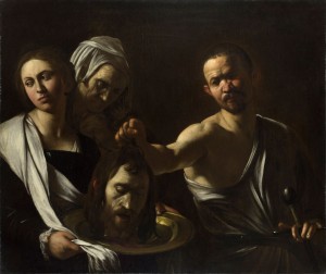
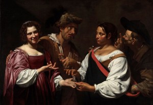
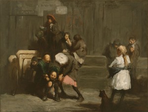
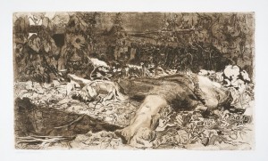 Raped (Vergewaltigt) (1907/08, etching on heavy cream wove paper, 11¾″ x 20⅝″ [29.9 x 52.4 cm)]. Plate 2 from the cycle Peasant War. Proof before the edition of about 300 impressions of 1908. Knesebeck 101/Va. Photo © Kollwitz Estate. The way to the blockbuster show led through a long corridor that at its beginning widened into an area whose walls the museum exploited for temporary exhibitions of works on paper too light-sensitive for permanent display. Attracted by the drawings and prints in this accidental gallery, some visitors slow for a more sustained look.
One image, which looked like an ill-kept garden, revealed itself via the wall text to be a 1907/8 etching called Raped by a German artist named Käthe Kollwitz,1 who lived between 1867 and 1945. Viewers who took the time to look more closely would detect amid the foliage a woman with legs splayed and head thrown back, the subject of the picture’s title. At that point most would move on to look at other works. Some few would linger, wanting to learn more about this depiction of sexual assault.
The only other information available at that moment–the description nearby on the wall–identified the brown-ink print as a plate from the Peasant War series executed on heavy cream wove paper. Although unschooled in art historical methods, an intrigued viewer might intuitively know that much could be gained by exploring every aspect of this simply-framed etching.
Drawing the viewer’s immediate attention and bisecting the bottom of the almost-double-square (approximately 12-by-21-inch) composition, the woman’s foot–set off from lighter surroundings by its dark sole–meets the picture plane and beckons the onlooker to follow its arch to the foreshortened, thick-set leg that disappears under a skirt. The eye continues along an arc, through the torso and extended neck, stopping at the chin beyond which lies the shadowed face with its features distorted by the angle of view.
Searching for the rest of her, the observer discovers behind a bent-over, wilted sunflower the right leg, forming a horizontal line with the top edge of the skirt and ending in a foot that points toward the upper left corner. Assisted by a nearby still-upright flower slanted at an angle running parallel to it, the foot directs the gaze to a blossoming sunflower in the background’s deep shadow, the form of which echoes the head of a barely discernible child with a pony tail (or braid) who drapes her right arm over a fence and looks down at the body before her. Faintly silhouetted against a patch of open space, the young girl can easily be missed by all but the most attentive viewers as she blends in with the leafy plants around her.
Once noticed, the child leads the eye to a structure suggested by two sets of vertical lines hiding in the dark recesses of the upper register–perhaps a house. Across the rest of this small patch of verdant landscape, damaged plants and flowers tell a story of struggle and recent destruction in what might have been a well-tended, backyard vegetable garden.
A shadow originating from outside the picture plane on the left ends in a point that meets the prone woman’s right foot and relates to her dark skirt. Cast by a structure with straight edges and therefore of human origin, its top boundary becomes one side of a flattened diamond, the other three edges of which are the overgrown part of the fence that supports the girl, its dark extension to the right, and the left side of the woman on the ground. Ominous in nature, the sharply angled shadow seems a stand-in for the recently-fled rapist.
Following the perimeter of that diamond shape brings the inquisitive observer to the figure’s left hand, the fingers of which curl around the edge of her torn garment near some trickles of blood on her torso and provide the final clue to the story. A peasant woman working in her garden has been raped and stabbed, then left for dead. Hearing the commotion and perhaps some screams, her daughter has come to see what happened and now stares sadly at the sight of her mother, wondering what to do.
Having followed the trail of clues and figured out the narrative, the formerly-naive tourist, seduced by a compelling work of art, has unwittingly entered the empirical world of the connoisseur. Questions tumble forth about the decisions that went into creating the etching. Who was Käthe Kollwitz? What was the Peasant War and why did the artist choose it as a subject? Why did she make a print instead of a painting? If this is a series, what does the rest of it look like? Most curious, why didn’t Kollwitz just tell her story directly and not force her audience to work so hard?
As often happens in exhibits, another visitor approaches and, noticing the engrossed tourist with nose scant inches from the print’s protective glass, engages in conversation about the piece. An art historian by trade, the newcomer eagerly offers information about a favorite artist, her work and her art. An exchange ensues.
First they talk about the etching itself. When the tourist points out the little girl in the background and the trickles of blood near the victim’s left hand, the art historian is surprised, having never before engaged closely enough with the image to notice these elements. More concerned with Kollwitz’s subject matter in general and how it relates to the context in which the artist lived and worked, the art historian appreciated this new insight and resolved to be more attentive in the future to the object itself.
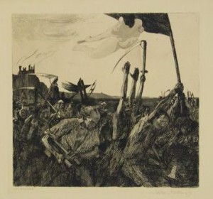
 Uprising (1902-03, etching on heavy beige wove paper, 20¼″ x 23⅜″ [51.4 x 59.4 cm]). Plate 5 from the cycle Peasant War. From the 1908 edition of approximately 300 impressions. Knesebeck 70/VIIIb. Private collection. Courtesy Galerie St. Etienne, NY. Familiar with most of Kollwitz’s oeuvre, this knowledgeable viewer knew that Raped was the second plate of seven in the print cycle Peasant War, commissioned by the Association for Historical Art in Germany following submission for consideration of the first completed etching of the series, Uprising (originally called Outbreak).2 In that print, a powerful woman, Black Anna, leads a contingent of fellow peasants armed with makeshift weapons against their feudal lords.3
 Revolt (1899, etching on heavy cream wove paper, 11⅝” x 12½” [29.5 x 31.8 cm]). First concept for plate 5 (Knesebeck 70) from the cycle Peasant War. Knesebeck 46/V. Private collection. Courtesy Galerie St. Etienne, NY. The idea for the cycle began in 1899 with a plate Kollwitz etched, variously translated as Uprising and Revolt, that pictured a rag-tag but triumphant mob of scythe-wielding farmers accompanied by a nude woman flying above, carrying a torch from which a flame leaps into the distant background to set ablaze the manor house, home of the oppressors. Coming from a long line of socialists, 4 Kollwitz had already explored the topic a few years earlier in her gold-medal-winning first cycle, A Weaver’s Rebellion.
From childhood, when the young Käthe had enacted barricade scenes with her father and brother, she had imagined herself a revolutionary. It followed that as an artist she would draw strong women into her narratives, depicting them as they sharpened scythes, galvanized men into action, cared for the wounded and identified the dead. When Kollwitz read Wilhelm Zimmermann’s 1841 General History of the Great Peasants’ War and discovered Black Anna, an actual participant in the 1525 revolt by peasants against their overseers, the idea for this cycle was born.
Answering the tourist’s questions about Kollwitz’s choice of printmaking, the art historian explained that after struggling unsuccessfully to master color in her studies at a Berlin academy for women and later in a painter’s studio, and being introduced in 1884 to the work of master printmaker Max Klinger, the young artist finally gave up on painting and in 1890 took up etching, a technique at which she soon excelled. Although Kollwitz later devoted herself to the medium of sculpture, in which she modeled emotionally compelling figurative pieces, she never abandoned printmaking. Expanding her practice to include lithographs and woodcuts, she valued the reproductive capabilities inherent in these mediums, guaranteeing the widest possible audience for her socio-political ideas.
The composition of Raped differs markedly from Kollwitz’s usual images of women who are shown in active roles, not supine on the ground. It is also the only instance where she tackled landscape with enough details to identify cabbage leaves, sunflowers and other plants.5 As for its narrative, in correspondence about this print the artist referred to Raped as “the next to the last plate,” which would have made it the sixth out of seven (though it was published as Plate 2) and described it as “an abducted woman, who after the devastation of her cottage is left lying in the herb garden, while her child, who had run away, looks over the fence.”6
Knowing the artist’s intentions and how she came to etch Raped served only to whet the tourist’s appetite for more information. Just then someone else approached, walking directly up to the two viewers who were blocking access to the print. As chance would have it, the latest arrival turned out to be a psychotherapist who worked with trauma survivors and had a long-standing interest in art depicting sexual abuse and other forms of personal violence.
Käthe Kollwitz, whose work is permeated with meditations on struggle and death, naturally aroused the psychotherapist’s curiosity, especially with respect to how the artist came to focus on those themes. Joining the already in-progress discussion, the clinician related how the printmaker’s son, Hans, had nagged his mother into writing about her life and her development as an artist, and how despite her initial objections, she had surprised him with a manuscript in 1922 that he later augmented with diary entries and letters, and published in 1955.7 Hearing what had already been learned by exploring the image and its creation, the therapist added to the discourse aspects of Kollwitz’s psychosocial history crucial to understanding her choice of subject matter for the etching.8
In recounting her early years, Kollwitz described seeing a photo of her stoic mother holding her firstborn son, “‘the holy child,’” who had died within a year of his birth. Her mother lost a second son before Kollwitz’s older brother Konrad was born. When Käthe was nine, her mother had Benjamin, who also failed to survive beyond his first year, dying from the same meningitis that took the firstborn.
The artist remembered how one night, during her baby brother’s illness, the nurse had burst into the kitchen where her mother was dishing out soup and yelled that the infant was throwing up again. Her mother had stiffened and then went on serving dinner, her refusal to cry in front of her family failing to conceal her suffering from her young daughter, to whom it was obvious.
After that dinner, Käthe–with her younger sister Lise–was sent to play in the nursery where she built with her blocks a temple to Venus and began preparing a sacrifice to a goddess she had learned about in a book on mythology, and who she had chosen to worship over the Christian “Lord”–a stranger to her despite her family’s devotion to him. When her parents walked into the room to convey the bad news that her little brother had died, Käthe was certain “God had taken him” as punishment for her disbelief and sacrifice to Venus.
Because the family’s way was to grit teeth and carry on, with no discussion or even expression of loss and grief, Käthe carried the burden of guilt for her brother’s death into her adult years. Her mother’s unexpressed sorrow suffused their home and her oldest daughter lived in fear that her parents would come to harm.
Stopping the story at that point, the psychotherapist retrieved an ebook reader from a handbag and read from Kollwitz’s autobiography. “I was always afraid [my mother] would come to some harm…If she were bathing…I feared she would drown.” Reflecting on watching through the apartment window as her mother walked by, Kollwitz continued, “I felt the oppressive fear in my heart that she might get lost and never find her way back to us…I became afraid Mother might go mad.”
As the clinician tucked away the ebook reader, the trio of observers turned back to the etching Raped. Suddenly they understood what the artist might not have known herself, that the young girl looking over the fence was nine-year-old Käthe and the woman on the ground was her mother, finally felled by a trauma too insistent to be repelled.
As the three viewers continued contemplating the poignant image before them, another person approached. They eagerly began sharing their recent discoveries as they made room for the newcomer who, noticing the dates of the artist’s life, explained that Käthe Kollwitz was not a twentieth century artist but a woman born, raised and educated in the second half of the nineteenth century.9 Living in Germany in the late 1800s must have affected her art, they all agreed.
But that’s a story for another time.
____________________________________________________
1A print of the etching was displayed for a while in the Drawing and Print Gallery of The Metropolitan Museum of Art several years ago. The work under consideration, a proof, is in the private collection of the writer.
2Martha Kearns, Käthe Kollwitz: Woman and Artist (New York: The Feminist Press at The City University of New York, 1976), 85.
3See Elizabeth Prelinger, Käthe Kollwitz (New Haven: Yale University Press, 1992), 30-39, for a description of the evolution and content of The Peasant War cycle.
4See Jane Kallir, “Käthe Kollwitz: The Complete Print Cycles” (Galerie St. Etienne, exhibit essay, October 8 through December 28, 2013) for additional information about Kollwitz’s print cycles.
5 Hildegard Bachert, “Käthe Kollwitz: The Complete Print Cycles,” gallery talk (Galerie St. Etienne, November 7, 2013).
6Käthe Kollwitz, quoted in Käthe Kollwitz: Werkverzeichnis der Graphik, by Alexandra von dem Knesebeck, trans. James Hofmaier (Bern: Verlag Kornfeld, 2002), 291. Relevant excerpt of text included in provenance documents accompanying the proof.
7The Diary and Letters of Kaethe Kollwitz, ed. Hans Kollwitz, trans. Richard and Clara Winston (Evanston, Illinois: Northwestern University Press, 1955).
8See Ibid., 18-20, for information about Kollwitz’s childhood experiences of loss.
9Bachert, gallery talk.
Käthe Kollwitz: The Complete Print Cycles
The Galerie St. Etienne
24 West 57th Street
New York, NY 10019
(212)245-6734
Now till December 28, 2013.
Posted in Art Historical Musings, Art Reviews |
Print This Post
Sunday, August 4th, 2013
An Unlikely Master,
Caravaggio Brings Light
To the World of Painting
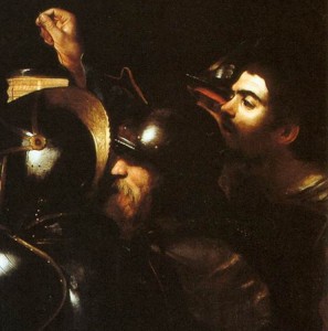 Michelangelo Merisi da Caravaggio, The Taking of Christ (detail) (1602, oil on canvas, 135.5 x 169.5 cm). National Gallery of Ireland. Courtesy of the Jesuit Community, Leeson St. Dublin. Photograph © National Gallery of Ireland. In 1610 in the Italian coastal city of Port’Ercole, at the all-too-young age of 38, Michelangelo Merisi da Caravaggio succumbed to either malarial fever (historically preferred version) or violence (supported by newer research).1 He left behind several paintings on a boat wending its way without him (another story) to his patrons in Rome and more critically, a new way of painting that had already changed the practices of many of his contemporaries, and would continue to inspire artists in the near and distant future.
In the spring of 2013, Hartford’s Wadsworth Atheneum Museum of Art hosted the final stop on an international tour of the exhibition, Burst of Light: Caravaggio and His Legacy. The multi-venue show, which grew out of a collaboration among the Los Angeles County Museum of Art, the Atheneum and several French museums, displayed a selection of works by Caravaggio and his many followers that could be seen in its entirety in the finely illustrated catalog but only enjoyed in part at each site.
For the movie-going, novel-reading public, facts and fantasies about Caravaggio’s tumultuous social life might be better known than the significance of his contributions to the practice of figurative painting. Two well-attended gallery talks in the space of a few hours on a beautiful Saturday afternoon in June demonstrated that given the opportunity, a contemporary audience could be captivated by the images that centuries ago first attracted fans.
A visitor asking at the Atheneum information desk for directions to the exhibit was told that straight ahead at the top of the grand staircase was a room with the Caravaggios and on either side of it, ones with the work of other artists. Unlike with the usual blockbuster that sprawls over an endless succession of galleries, the close proximity of these 32 paintings allowed for comparisons among them via a short walk from one to the other.
Only four of the five Caravaggios originally slated for the show were on display. Apparently the Metropolitan Museum of Art had decided to hold onto its jewel, The Denial of Saint Peter (1610), for the spring opening of its new European painting galleries. A late work, the painting demonstrates how far the master had gone in his ability to pick out light from darkness with just a few deftly applied swipes of high-value color.
 Michelangelo Merisi da Caravaggio, Saint Francis of Assisi in Ecstasy (c.1595–96, oil on canvas, 36⅜″ x 50¼″ [92.5 cm x 127.8 cm]). Wadsworth Atheneum Museum of Art, Hartford, Connecticut. Caravaggio’s potential to do a lot with a little was already evident fifteen years earlier when he created Saint Francis of Assisi in Ecstasy (c.1595–96). In a three-by-four composition with a sweeping diagonal, an angel with a highlighted bare left shoulder supports the weight of Saint Francis, whose head is thrown back in dreamy contentment as he indicates with his right hand a chest wound similar to the one inflicted on Christ when he was crucified.
In the right half of the painting, Caravaggio’s light draws attention to the action as it lands on the angel’s face, upper body and right hand (which tugs on the rope around the saint’s habit), and Francis’s face and hands. Following the sweep of the brown cloth brings the viewer to a bright spot that opens up the rest of the scene where a man curled in a fetal position leans against a tree and props up his head with his hand, perhaps sleeping, unaware of the drama taking place nearby.
Behind him several much smaller figures gather around the bright spot–a fire–intent on something outside the picture on the left. Further back, light of unknown origin, either from an unseen full moon or a spiritual presence, illuminates a body of water.
The tenderness with which the spiritual being gazes upon and cradles in his arms the ecstatic mortal borders on a far more profane tableau of post-coital bliss. The barely open, unfocused eyes, slightly upturned corners of the mouth, and limp body of the saint remind the viewer of the thin line between religious ecstasy and sexual arousal.
That double entendre was probably not accidental. Caravaggio ran with a wild bunch of like-minded painters in Rome and when not working in his studio to “destroy the art of painting”2 with his rebellious naturalism, managed to repeatedly come into conflict with the law. As unconventional with his sexual behavior as he was with his brush, the great iconoclast enjoyed an intimate relationship with one of his young followers nicknamed Cecco del (as in belonging to) Caravaggio. An accomplished artist in his own right, Cecco modeled for his master and accompanied him on his travels.3
Caravaggio, having lost his father at age six and a brother several years later, sent by the time he was thirteen to live in the house of the painter with whom he apprenticed, then having his mother die when he was nineteen,4 arrived in Rome at age twenty–a young man with a history of many losses and maybe even exploitation. Born in Milan in 1571 as Michelangelo Merisi da Caravaggio, this fledgling artist soon after his mother’s death cashed in his inheritance and headed to Rome where, within the next few years, he found a wealthy supporter and developed a revolutionary style of painting.
Proclaiming Nature as his teacher, Caravaggio painted from life; he found his models among the street people he met on his usual rounds and portrayed them as they appeared–without idealization. Using a single source of light that raked across figures placed in a shallow, dark space without an identifying context, the artist sometimes encountered outright rejection of his in-your-face realism when one patron or another refused to accept a commissioned piece (usually one bound for a church). But the look caught on and others emulated it, though none except perhaps Jusepe de Ribera came close to wielding a brush the way this virtuoso could.
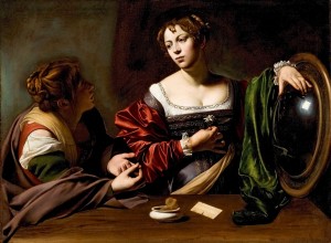 Michelangelo Merisi da Caravaggio, Martha and Mary Magdalen (1595–96, oil and tempera on canvas, 39⅜″ x 53″ [100 x 134.5 cm]). Detroit Institute of Arts. In what was to become that signature style, in another early work, Martha and Mary Magdalen (1595–96), Caravaggio again used light to differentiate between the spiritual and material. Bright spotlighting on the compositionally central Magdalen’s face emphasizes her enlightenment at the same time it draws attention to her cleavage-revealing low-cut dress, a reminder of her former attachment to worldly things. A bright island amid an area of dark colors, her left hand points to an almost pure white rectangle in a mirror that supports her arm. While probably meant to represent the presence of the Divine, the reflection also suggests Caravaggio’s light source: a small (basement?) window high up in an otherwise very dark room.
The curve of Mary’s red-satin-clad right arm leads to a white flower held close to her heart and onwards to the yellow sash that ends at a sponge in a bowl near a comb, all of symbolic value. Open-mouthed Martha, in the midst of a debate with her sister, enumerates her first point with brightly defined hands. Her shadowed face and far more sober attire attest to her attachment to good deeds as the path to spiritual attainment in contrast to Mary’s preferred life of contemplation.
The purple of Mary’s dress, green of the cloth near the mirror, and variety of hues of Martha’s attire, painted in large areas of local color, would continue for a while in Caravaggio’s early paintings and later be supplanted by mostly monochromatic images with an occasional bright red section, perhaps because of the high cost of other pigments.
 Michelangelo Merisi da Caravaggio, Salome Receives the Head of Saint John the Baptist (c. 1606–10, oil on canvas, 36″ x 42″ [91.5 x 106.7 cm]). The National Gallery, London. The late work Salome Receives the Head of Saint John the Baptist (c. 1606–10) is a good example of the way Caravaggio eventually distilled his style to a tenebristic scene of light and dark with few hints of color. In a setting lacking description, three half-length figures joined by the head of another are caught in the moment immediately following a decapitation. Looking at something outside the picture frame, Salome turns her head away from the platter she holds on which the executioner places that part of Saint John she had requested, while an elderly, ghost-like woman behind her rests head on clasped hands and looks downward. The grim-faced executioner, with his characteristically Caravaggio light-bathed bared shoulder, extends his arm to deliver Salome’s trophy, as if to create distance between himself and his deed.
Similar in style and format to The Denial of Saint Peter, the Salome seems to have been cut off on the left. A few more inches on that side would bring it closer to the three-by-four proportion of the Denial and other Caravaggio paintings. Also, although identified as Salome, the woman receiving the head is entirely too dressed down to be the seductress of myth.
At this point in his career, Caravaggio painted with light. Notorious for having left behind few if any drawings, he scratched his ideas directly onto a wet underpainting and built upon that with observations from life. In the Salome, unhesitant brush strokes of almost pure white describe the folds in the cloths and pick out the highlights on the cross-like sword. The few notes of warm color can be seen in the slight blush on Salome’s face and in the sun-exposed visage of the executioner, in the still-flushed ear of the saint’s head and the neat little trickle of blood below it, pooling in the dish. The artist’s true genius can be found in his ability to model barely perceptible form in very dark shadows.
Early on, Caravaggio’s rapid rise to artistic prominence in Rome, along with his notoriety, attracted the attention of the many other young artists who had come to the ancient city in search of fame and fortune. Among them was Bartolomeo Manfredi (1582-1622), who adopted his teacher’s tenebrism and half-length figures set in dramatic, often violent, tableaux, and eventually influenced future generations of artists with what came to be known as the Manfrediana methodus.5
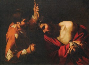 Bartolomeo Manfredi, Christ Crowned with Thorns (c. 1620, oil on canvas, 33″x 44″ [82.6 x 110.5 cm]). Michele and Donald D’Amour Museum of Fine Arts, Springfield, Massachusetts. Caravaggio’s influence on this older artist was especially evident in one of the two Manfredi paintings at the exhibit, Christ Crowned with Thorns (c. 1620). In a zoomed-in view of Christ’s tormentor yanking on a rope that seems to simultaneously force his captive to bend over while at the same time embedding the wreath of thorns securely into the skin, Manfredi emulated Caravaggio’s use of dramatically lit half-length figures–even including a spotlighted bare shoulder–and the latter’s often imitated head-bowed Christ as seen in his The Crowning with Thorns (1604).
Neither Manfredi nor most of the others desirous of cashing in on this much-in-demand new style of painting could approach Caravaggio’s drawing ability and paint handling. Where the master’s brushstrokes demonstrate the same swaggering self-confidence that was his undoing in the streets, Manfredi’s reveal the effort required to accurately render his intentions.
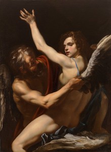 Orazio Riminaldi, Daedalus and Icarus (c. 1625, oil on canvas, 52″ x 37″ [132 x 96.1 cm]). Wadsworth Atheneum Museum of Art, Hartford, Connecticut. Another member of the club was Orazio Riminaldi (1593-1630), whose Icarus with open mouth, red lips and come-hither expression in the homoerotic show stopper Daedalus and Icarus (c. 1625) shares an affinity with the lute player in Caravaggio’s The Concert (c. 1595), who presents himself to the onlooker in much the same way.
Ostensibly, Riminaldi has illustrated the myth of the architect of the Labyrinth, imprisoned with his son in his own creation, who fashioned wings from wax and feathers to enable their escape, and is here seen affixing them to the boy, who will fly too close to the sun and perish. Interpreted by some as an allegory of the risks of creative genius,6 the subject affords this artist an opportunity to exquisitely contrast the freshness of youth with the weathered appearance of maturity.
The wrinkled skin on the forehead of the older man, his tan and muscular right arm, and the prominent veins on the hand holding the wing are set against the curly hair, silky smooth pale complexion and less developed musculature of the boy. The brightly lit, perfectly painted flesh of the latter’s thigh, the softness of which is alluded to by the nearby downy feathers, invites the viewer to caress it.
Taking away the wings and the title, one sees a much older man about to embrace a rather fey, nude, prepubescent boy who supports himself with his right arm as he leans back, perhaps in response to the pressure of the other between his legs. Riminaldi discreetly draped a red cloth down the front of the man’s body to avoid the appearance of skin-to-skin contact in the area of the youth’s genitals. The boy’s raised arm, which provides freer access to his body, parallels that of the man’s and avoids direct contact with it.
Riminaldi’s compositions indicate substantial knowledge of Caravaggio’s paintings, primarily via Orazio Gentileschi (1565-1639) and Manfredi but also from Simon Vouet (1590-1649).7 Much more challenging to trace was how Jusepe de Ribera (1591-1652) came to incorporate in his own work the tenebrism and brute naturalism of Caravaggism.
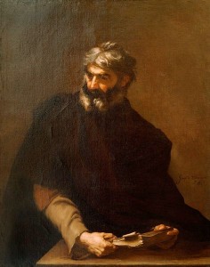 Jusepe de Ribera, Protagoras (1637, oil on canvas, 48⅞″ x 38¾″ [124 x 98 cm]). Wadsworth Atheneum Museum of Art, Hartford, Connecticut. A Spanish artist working for a while in Rome and later in Naples–called Lo Spagnoletto by the Italians–Ribera produced a large body of work during his stay in the birthplace of Caravaggism, enough to push back his dates of residence to those contemporaneous with Manfredi and his cohorts (as early as 1604-5), and allow for at least eight of his formative years for absorbing their influence. 8
Tucked away in a small room where visitors could thumb through the exhibition catalog and other relevant books was Ribera’s Protagoras (1637), a prime example of Roman lessons well learned. Luminescent thanks in part to direct lighting, this exquisitely drawn and painted oil places in a nondescript setting a three-quarter length figure whose hands hold a book that abuts the picture plane. Other black-infused canvases from these later years, epitomized by the 1637 Apollo Flaying Marsyas, demonstrate the continued appeal to Ribera of Caravaggio’s use of starkly lit figures in the depiction of suffering, martyrdom and death.
 Simon Vouet, The Fortune Teller (c. 1620, oil on canvas, 47″ x 67″ [120 x 170 cm]). National Gallery of Canada, Ottawa. Another arrival from foreign shores, Simon Vouet (1590-1649) built a very successful career in Rome by cashing in on the Caravaggism craze, initially with portraits of spotlighted subjects and later with amusing genre subjects like The Fortune Teller (c. 1620), the subject of which was popularized by Caravaggio with at least two versions of The Gypsy Fortune Teller (1595). In these scenes, costume-clad characters enact comical scripts of chicanery for the entertainment and perhaps instruction of the viewer, not unlike theater performances.
In Vouet’s reading, the shining smile of the fancily dressed woman on the right, who makes eye contact with the audience, directs attention to the unfolding events. An astounding interplay of five hands in the center of the composition distract the eye from the missing three hands of the expected eight possible among four actors.
The scruffy looking guy with the strange mouth rests his right hand on the lady’s shoulder in a too-familiar gesture, points at her with his other hand, and looks toward the other man who raises a finger in a just-a-moment pose while ransacking the gypsy’s shoulder bag for means of payment. The lack of jewelry (other than a simple ring) on the well-dressed woman adds yet another clue that she is not some wealthy woman visiting a poor neighborhood to find out her future. The fortune teller seems poised to drop a coin into the extended hand while looking across at its owner with the slightly raised eyebrows of curiosity and expectancy.
Lest anyone miss the joke, Vouet painted a red sash on the brown-skinned woman’s bag, leading the eye straight to the action. Likewise, the high-value white of the fortune teller’s blouse in contrast with the dark tone of her skin draws focus to the right side of the painting and the man in the shadows behind her. Each facial expression adds to the drama played out by three-quarter length figures set close to the picture plane in an indeterminate setting lit in typical Caravaggesque fashion.
 Simon Vouet, Saint Jerome and the Angel (c. 1622, oil on canvas, 57″ x 70″ [144.8 x 179.8 cm]). The National Gallery of Art, Washington DC. Picking up on another well-known Caravaggio theme, Vouet painted his own Saint Jerome and the Angel (c. 1622), a tour de force of gesture and facial expression with even more dramatic lighting accenting the action. The same red garment, exposed torso, balding head and white beard that characterize the protagonist in Caravaggio’s Saint Jerome Writing (c. 1606) appear in Vouet’s rendition of the story. The debt to his predecessor is further evident in the angel’s right hand, which takes its pose from the left hand of the Boy Bitten by a Lizard (1595), an early painting by Caravaggio.
Arriving trumpet in hand to announce to Jerome his imminent death, the curly-haired angel with its sweet smile of compassion encounters the busy scholar in the midst of his work transcribing ancient Greek and Hebrew biblical texts into Latin.9 Jerome turns from his work, makes eye contact with his visitor and raises his left hand as if to say, “Give me a break! I’ve barely made a dent in this stuff.”
Vouet choreographs the figures within a diamond shape, the top point of which is the angel’s left wing and the bottom the foremost corner of the table, lying just beyond the picture plane. All but one of the their combined four arms synchronize with each other in their movement upwards. The rebellious exception remains adamantly planted on the desk, its hand poised to continue writing if given the chance.
Despite wrinkles, receding hairline and long white beard, Jerome sports the musculature of a much younger man. The red drapery against which his left arm must work to achieve levitation serves to define part of the lower left side of the diamond while doing nothing to cover that by-now-familiar, well-lighted, bare male shoulder.
Some of the abilities that made Vouet so successful in Rome are apparent in his modeling in the dark of the angel’s face and his skill in rendering a great variety of textures, especially the characters’ hair and skin. Never fully wedded to Caravaggism, however, this artist went on to paint in other styles.
 Nicolas Tournier, The Denial of Saint Peter (c. 1625, oil on canvas, 63″ x 94″ [160 x 240 cm]). High Museum of Art, Atlanta, Georgia. In contrast, Nicolas Tournier (1590-1639) completely adopted the current fashion of painting in Rome when he arrived there sometime around 1619 10–quite obvious in The Denial of Saint Peter (c. 1625), his one work in the exhibit. Eager to demonstrate his skill at depicting the prevailing themes among the Caravaggisti, Tournier combined two separate stories in his one large canvas.
On the left, Peter denies to the soldier about to arrest him that he knows Christ. On the right, another soldier watches three colorfully dressed men in a game of dice. The beautifully painted sword that adorns the one in the skin-tight leggings and blousy, yellow shirt, and the hilt of another peaking out from the dice player who stares with wide-eyed, open-mouthed alarm at the events unfolding nearby, bring to mind the artists who originally ran with Caravaggio; they also carried blades and often got into street brawls. Perhaps Tournier’s idea was to show on one side a biblical scene a la Caravaggio and Manfredi, and on the other, the artists who looked closely at their work.
This multi-figured composition contains plenty of action along an arc that begins with the head of the sleeping disciple on the left and travels through all the heads to the back of the young man on the far right. Tournier adeptly portrays facial expression and packs into the painting lots of opportunity to display his talent for depicting texture, from hard, shiny armor to coarse cloth, and throws in a pail of very convincing burning coals for viewers’ enjoyment. While his artistic model was Caravaggio, unlike the master, Tournier applied paint in thin and carefully applied layers to slowly build up form and define surfaces.
 Francisco de Zurbarán, Saint Serapion (1628, oil on canvas, 475/16″ x 4015/16″ [120.2 x 104 cm]). Wadsworth Atheneum Museum of Art, Hartford, Connecticut. A Spanish artist with a much thinner connection to the crowd in Rome, Francisco de Zurbarán (1598-1664) might have been chosen by the Atheneum’s curators because a stunning example of his work, Saint Serapion (1628), already hung on their walls. Studying in Seville when awareness of Ribera’s work ran high, 11 he seems to have incorporated the tenebristic lighting of Caravaggism, if little else.
Zurbarán brilliantly summarizes the martyrdom of Serapion–by crucifixion, beheading and quartering–in the pose. The slumping saint’s body held up by ropes that fix his outstretched arms above his head represents death on the cross. His head falling to the side, disconnected from his body by the hood of his habit, suggests decapitation. And the securely tied rope around his right wrist references his quartering.
Lacking the usual bloody drama of Caravaggesque martyrdom scenes, Zurbarán’s almost square composition provides a sense of stability. His placement of the saint’s head in repose on his right shoulder and the calm look on his face have little in common with the theatrics found among other works in the exhibit.
By affixing to the canvas with a tromp l’oeil pin a torn scrap of paper with his signature in ultra thin lettering, and rendering the red and yellow shield of Serapion’s monastic order in a decidedly unrealistic fashion, Zurbarán calls attention to the artifice of painting. Unlike the three-dimensional drapery folds, and the hands and head of the figure, the shield–with its central placement and sole use of color in this monochromatic picture–loudly calls attention to the two-dimensional nature of the canvas by appearing to float on the picture plane rather than be attached to the robe.
 Gerrit van Honthorst, Christ Crowned with Thorns (c. 1617, oil on canvas, 51⅜″ x 67⅜″ [146 x 207 cm]). Los Angeles County Museum of Art. Unlike Zurbarán with his attenuated connection to Caravaggio’s circle of followers, Gerrit van Honthorst (1592-1656) lived and painted in Rome starting in 1616. Part of a small community of other Dutch artists, he quickly adapted the latest style of painting, especially apparent in Christ Crowned with Thorns (c. 1617), one of three of his paintings in the exhibit.
Taking compositional ideas from Manfredi and company, particularly in his choice of subject matter,12 tenebristic lighting, undefined background and zoomed-in view, van Honthorst followed his own path in the material execution of the painting. Figures are contained within their own contours. Fabrics are devoid of identifying details. And brushstrokes are barely detectable. He differed too in his choice of body types for his figure of Christ, which lacks the buff male body with its bared shoulder(s) so popular among the Roman crowd.
Instead, van Honthorst’s mocked man, with sad resignation, gracefully submits to the humiliation and physical pain being forced upon him; though he bows his head, he doesn’t resist the thorns being implanted there. Slightly slumped forward, Christ accepts the stick placed in his hand by one of his tormentors, a man whose open-mouthed laugh, wrinkled brow and wide-open eye express a sadistic enjoyment rarely depicted among Christ’s torturers.
 Georges de La Tour, Old Man (c. 1618–19, oil on canvas, 35⅞″ x 23″ [91 x 60.5 cm]). The Fine Arts Museums of San Francisco, California.  Georges de La Tour, Old Woman (c. 1618–19, oil on canvas, 35⅞″ x 23″ [91 x 60.5 cm]). The Fine Arts Museums of San Francisco, California. Awareness of the work of northern European artists like van Honthorst contributed to the spread of Caravaggism beyond the Alps and might have been how Georges de La Tour acquired knowledge of this new way of painting. Whether or not he ever made it to Rome remains indeterminable and his inclusion seemed like an afterthought, quite literally since his were the last three works in the exhibit.
Unlike the first of those (de La Tour’s much later candlelit scene of The Magdalen with the Smoking Flame [1638-40]), the other two–a pair of full length figures, Old Man and Old Woman (c. 1618–19)–were far from Caravaggesque. These striking portrayals of an elderly couple lack most of what had come to be associated with artists inspired by the works of Caravaggio.
The man, whose painting was displayed to the left of the woman’s, supports his weight on a walking stick, leans over as if to peer around the picture frame, and casts a sidelong glance at the woman in the other picture. The object of his gaze stands with hands on hips–perhaps removing the apron that falls away as her left hand slips under it–and looks back at him with her mouth open, as if in midsentence.
De La Tour made the man the more colorful subject, with his green jacket, orange-red pants, yellow leggings and suntanned skin, and indicated his age with a bald head, grey hair, white beard and need for a stick to prop him up. For the woman, the artist used stark white for her hat and blouse without benefit of modifying colors, a flat green with revealing bits of brown underpainting for the bodice of her dress, and a golden hue for the fold-creased apron that covers most of a burgundy skirt, a sliver of which turns lavender under the light on the left. Giving her far fewer wrinkles than her mate, the artist somehow still managed to convey her seniority.
In each painting, de La Tour made the background dark for the lighted area of the figure and lighter for the shadowed side. The man’s right leg hides the point where diagonal lines meet convincingly to indicate a corner at the base of the walls. The woman’s body covers most of the edge where dark walls meet light ones, but the horizontal line running along their base would destroy any illusion that this is a corner were one to look too closely at it. In his skillful rendering of an elderly woman in the midst of an interaction, de La Tour manages to provide enough distractions for the viewer not to notice.
The inclusion of de La Tour in an exhibit on Caravaggism demonstrated just how far afield Caravaggio’s groundbreaking approach to figurative painting reached, extending its spread throughout Europe over the next few hundred years. One man’s impulse to transmute his inner turmoil into art resulted in a new way of constructing images, one still practiced in the present by artists who place emotionally expressive, ordinary characters within tenebristically lighted settings, and assign them roles in emotionally and/or spiritually significant stories, hoping to engage their audience in the contemplation of the often violent drama of human relationships.
_________________________________
1 Spike, John T. Caravaggio (New York: Abbeville Press, 2001), 239.
2 Papi, Gianni. “Some Reflections and Revisions on Caravaggio, His Method, and his ‘Schola’” in Caravaggio and His Legacy, ed. J. Patrice Marandel (New York: Prestel Verlag, 2012), 14.
3 Ibid., footnote 21, 30-31.
4 All biographical information from Spike, Caravaggio.
5 Marandel, J. Patrice. “Caravaggio and His Legacy” in Caravaggio and His Legacy, 13.
6 Zafran, Eric. “Orazio Riminaldi, Daedalus and Icarus” in Caravaggio and His Legacy, 62.
7 Ibid.
8 Papi, 24-26
9 Exhibit object label.
10 Caravaggio and His Legacy, 78.
11 Ibid, 109.
12 Ibid, 118.
Burst of Light: Caravaggio and His Legacy
The Wadsworth Atheneum Museum of Art
600 Main Street
Hartford, Connecticut 06103
(860) 278-2670
Catalog available.
Posted in Art Reviews |
Print This Post
Sunday, June 2nd, 2013
In Search of George Bellows
 Self Portrait (1921, lithograph, 10½″ x 7⅞″ [26.67 x 20 cm]). Collection of Max and Heidi Berry. Courtesy Board of Trustees, National Gallery of Art, Washington. Photograph by Ric Blanc. In his 1921 lithograph, Self Portrait, George Bellows poses in formal attire: white shirt with link-adorned cuffs, bow tie and large-buttoned jacket. Calling attention to the artistic process, he includes the mirror that reflects back his image and draws the sketchbook in which he works. His proper right hand–the one that would hold the lithograph crayon and here holds a cigarette–casually rests on something, perhaps the back of a chair.
The 39-year-old Bellows of this self-portrait, concentrating intensely on the task at hand, had already achieved major recognition and can be forgiven for such self-aggrandizement. He shows off not just with his fancy clothes but also with the way he plays with space, from the mirror frame as picture frame and the placement of the artist in the viewer’s space to the background view of a terrace or window overlooking an outdoor scene–beyond the artist and behind the viewer.
This sophisticated urbanite, who in the following year would have the resources to build his own house in Woodstock, New York, began his career with far more earthy fare. Born in 18821 in Columbus, Ohio, Bellows dropped out of college there in 1904 and headed to New York City to pursue an art career. Checking into the YMCA and wandering around the city, he discovered a demimonde that became the subject of his art for a number of years. He was encouraged by his teacher, Robert Henri (pronounced hen-rye), who espoused a manner of working (practiced by a group of artists who came to be known as the Ashcan School) that began with the inner spirit and reached out to encompass the grit of life.
Turn-of-twentieth-century New York City provided abundant material for artists bored with classical subject matter. For Bellows, it was its teeming hoards. Children on the streets and in the rivers seeking relief from overcrowded tenements, crowds in Times Square waiting for results on election night, and spectators at sporting events and revival meetings, all came to life in his drawings, paintings and prints as he set out to establish his artistic identify.
 Kids (1906, oil on canvas, 32″ x 42″ [81.3 x 106.7]). James W. and Frances G. McGlothin. © Virginia Museum of Fine Arts. Photograph by Katherine Wetzel. The painterly canvas Kids (1906) was among the earliest of Bellows’s paintings on display at a ten-room retrospective held during the winter of 2012-13 at The Metropolitan Museum of Art, organized in association with the National Gallery of Art (Washington, DC) and Royal Academy of Arts (London). The first comprehensive review of the artist’s work in over 30 years, the exhibit gave the viewer an opportunity to track Bellows over time as he struggled to find the perfect way to conceptualize, construct and execute a work of art.
In Kids, Bellows quickly sketched a scene of children hanging around, tussling with each other, sharing some food, smoking and on the left–emphasized by highlighting on a street cart behind him, a boy painting a wooden object, perhaps destined to be a wagon. Bellows’s adept draftsmanship guides his sure application of paint as he craftily relates the two discreet groups by having the blond girl in the white dress and her canine companion stare at the action to their left. These are not portraits of individuals so much as they are portrayals of types engaged in defining activities.
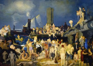 River Front No. 1 (1915, oil on canvas, 45⅜″ x 63⅛″ [115.3 x 160.3 cm]). Columbus Museum of Art. In Bellow’s time, the New York waterfront–of which there is plenty–hosted large groups of swimmers from all socioeconomic classes depending on the level of amenities provided. For children looking to escape overcrowded Lower East Side tenements in the sweltering summer, the broken-down piers and under-development docks became their beaches. Where they went, Bellows followed.
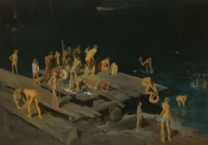 Forty-two Kids (1907, oil on canvas, 42¼″ x 60¼″ [106.7 x 153 cm]). Corcoran Gallery of Art, Washington. Photograph by Mark Gulezian. Like Thomas Eakins’s not-so-innocent composition of six male Swimmers (1884-5), Forty-two Kids (1907) is a pedophile’s paradise. Mostly nude, young boys in assorted poses unabashedly bare their asses to an unseen audience and frolic among themselves, in and out of the water. Bellows’s voyeuristic fascination with males naked together finds a reprise in the more upscale oil, River Front No. 1 (1915) and the later lithograph, The Shower-Bath (1917), the latter perhaps a revery on his brief stay at the YMCA.
With the boys indicated by just a few strokes of color, in Forty-two Kids Bellows massed the figures on the left side of the dilapidated dock to open up the space on the right, directing the eye through the diver to the swimmers, the dark river and the rowboat in the background. Were one to trace the strong diagonals of the wooden planks and draw the horizontal and vertical lines where they intersect, one would glimpse the underlying geometry that already had Bellows in its thrall.
Spontaneity in paint application would ultimately lose ground to a driving need for structure–and perhaps legitimacy–that eventually drained the life from much of this gifted artist’s work. Bellows succumbed to untreated appendicitis at age 42 when some of his work held hints that he might once again throw paint freely. Nonetheless, for connoisseurs of the less fettered work, the exhibit at The Met offered much to admire.
 Paddy Flannigan (Winter 1908, oil on canvas, 30¼″ x 25″ [76.8 x 63.5 cm]). Erving and Joyce Wolf. Chief among those paintings was a Ribera-like portrait of one of the street kids who posed for Bellows. Intentional or not, Paddy Flannigan (1908) pays homage to that old master’s portrayal of St. Jerome (1640) with its exposed flesh, semi-draped upper torso and elongated brushstrokes that follow the length of the arm. While Jusepe de Ribera’s saint–poised to pound his chest with the rock he grasps–turns his eyes heavenward, Bellows’s street urchin looks out at the viewer/painter from under almost-closed lids; with one hand on his hip and the other in his lap, this young model broadcasts both an invitation and a challenge.
Bellows infused the face with sun-toned red and gave Paddy’s ear the same color as the drapery he holds. Here again, underlying what appears to be a free-wheeling application of paint reminiscent of other American portraitist of that time (think John Singer Sargent and Cecilia Beaux), a geometric system determined the placement of the arms and the cut of the torn shirt in relationship to the frame of the composition.
Robert Henri extolled the virtues of “a thorough knowledge of geometry” for “the artist whose ideas are to be expressed in apparently magical proportions.”2 Following his teacher’s suggestion probably came easily for Bellows, who seemed to find renewed inspiration from every freshly encountered scientific theory about color and composition, though after a while each new ideology proved insufficient to carry him through self-doubts and frustrations about his work.3
Regarding composition, Bellows drew from a long history of proportional schemes,4 including rebatment, the Golden Section and its close relative, the Fibonacci Spiral. Likewise, he could choose among a plethora of approaches on setting up the perfect palette, one guaranteed to insure repeated success.
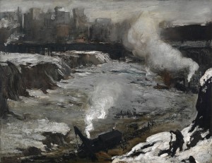
In his early explorations of composition and color, Bellows’s inner vision remained paramount as he trawled the streets of his newly adopted city in search of subjects. He must have found irresistible the eight-acre pit covering more than two full blocks that began to appear in midtown the same year the artist arrived in New York. By 1909, the hole was occupied by Pennsylvania Station, a magnificent beaux-arts building later sacrificed for a succession of structures culminating in the current eyesore.
A major attraction for both complaint and celebration, the magnificent feat of engineering that became the first Penn Station served as the foundation for several oils in The Met’s exhibit, the best among them being Excavation at Night (1908). The image is a masterpiece of composition but like any fine painting, the thought behind it takes a back seat to its visual lushness.
Bellows masterfully uses light to direct the eye from the brightly illuminated wall–white on the right and steamy blue on the left–contrasting with and leading to the warmly lit tenements in the background, the orange and yellow of which brings the eye to the foreground and the fire where workers attempt to get warm. Once here, the gaze finds the other light spot in the front, a patch of snow on the left from which a track travels back to streaks of snow in the middle ground that lead right back to the cliffs.
In Excavation at Night, it’s easy enough to see the rebatted squares. Measure the horizontal length along the bottom from first one lower corner and then the other. Where each point falls imagine a vertical line ascending from it. Notice the way Bellows has arranged the composition to fit those vertical lines.
 Pennsylvania Excavation (1907, oil on canvas, 33⅞″ x 44″ [86 x 111.8 cm]). Smith College Museum of Art, Northampton. In another view of the pit, Pennsylvania Excavation (1907), the emphasis seems to be on diagonals forming a diamond shape that, along with the bright white steam originating from behind some massive machinery in the foreground, brings the onlooker right down into the belly of the beast. Deploying a nearly monochromatic palette, Bellows conveyed the shivering grey cold of the city in winter. In the lower right, set against a triangle of bright snow, two men bundled up in stone-hued clothing work at something in the ground, their size an indication of the distance separating them from the laborers below.
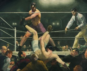
In both excavation canvases, Bellows seems to have reveled in the application of paint, with a variety of brush and palette-knife strokes. That same freedom was evident in his first fight paintings, one of the best–Stag at Sharkey’s (1907)–was featured in the publicity for the retrospective and on the catalog’s cover.
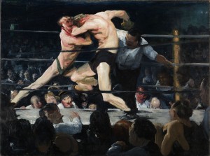 Stag at Sharkey’s (1909, oil on canvas, 36¼″ x 48¼″ [92 x 122.6 cm]). The Cleveland Museum of Art, Hinman B. Hurlbut Collection. The usual four seconds most viewers accord a painting reveal a dynamic composition of two fighters going at it amidst male spectators attentively following their moves, perhaps anticipating the illegal knee to the groin that Bellows’s choreography implies and the referee seems to expect. A more sustained engagement reveals the underlying isosceles triangle with its left edge running from the right fighter’s head down through the left fighter’s leg and the other edge going down through the left arm of the referee. The three-by-four ratio of the outer dimensions lends itself to other geometric manipulations that Bellows used and can be ferreted out by any interested reader.
Peering over the ring’s canvas on the far side to the right might be Bellows looking up from his sketch pad,5 identified by his balding pate. To capture the action, he needed his expert drawing skills, quite apparent in the persuasive way the figures occupy space and interact. Notice especially the foreshortened raised legs and how each fighter balances perfectly on the limb that supports his weight.
Despite its appeal, Stag at Sharkey’s suffers from Bellows’s too heavy reliance on white; colors lose their intensity in the lights. Here as in his other crowd scenes, faces look more like caricatures than those of real folk. An image best viewed from a distance, this glimpse into the once not-quite-legal world of boxing still pulsates with the frenetic energy conveyed by Bellows’ brushstrokes and composition.
 Dempsey and Firpo (1924, oil on canvas, 51″ x 63¼″ (129.5 x 160.7 cm]). Whitney Museum of American Art. Photograph by Sheldon C. Collins. The same can’t be said for Dempsey and Firpo (1924), a late work completed in the year before Bellows died. With a drawing style evocative of comic book art, using formulaically applied colors in a compositional schema so obvious as to command more attention than the action (triangles galore, diagonals and verticals relating to rebatted squares), Bellows seems to have lost his way in pursuit of perfection in both art and life.
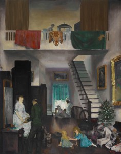 The Studio (1919, oil on canvas, 48″ x 38″ [121.9 x 96.5 cm]). Crystal Bridges Museum of American Art. The artist exposes his craving for an orderly, middleclass life along with his working methods in the stage-set painting, The Studio (1919). Here in a spotless work space, his two daughters sit among their newly opened Christmas presents while their father, decked out in white shirt, jacket and cuffed slacks, rebats the square and draws the diagonals that will underpin his portrait of their mother (Emma) who, clothed in an evening dress, sits raised on a model’s platform.
In the upper register, Bellows’s printmaker works a printing press on a balcony from which hang red and green drapery (the complementary colors of the season) and a spotted wildcat’s hide. In the background, Emma’s mother holds the phone to her ear while a dark-skinned servant looks on, as if awaiting instructions.
The organized mess of the earlier work has disappeared. Growing success and its attendant financial rewards couldn’t compete with Bellows’s feelings of inadequacy. He seemed driven to infuse his work with the gravitas he associated with great art, and many of the later paintings displayed in the last two galleries of the retrospective suffer from it. In trying too hard, Bellows only succeeded in producing deadeningly serious paintings.
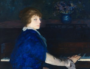 Emma at the Piano (1914, oil on panel, 28¾″ x 37″ [73 x 94 cm]). Chrysler Museum of Art, Norfolk. © Courtesy of the Bellows Trust. Contrast, for example, Emma at the Piano (1914) with Emma and her Children (1923), a portrait done almost a decade later. The earlier, far more colorful painting is a tenebristic study in blues that draws attention to the exasperated Emma’s face. A slightly lower-valued arm leads the eye to the keyboard, where bright white defines the edge of the keys and highlights the hand striking a chord.
The inclusion of Emma’s left hand in her lap and the tension inherent in the twist of her torso as she turns to face her husband belie the spontaneity that the setup implies of Bellows’s interrupting his wife in the middle of practicing; in fact she looks uncomfortable in that position. Although Emma might not be animated, the brushstrokes are–especially the ones vaguely defining the flowers in the vase that’s centered behind the music back.
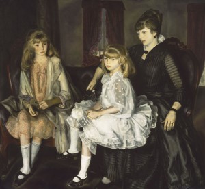 Emma and her Children (1923, oil on canvas, 59¼″ x 65⅜″ [150.5 x 166.1 cm]). Museum of Fine Arts, Boston. Photograph © 2012 Museum of Fine Arts, Boston. Discomfort also inhabits Emma and her Children in the stiffness of the poses and the expressions on their faces. Bellows’s wife and two daughters, twelve-year-old Anne and eight-year-old Jean, are here dressed in the antique clothing the artist came to favor–and each seems in a world of her own. Emma sternly/sadly casts an inward glance in the general direction of her serious-looking youngest child who almost makes eye contact with her father. The older girl, the unhappiest among the pictured family, gazes toward her little sister and holds a fan in one hand while trying to figure out what to do with the other.
Using an almost monochrome palette and reined-in brushstrokes, Bellows has done an exquisite job of rendering a variety of textures, including hair, fabric and the wood of the settee. Less successful is the placement of the figures in their respective seats. In particular, Jean’s legs, bent at right angles, are more indicative of the chair upon which she sat for the artist’s study than of a heavy eight-year-old’s sitting on her mother’s lap.
 Mrs. T in Cream Silk, No. 1 (1919, oil on canvas, 48″ x 38″ [121.9 x 96.5 cm]). Hirshhorn Museum and Sculpture Garden, Smithsonian Institution, Washington. On his way from the relative openness of Emma at the Piano to the stilted Emma and her Children, Bellows tried his hand at other portraits. For Mrs. T in Cream Silk, No. 1 (1919), the artist requested the sitter, a socialite he’d met while teaching in Chicago, to pose in her 1863 cream silk wedding gown 6 in keeping with his fascination with vintage clothing, perhaps as a way to create a link between his art and that of the old masters.
Mrs. T maintained her wasp-waist figure but the aged skin on her face and neck offers stark contrast to the youthful dress she wears, the skirt of which still bears the fold marks from its time in storage. Looking off to the side, just short of eye contact with the artist, Mrs. T holds a fan in one of her white-gloved hands, the rendering of which is not entirely convincing. Bellows has smoothed over not just the now-concealed wrinkles of those hands but also almost all the creases in the gloves’ fabric, lavishing on them little of the brushstroke bravura so liberally distributed across the rest of the canvas.
The bowl of fruit on the sitter’s left includes a pineapple’s crown and perhaps a mango, both tropical in origin. On her other side, on a bright orange tablecloth, rests what looks to be the base of the corsage she would have held on her way to the altar. A bookcase and its contents blend into the dark background and a patterned gold-and-black cloth hanging behind her brings to mind those behind the Virgin in early Renaissance images. Bellows was clearly making a statement about the passage of time, though once again he might have overdone it.
The same can be said for a great deal of the art he created in 1918 in response to reports of atrocities committed by Germans during The Great War. Many of these–some paintings, but mostly drawings and lithographs–were part of this panoramic retrospective that demonstrated the wide array of subjects that Bellows tackled. Pieces like The Barricade (1918) are overwrought while others like the lithograph Murder of Edith Cavell (1918) show what Bellows could accomplish when he got out of his own way.
In other rooms the artist’s prodigious drawing skills and sensibilities were on view in several highly political pieces, including the lithograph Electrocution (1917) of a man being executed, and both the preparatory drawing and lithograph for The Law is Too Slow (1923) of a black man being burned alive by a lynch mob. These contrast dramatically with paintings in other rooms of tennis matches set among the well heeled.
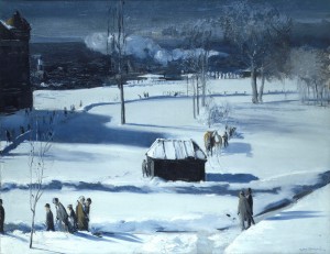 Blue Snow, The Battery (1910, oil on canvas, 34″ x 44″ [86.4 x 111.8 cm]). Columbus Museum of Art, Ohio. In the last room of The Met exhibit hung an oil sketch, My House, Woodstock (1924), that seemed an attempt by Bellows to find his way back to brighter colors and freer paint application. It pales in comparison with Blue Snow, The Battery (1910), one of his many accomplished landscapes displayed in the first part of the show.
The icy blue monochrome of the wintry scene is sparingly punctuated by the orange in the blankets on the horses and in the faces of the pedestrians in the foreground. With an economy of means, Bellows used color and form in Blue Snow, The Battery to create a sweeping view of shivering-cold lower Manhattan, peopled by passersby intent on reaching some destination or just out for a stroll.
In the shadow side of the structure in the visual center of the painting, the viewer gets a peek into Bellows’s working process. A thinly applied underpainting of brown (also evident in the shaded large building in the left background) was brushed away to denote the horizontal boards of the wall. Thick, opaque, high-value color was applied throughout to reflect the crystal-clear light of winter. The geometries that the artist certainly used in devising his composition dissolve in the wonder of how simple marks, placed expertly, can come together to form such a believable picture.
In his best work–from disheveled street urchins, New York’s dock workers and its resident poor, to well-dressed ladies and gents in other wintry settings, and landscapes of the city’s changing faces–George Bellows was at his best at the beginning of his career before the ordinary self-doubts inherent in the life of any artist overwhelmed him, compelling him to pursue techniques ill suited to his nature. He died in 1924 at the age of 42 before he could find his way back home.
__________________________________________
1 All biographical material comes from Quick, Michael, et al. The Paintings of George Bellows. (New York: Harry N. Abrams, Inc., 1992).
2 Henri, Robert. The Art Spirit (1923). (New York: Basic Books, 2007), 155.
3 Quick, Michael. “Technique and Theory: The Evolution of George Bellows’s Painting Style” in The Paintings of George Bellows.
4 See Bouleau, Charles. The Painter’s Secret Geometry: A Study of Composition in Art. (Harcourt, Brace & World, Inc., 1963).
5 Exhibit wall text.
6 Ibid.
George Bellows
The Metropolitan Museum of Art
1000 Fifth Avenue (at 82nd Street)
New York, NY 10028
(212)535-7710
Catalog available.
Posted in Art Reviews |
Print This Post
Sunday, January 6th, 2013
Breaking the Code:
Jane Kallir Deciphers
Egon Schiele’s Images of Women
 Self-Portrait with Long Hair (1907, oil on canvas, 14″ x 11¼″ [35.5 x 28.5 cm]). Private collection. Once upon a time there was a little boy named Egon who loved to draw. He lived in fin-de-siècle Vienna with his mother, father and two older sisters, Elvira and Melanie. 1 When Egon was three years old, ten-year-old Elvira died from meningitis. A year later his baby sister Gertrude (Gerti) was born.
The story of how Egon’s parents got together was typical for those times. When his father Adolf was 23 he fell in love with twelve-year-old Marie but waited till she was seventeen to marry her. Having contracted syphilis some time before then and refusing to have it treated, Adolf soon gave it to his new wife. Because of complications from her conjugally acquired venereal disease, Egon’s mother suffered three stillbirths before she had her first live baby, Elvira, whose later death probably resulted from the syphilis passed on to her at birth.
By the time Egon was twelve, his ill father’s behavior had become unpredictable and violent, symptoms of his end-stage syphilis. On one occasion, the increasingly erratic man “set fire to all of [his son’s] carefully executed railroad car drawings.”2
“Following a final fit of madness that involved a suicide attempt and the burning of all of the family’s stock certificates,”3 Egon’s father died. The relief that the fourteen-year-old boy must have felt could not have lasted long. The uncle enlisted by his mother to share guardianship of her two minor children (Egon and Gertrude), forbade the talented child from pursuing an art career.
Egon’s school performance had suffered greatly during his father’s decline and, after another couple of years of lackluster grades, the young teenager left school under threat of being held back. In 1906 his mother, against his uncle’s dictates, enrolled Egon in the Vienna Academy of Fine Arts, where the rebellious sixteen-year-old who had been drawing independently for many years, collided with the regimentation of its classic academy curriculum, though not before acquiring some useful drawing techniques.
 Portrait of a Lady in Profile Facing Right (1907, charcoal on paper, 20⅝″ x 13⅝″ [52.4 x 34.6 cm]). Courtesy Galerie St. Etienne. To qualify for admission to the Academy, Egon submitted portraits of women he encountered in his day-to-day world: his older sister, his mother and a maid. The style was not unlike Portrait of a Lady in Profile Facing Right (1907), one of his student drawings. At seventeen, Egon drew with the confidence and skill of a master, able to capture subtleties of texture, from the model’s fur wrap to her smooth, young skin.
After two years of butting heads with one professor in particular, Egon stopped regular attendance at the Academy and sought other sources of inspiration. He had plenty to choose from, gravitating toward Gustav Klimt and his fellow Austrian Expressionists, as well as a bevy of other contemporary artists breaking new ground elsewhere in Europe.
 Self-Portrait with Arm Twisted Above Head (1910, watercolor and charcoal on paper, 17¾″ x 12½″ [45.1 x 31.7 cm]). Private collection. Courtesy Neue Galerie, New York. Fifteen years later another young man with a taste for Expressionism opened the Neue Galerie in Vienna with “the first posthumous Egon Schiele retrospective.” 4 During the years that this gallerist, Otto Kallir, maintained his exhibition space, he continued to champion Schiele and his cohorts. When Hitler’s invasion of Austria forced Kallir to emigrate to the United States in 1939, he set up shop in Manhattan, opening the Galerie St. Etienne with Hildegard Bachert. 5
When Otto died in 1978, his granddaughter Jane Kallir inherited not just the gallery but also a passion for the art of Austrian and German Expressionists, especially that of Egon Schiele, about whom she has written tomes. The publication of her latest volume, Egon Schiele’s Women, a coffee-table-sized book lavishly illustrated with over 200 high-quality reproductions of the artist’s drawings and paintings, was well timed to coincide with the similarly titled exhibition at Galerie St. Etienne.
In the book and the essay accompanying the exhibit’s checklist, Kallir positions Schiele within the particular milieu that was turn-of-the-twentieth-century Vienna, where Darwin’s theory of evolution, Freud’s uncovering of the unconscious, and women’s new opportunities for participation outside the home (thanks to industrialization) threatened the previously entrenched patriarchy. The backlash unleashed by the established order in reaction to those threats still reverberates down through the decades, blinding investigators in all fields to a reality possible in Viennese (and all other) families that for a while Freud and some colleagues could not ignore.
In 1896, the founder of psychoanalysis presented an earthshaking paper “The Aetiology of Hysteria”6 to an audience of esteemed Viennese doctors, in which he described eighteen case histories of mostly women whose symptoms now fit the criteria for post-traumatic stress and dissociative disorders. “[A]t the bottom of every case of hysteria there are one or more occurrences of premature sexual experiences…[that] belong to the earliest years of childhood,”7 he declared, going on to say that in most cases the aggressor was the father. (Emphasis in original.)
Cowed by the ostracism such blasphemy engendered, Freud soon began backtracking and within a few years had repudiated his original observations. In its place grew his convoluted theory of infant sexuality, part of which entailed the girl child’s lusting after her father and developing sexual fantasies about him, the later repression of which during adolescence accounted for her acute psychological distress. On a parallel track, other doctors had determined that children were, by nature, pathological liars, effectively eliminating the need for adults to pay any attention to reports of childhood sexual assault.
Kallir references a variety of other contemporary writers who likewise endeavored to demonize women’s sexuality. Some believed the female sex’s primal nature–a morass of urges that had to be contained–to be the antithesis of male’s rationality. Others insisted that proper bourgeois women had no interest in sex at all, relegating such desires to the lower classes. One popular belief held that premarital masturbation by women led to neuroses.
By sequestering adolescent upperclass girls, society protected the guarantee of their virginity, if not necessarily the fact of it. Boys like Egon, who were denied sexual access to them until reaching sufficient financial maturity to marry (usually in their mid-twenties) could in the meantime avail themselves of prostitutes. Demand drove supply and Vienna became “the capital of European prostitution,”8 with women of the lower classes filling the many openings created by the myth of the asexual bourgeois female. Within that societal context and his more immediate family environment, Egon traversed his adolescence.
Once the teenager left the Academy, he needed to secure his own models. At home, continuing his habit of using family members as subjects, he turned to his vulnerable younger sister. By the time she was thirteen, Gerti had become her older brother’s favorite model, frequently posing for him in the nude. Commenting on the siblings’ relationship, Kallir described the way the publicly shy artist would bully his sister: “In the morning he was at her bedside, clock in hand, to wake her. At the count of three she had to be up and ready to pose.”9
 Nude Girl with Folded Arms (Gertrude Schiele) (1910, watercolor and black crayon on paper, 19¼″ x 11″ [48.8 x 28 cm]). Albertina, Vienna. Egon also used his power over Gerti to force her company on train rides around the Austro-Hungarian Empire, perks he enjoyed by virtue of his family’s employment by the railroad. In one of their several trips to Trieste, sixteen-year-old Egon checked into his parents’ honeymoon hotel with twelve-year-old Gerti. 10
In connection with that jaunt, Kallir raised the question of incest, defining it vaguely as behavior that “went beyond the realm of what would today be considered permissible, or resulted in any overtly sexual escapades.”11 A four-year age difference and a male’s gender advantage enabled Egon to enjoy a control over something/somebody in his life that had heretofore been unattainable. Whether that included actual sexual contact with Gerti remains unknown, but it’s clear that Egon abused the authority he had over his younger sister for his own gratification. Poor Gerti. One also has to wonder what precious possession she might have lost to the out-of-control father who could destroy his son’s prized drawings and his wife’s major means of financial support.
 Pregnant Woman (1910, watercolor and charcoal on paper, 17¾″ x 12¼″ [45.1 x 31.1 cm]). Private collection. Courtesy Galerie St. Etienne, New York. Other sources of models for Schiele included street urchins and prostitutes, and–in exchange for an oil portrait of a gynecologist at a women’s clinic–pregnant women and their babies. Among several of those works on display at the exhibit, Pregnant Woman (1910) stood out for its geometricity and idiosyncratic use of color: the circle of the abdomen contrasts with the right angles of the arms; the green wash of the face and belly complement the red orange of the breasts and arms; and the brown of her stockings relates to that of her hair.
Schiele captured his subject with her arms stretched out to the sides, handless forearms dangling. Her head droops onto her shoulder, her heavy-lidded eyes roll upwards and reveal space under the pupils, suggestive of a trance/hypnotic/drugged state. The artist disappeared the setting, focusing all attention on the exposed woman who might have been premedicated in advance of an examination and now found herself visited by some strange young man with paper and paint.
 Nude Girl with Arms Raised (1910, pencil on tan wove paper, 17⅜″ x 12¼″ [44.1 x 31.1 cm]). Private Collection. Courtesy Galerie St. Etienne, New York. Girls willing to model for some change were easy enough for Schiele to come by in lower-class neighborhoods throughout the city. Part of a series depicting a pair of black-haired girls he hired to pose for him, the pencil drawing Nude Girl with Arms Raised (1910) epitomizes the command that Schiele exercised over his line.
In this sketch, the artist confidently traced the contour of his subject’s body and added marks to sparely indicate nipples, navel, facial features and pubis. By drawing extra lines to darken the eyes and pubic hair, Schiele set them off as brackets for the torso. By having the young girl lift her arms, he assured the viewer visual access to her body. Compositionally, Schiele managed to suggest his model’s thighs, bent knees and lower limbs by discontinuing her legs just short of the bottom edge of the page, and picking them up again at her left ankle and foot.
Because he was only twenty, Schiele’s predilection for young girls as models might seem less jarring than had he been a seasoned artist, but it still highlights the disparity in status between male and female, bourgeois and working class. Kallir makes a case for the artist’s being motivated by both his own natural curiosity about sex (he was still developmentally an adolescent) and his desire to overturn conventional mores by placing women’s sexuality on an equal footing with men’s, thus liberating them at least pictorially.
Kallir also acknowledges the discomfiting nature of most of Schiele’s images of women, including later ones of his lover, his wife and other portrait sitters. Unlike Schiele’s mentor, the older Klimt, whose “numerous meaningful romantic affairs”12 gave him firsthand experience with women’s sexual practices and informed his own erotic drawings, the much younger artist could only draw on his limited exposure: what he had witnessed in his family, any dalliances with models and prostitutes that he might have had, and the prevailing ideas about women gleaned from the misogynistic society in which he lived.
By whatever route, Schiele arrived at a unique graphic form, especially evident in his figurative work. Kallir, in her opening night gallery talk, observed the care with which the artist constructed each piece. Every element, including his signature, was precisely placed on the sheet so that negative space would be part of the overall composition and there would be spatial balance in relationship to the surrounding edges of the page.13
 Girl with Black Hair (1911, watercolor and pencil on paper, 22¼″ x 14¼″ [56.5 x 36.2 cm]). The Museum of Modern Art, New York. Courtesy Galerie St. Etienne, New York. Schiele’s singular sense of composition is evident in Girl with Black Hair (1911), where concentric arcs emanate from an ambiguous area that might be a view of pubic hair through a slit in an undergarment of some sort or simply the artist’s perception of a woman’s genitals. They radiate upwards from there, encompassing the lower and upper perimeter’s of the model’s skirt and big black hair.
Schiele left out his model’s arms except for a sliver of her right one–the shape of which echoes that of the dark and light areas that define the skirt–and amputated her legs below the knees. Typical of his drawings of that period, the eyes lack pupils, only hinted at here by a grey-green wash. Although his composition targets her sex, and her facial expression could be read as aroused (parted red lips and vacant gaze), something about the absence of limbs and oddness of her crotch repels rather than attracts.
 Portrait of the Artist’s Mother (1911, pencil on tan paper, 17⅝″ x 12½″ [45.2 x 31.6 cm]). Private Collection. Courtesy Galerie St. Etienne, New York. Not all of Schiele’s depictions of females oozed sexuality. The same year he was churning out titillating images, he was also applying his prodigious drawing skills to other portrayals of women. In one, Portrait of the Artist’s Mother (1911), he used pencil on tan paper that was either dark at the time or has since darkened, making it difficult to see even in the well-lighted gallery.
To the grown Schiele, his mother still loomed large, much like she did when he was small. He positioned the almost-fifty-year-old widow considerably above eye level so that she looks down her nose at the viewer (and artist), and crowded her onto the page, letting the upper edge clip off the very top of her coiffure.
With sensitively rendered lines, Schiele economically indicated his subject’s form, bearing down more with his pencil when outlining the head and hair. The shadowy reflections on the glasses, which give the eyes a skeletal quality, and the corpselike way the hands rest on the chest combine to create a sepulchral mood.
 Lady with Hat and Coat (1911, pencil on heavy tan wove paper, 17 ⅞″ x 12⅜″ [45.2 x 31.6 cm]). Private Collection. Courtesy Galerie St. Etienne, New York. Despite the rapidity with which Schiele executed his works on paper, the marks and their placement indicate careful deliberation prior to execution. The effect of the pencil lines in Lady with Hat and Coat (1911) differs from that in the sketch of his mother, the face of which lacks the youthful smoothness found in that of the younger woman.
In depicting the model in Lady with Hat and Coat, Schiele outsized her head, eliminated her limbs except for a slight indication of arms and, with a line that retraces itself (quite different from the sure way he traced the clothing in Portrait of the Artist’s Mother), outlined her dress. Her head and torso seem to belong to two different women, creating tension between them.
Here again Schiele called attention to the face, this time by framing it with the brim of a hat and delicately smudging pencil around the eyes, the most alluring parts of the portrait. A few dark lines form the pupils and reserve the tone of the paper for their highlights. With shading and a couple of marks above the proper right nostril, a nose appears. The only other filled-in area is the carefully drawn mouth that, with the eyes and brows, contributes to the overall intensity with which the subject stares in the general direction of her observer.
Schiele, along with the other Expressionists, challenged the traditional passivity of the female model, giving her an active role in relationship to her audience and/or herself. In an age when peeling away surfaces in the quest for new knowledge brought breakthroughs in many of the sciences, including the development of psychoanalysis, Schiele and his cohorts sought to express the unconscious in visual form.
 The Red Host (1911, watercolor and pencil on cream wove paper, 19″ x 11⅛″ [48.2 x 28.2]). Private Collection. Courtesy Galerie St. Etienne, New York. Schiele’s choices of subject, medium and style reflected his determination to include in his work pieces of himself as well as a deeper truth about his subjects. In The Red Host (1911) he let it all hang out. A realistically rendered portrait of his penis, maintained erect by the obliging woman who grasps it tightly at its base, invites the viewer to reflect on–among other mysteries–how he managed to pose and draw at the same time.
The erection points to the man’s head–tilted all the way to his right–and to his face, with its slightly parted lips and heavy-lidded eyes, one of which rolls upwards to his left while the other looks straight ahead (to the mirror? to the viewer?). The expression, which could be one of sexual arousal, seems more unhappy than orgasmic.
While the man is covered from the waist up (and ankles down), the woman’s body is exposed; cut off below the navel, she’s been robbed of her own organ of pleasure. Her face, with red wash around the eyes and on her cheek bones, looks less flushed from pleasure than from physical exertion–like Atlas holding up the world.
Already 21 when he painted this watercolor, Schiele revealed a sexual angst that had its roots in the repressive culture in which he lived and the chaotic home in which he was raised, watching his syphilitic father go mad and die from a sexually transmitted disease. Surely Schiele must have feared the same fate would befall him. The conflict between the young man’s own natural desires and the anxiety and shame attached to sexuality impacted not just his artistic production but also his relationships with women.
 Wally in Red Blouse with Raised Knees (1913, watercolor, gouache and pencil on heavy cream wove paper, 12⅝″ x 19⅜″ [32.1 x 49 cm]). Private Collection. Courtesy Galerie St. Etienne, New York. The same year that he painted The Red Host, Schiele hired Wally Neuzil to model for him. Four years younger than Schiele (same as Gerti), Wally soon became his lover and muse, and later his assistant.
The connection they shared is evident in Wally in Red Blouse with Raised Knees (1913). Wally insists on watching the man who renders her form on paper, straining against the pose he has set for her. To make visual contact with him, she must fight against her lowered head, raise her eyelids and force her pupils to their far right corners, yet she insists on doing it. Her furrowed-brow expression of pique and unsmiling mouth challenge her demanding partner, who paints her as the dynamic woman he sees.
Wally’s unusual position (torso and upper legs at a right angle, as if seated) brings to mind Kallir’s observation that Schiele was known to pose his models in a vertical position then flip the paper and sign his name in its new horizontal orientation, or vice versa.14 Wally in Red Blouse with Raised Knees makes sense either way.
In addition to playing these compositional games, Schiele masterfully deployed color to convey emotions. The dominant orange-red of this watercolor with its touches of red on the sleeves of Wally’s blouse, and the golden brown of her hair that repeats the tone of her shoes/slippers, combine to deliver a feeling of warmth. With an outline and wash fill, Schiele convincingly established the sheerness of her bloomers and in similar fashion used a solid orange-red on the garters, which relates them to the blouse and, by contrasting them to the orange wash of the stockings, implies their transparency.
Had Egon and Wally lived in another time and place, they could have rode off into the sunset together. But when Schiele found himself reaching the age where he could choose a wife, he looked across the street rather than in his studio in search of appropriate marriage material. Despite his rebellious spirit, he remained a product of his era, though the subsequent difficulty with which he let go of Wally showed he was not without some heartache at having to discard her.
To properly court Edith and her older sister Adele, attractive and available young women living nearby, he enlisted Wally as a chaperone. Ultimately choosing the flirtatious Edith, Schiele wed her in 1915, then three days later was called up for service in the army. In a familiar scenario, Egon dragged his unhappy wife along with him to wherever he was stationed.
Unlike Wally, Edith wasn’t interested in shedding her clothes whenever her husband felt like drawing or painting her in the nude, although on the few occasions when she did succumb to his demands, she posed in the same sexually provocative manner as did his other models. None of those works appeared in the exhibit but a couple are in the book.
") Woman Holding Flower (Edith Schiele) (1915, pencil on cream wove paper, 18¼″ 12⅜″ [46.4 x 31.4 cm]). Private Collection. Courtesy Galerie St. Etienne, New York. In Woman Holding Flower (Edith Schiele) (1915), the artist portrayed his wife gently holding the stem of a wilted flower, leaning into the picture from the left with her body swaying in a reverse S curve. Anxious, retraced lines define the contours of her textured jacket but surer ones denote her expressive hands. Her eyes, out of convergence and with lowered lids, fall short of direct confrontation with the viewer.
 Portrait of the Artist’s Wife, Standing, with Hands on Hips (1915, black crayon on paper, 18″ x 11¼″ [45.7 x 28.5 cm]). Private Collection. Courtesy Galerie St. Etienne, New York. Wearing a striped dress that reappears in many of Schiele’s pictures of her, Edith takes a far more active stance in Portrait of the Artist’s Wife, Standing, with Hands on Hips (1915). In this drawing, her eyes open wide and stare straight ahead. Her lowered brows and thin, drawn-back lips signal annoyance; the upright posture and hands on hips announce her impatience. Schiele demonstrates his talent for conveying attitude while Edith obliges with plenty of it.
") Embrace (Egon and Edith Schiele) (1916, pencil on cream wove paper, 12⅜″ x 18⅛″ [31.4 x 46 cm]). Courtesy Galerie St. Etienne, New York. The rag-doll-like appearance, enhanced by button eyes, 15 of the couple in Embrace (Egon and Edith Schiele) (1916) belong to a style Schiele developed a few years earlier and increasingly employed in his figurative work. As he matured, he also showed interest in three-dimensionality, able to convincingly suggest solidity with just a few lines.
In Embrace, the ambiguous lines marking where the artist’s arms and hands find the woman he holds barely define the action in that area. A three-pronged extension of what might be his left arm could be a hand, but a superimposed darker mark directs the eye to a position more consonant with the embrace of the drawing’s title. The woman, Edith, rests her chin on a right hand, which can’t comfortably be hers and clasps her legs from under the knees with her right hand, barely indicated by a continuous line that goes on to create a wrist.
Schiele drew quickly but each line carried thoughtful intent. The closely spaced parallel lines of his forehead repeat in a patch of Edith’s hairline, in her ear/earring, the hand immediately under it, her three fingers, and the pattern on her skirt, linking them graphically. With his head, the man’s arms form an equilateral triangle that subsumes within it the woman’s head and upper body, enveloping her in a symbiotic embrace.
Despite the ferocity with which Schiele attempted to hang on to Edith, they were often separated by military orders that took him away from Vienna. Although in the beginning she had joined him as he was moved from one isolated outpost to another, she reached her limit and ultimately stayed behind in the city.
In 1917 with the help of an influential art dealer, Schiele was able to permanently return to Vienna to much lighter military duties, allowing him to devote more time to his career. Despite the cloud of war that continued to hover, he found supporters and a market for his work. The improved finances from his sudden success allowed him to hire professional models and with growing acceptance by the bourgeoisie and with his own maturation, his style evolved into a more traditional realism. The antithesis of his earlier adolescent work, the nudes from the period 1917-18 are his best known, most coveted and least radical.16
 Reclining Woman (1918, charcoal on paper, 11⅝″ x 18¼″ [29.5 x 46.4 cm]). Private Collection. Courtesy Galerie St. Etienne, New York. In one of the more sexually explicit works on the gallery walls, Reclining Woman (1918) demonstrates Schiele’s gravitating toward a more conventional depiction of bodies. Using shading as well as his characteristic line, he continued to delight and confuse the viewer with such touches as the lady’s right thumb disappearing into a line related to the collar of her shirt. While her torso hasn’t been allocated enough space for its full volume, the artist has tricked the viewer’s eye into believing in its full existence.
All parts of the model have been equally developed, with her face getting as much attention as her crotch, the dark shaded hair of which parallels that of her tresses. By fixing her gaze on something of great interest off to her right, she disengages herself from the activity of her body, which seductively displays its privates to anyone present.
 Reclining Woman with Green Stockings (1917, gouache and black crayon on cream wove paper, 11⅝″ x 18 ⅛″ [29.4 x 46 cm]). Private Collection. Courtesy Galerie St. Etienne, New York. Despite the solidity with which Schiele constructed the figure in Reclining Woman with Green Stockings (1917), she remains an exercise in rhythmic design. An S curve begins with her face, continues down her right upper arm to its elbow, slides over onto her right buttock, descends to her right thigh and sweeps along her stockinged leg to her shoe. The lower part of her right arm–which disappears beneath her left calf–emerges at the wrist and hand, and points upward to form a continuous contour with her torso. It then loops back around via her camisole strap to her face, directing the eye to the bent arm that supports her weight, the angle of which parallels that of the hooked leg.
The model, who makes eye contact with the viewer, exists nowhere in space. Yet the manner in which the weight of her body rests on her left elbow and the calf of her left leg flattens as though pressing down against something, strongly implies a floor and by extension, a horizon line. Schiele has engaged the viewer as an active participant in completing the construction of his composition.
") Portrait of a Woman (Lilly Steiner) (1918, watercolor and black crayon on paper, 17⅜″ x 11⅜″]). Private Collection. Courtesy Galerie St. Etienne, New York. As his renown spread, Schiele began to get portrait commissions from women, where in the past they had come mostly from men. One of several sketches he did of the Steiner family, Portrait of a Woman (Lilly Steiner) (1918), doesn’t spare the subject from the artist’s piercing gaze. Steiner’s lowered lids and brows coupled with her pursed lips give the appearance of anger. Here again Schiele positions one eye looking straight ahead and the other fixed on something to her left, effectively creating movement in an otherwise static, two-dimensional image.
With just a few lines depicting his sitter’s shoulders and the sleeves of her garment, Schiele leads the observer to imagine her upper body and arms. Ever conscious of the overall design, he has posted his signature at the base of Steiner’s left sleeve, just below its lowest lacy curl.
Throughout his artistic life, Schiele never gave up his fascination with women’s identity as sexual beings. Even as his younger, idiosyncratic linear style gave way to a more evolved volumetric one, he continued to churn out paintings and drawings of nudes exposing themselves. Fewer of those were on view at Galerie St. Etienne but the reader of the book, Egon Schiele’s Women, from which this exhibit was drawn, will find many tantalizing examples of the shameless ways in which this artist could position a model.
With the death of Gustav Klimt in February of 1918, Schiele moved into his former mentor’s spot as leading artist of Austria. For Egon and Edith, life was good. With prosperity they were able to live well; the artist could rent a larger studio. When his wife became pregnant early in 1918 with their first child, Schiele was inspired to meditate artistically on mothers and babies.
 Egon Schiele on his deathbed, November 1, 1918. Photo courtesy Galerie St. Etienne, New York. Beginning in the winter of 1918, a worldwide flu pandemic began a devastation that lasted several years, took the lives of upwards of fifty million people, and sickened many others. In October, Edith succumbed to it and just a few days later on October 31st Egon, already ill, followed her. The passing of this brilliant artist who, at 28, had barely entered his prime, left the world a little dimmer and robbed it of the promise of the boy who had always wanted to draw.
_______________________________________________
1 Unless otherwise indicated, all biographical information comes from Jane Kallir, Egon Schiele’s Women (New York: Prestel Publishing), 2012.
2 Alessandra Comini, Egon Schiele (New York: George Braziller, Inc.), 1976, 11.
3 Kallir, Egon Schiele’s Women, 39.
4 “A Brief History of the Galerie St. Etienne.” Fields of Study / About. Galerie St. Etienne website, accessed November 18, 2012. http://www.gseart.com/.
5 Ibid.
6 Sigmund Freud, “The Aetiology of Hysteria,” trans. James Strachey, in The Assault on Truth by Jeffrey Moussaieff Masson (New York: Viking Penguin, 1984).
7 Ibid, 271.
8 Kallir, Egon Schiele’s Women, 83.
9 Ibid, 54.
10 Comini, Egon Schiele, 11.
11 Kallir, Egon Schiele’s Women, 77.
12 Eric R. Kandel, The Age of Insight: The Quest to Understand the Unconscious in Art, Mind, and Brain, from Vienna 1900 to the Present (New York: Random House, 2012), 91.
13 Jane Kallir, Gallery Talk, October 23, 2012.
14 Ibid.
15 Ibid.
16 Ibid.
Egon Schiele’s Women
The Galerie St. Etienne
24 West 57th Street
New York, NY 10019
(212)245-6734
Egon Schiele’s Women by Jane Kallir
Available at the gallery and online.
Posted in Art Reviews |
Print This Post
Sunday, September 23rd, 2012
Constructing Narrative
Eric Fischl Paints the Unconscious
 Eric Fischl in His Studio © Edgar Howard, Checkerboard Film Foundation. When psychologists use the Thematic Apperception Test (TAT)–a projective technique–they show drawings to their subjects and ask them to tell a story about each one. Research has demonstrated that the narratives thus produced reflect projections from the unconscious and therefore can be used to assess mental states. Unfortunately, in the case of the TAT, the images are hopelessly dated and far from neutral; reminiscent of film noir, they tend to produce rather depressive narratives.1
 Untitled (Poolside, 3 Figures) (1979, charcoal on paper, 43″ x 94″). Courtesy of the artist. In developing compositions for his paintings, Eric Fischl relies on the same mechanism of projection that underpins the use of the TAT. Beginning with disparate elements (initially drawings and more recently photographs), he plays with them until they assemble into an intriguing tableau. Relying on his responses to these random arrangements to let him know when it’s time to paint, Fischl explains: “…for me it’s not a preconceived narrative, it’s a discovered narrative.”2
Dive Deep: Eric Fischl and the Process of Painting at the Pennsylvania Academy of the Fine Arts (PAFA) “…let audiences look at the art of painting over Fischl’s shoulder,”3 an idea that grew out of a conversation between the artist and Susan Krane, executive director of the San José Museum of Art, where the show originated in collaboration with PAFA. The accompanying catalog includes the transcript of an interview with Fischl about his artistic process, the film of which continuously played in a room at the exhibit.
 Saturday Night (The Aftermath Bath) (1980, oil on glassine, 72″ x 84″). Courtesy of the artist. Fischl’s working method is far more obvious in early sketches like Saturday Night (The Aftermath Bath) (1980), where one can readily see the four painted glassine overlays, each with its own subject. In the later digitally manipulated photographs, the artist’s hand is less evident.
In Saturday Night, the bathtub sets the scene within which a nude man shaves, a woman in a black slip and high heels–lit cigarette in hand–sits on the rim of a tub, crosses her legs and casually glances over her shoulder at her audience, while a young boy, standing in the tub, looks down at his small penis, held in his hands. Despite the casual intimacy suggested by the setup, the figures are absorbed in their own concerns, oblivious to one another–a perfect depiction of the disengaged family.
Born in 1948, growing up during the fifties and sixties, Fischl has written candidly about his family. “I came out of a white, upper-middle-class, Protestant suburban background…I lived in essentially a secretive environment. My mother was a ferocious alcoholic…It was a family shame, something you kept out of public.” He went on to describe the contrast between the outside, which was “nicely kept yards, clean pressed clothes, and going to school on time,” and the inside, “frightening and tumultuous and violent and dirty and disgusting.”4 Afterimages of scenes observed by the boy he was pervade Fischl’s oeuvre.
Now able to direct the cast of characters–both created and found–the grownup Fischl has become the puppet master, shedding the role of helpless bystander to the drama that played out between his parents. In the scenes of suburbia that he produced in the 1980s, Fischl intimated all was not well. In many of them, boundaries dissolved and left the viewer wondering, “What’s going on here?”
That’s just the kind of question Fischl likes to imagine people asking when they look at his pictures. It’s also part of what happens to him. “I’m just sitting there looking at it and basically I’m going, what the fuck is going on here?! Who are these people and why are they this way?”5 Rather than getting mired in such musings, Fischl revels in the ambiguity, picks up his oil-paint-loaded brush, and takes swipes at a large canvas. This artist is no “knuckle painter.” He is at least a “wrist” if not an “elbow painter.”6 Creating an active surface covered with perfectly placed colors, he fills the rectangle with figures vaguely relating to each other and engaged in activities that seem oddly familiar yet totally strange.
In roughly chronological order, the exhibit followed Fischl as he experimented with different methods of discovering narratives. Works were grouped according to their relationship to each other, particularly enlightening when photographs taken on the beach at Saint Tropez (1982-1988) and for the Krefeld Project (2003) appeared in the vicinity of their respective paintings. Sketches, sculptures and the occasional print revealed the breadth of Fischl’s gifts and the depth of his explorations.
 Dog Days (1983, oil on canvas, diptych, 84″ x 168″). Collection of the Hall Art Foundation. With the diptych, Dog Days (1983), the artist exposed a private moment of early-adolescent lust juxtaposed with a cryptic comment on it. Attention is drawn first to the right panel (rather than to the more usual left) of the two-painting set where on a balcony overlooking a tropical beachside road, a white cloth (perhaps a towel) has been spread out across a section of its sun-drenched concrete floor. On it stands a boy wearing only a tee shirt (and perhaps briefs) who sports an erection as he reverentially touches the bare skin just above his nude companion’s red pubic hair as she, not quite finished kicking out of the bikini bottom that threatens to trip her, leans back and thrusts her crotch in his direction, making it easier for him to reach his prize. Curiosity animates both their faces.
In the left panel, standing on a similar terrace, a grown woman clad only in white sandals and carrying a beach bag with a large water bottle emerging from its front opening, looks down at two mutts who return her gaze. Her expression asks, “What do you want?” in response to their expectant looks. A whisper of humor in both images lightens what could easily get crushed under the weight of psychological interpretation. Fischl’s playful nature shines through in much of his work.
 Portrait of the Artist as an Old Man (1984, oil on linen, 85″ x 70″). San Francisco Museum of Modern Art. At the ripe old age of 36, riffing on the title of Joyce’s slim novel by gazing into the future instead of reflecting on the past, Fischl painted Portrait of the Artist as an Old Man (1984). Hardly aggrandizing, this self-portrait positions the artist in front of a Jullian easel lacking palette and brushes but supporting a canvas with a thin wash demarcating sand and sky. The white-haired, toothless old man, who wears only an open, short-sleeved blue shirt, looks up at the intruder from behind dark glasses and either modestly covers his partial nakedness or has been caught in the act of getting off, like a flasher exposing himself from beneath a newspaper discreetly positioned across his lap.
Defying compositional rules, Fischl placed the figure dead center, connecting the elderly artist visually via his shirt to the dark blue sky above, and to the ground underfoot by way of his skin tones. He balanced the bright white of the surf on the left with the high value of the canvas on the right, sandwiching a band of bright yellow grasses between green immediately above and below. The consummate craftsman, Fischl used a golden light and long shadows to denote late afternoon, a time of great opportunity for a landscape painter.
 Untitled (1988, charcoal on paper, 29″ x 23″). Courtesy of the artist. Similar questions of propriety surfaced in a quartet of charcoal drawings–grouped together in a two-by-two grid at the exhibit–of a nude man seen from behind, a series providing the viewer with a wonderful example of the artist’s imaginative wanderings. The original idea for the first one, Untitled (Study for a Man Exposing Himself) (1987), seems to have sprung from Fischl’s photographs of bathers at St. Tropez. A very young girl runs off across the sand with her back to a man with wrinkled skin suggestive of aging; he stands awkwardly in the foreground as though caught off balance.
That both wear nothing creates little tension in the context of the outdoor setting of the picture and the photos of a predominantly nude beach displayed nearby. With the title, the artist invites the viewer to project malevolence onto the story; a pleasant seaside scene holds little interest for him. Commenting on the impetus behind his work, Fischl explained, “I long for a stronger reality, I long for a drama, I long for a life-and-death experience that makes me feel alive. And so I paint these people…these desperate people trying to find a better life.”7 “I don’t paint heaven. I’ve never painted heaven. I wouldn’t know how.”8
 Untitled (Study for a Man Exposing Himself) (1987, charcoal on paper, 24″ x 18″). Courtesy of the artist. In the other three drawings–each labeled Untitled (1988), Fischl anchored the compositions with the nude man seen from behind, then drew in different elements and erased others, searching for that stronger feeling. The most neutral arrangement puts flippers in the protagonist’s right hand and places him poolside, facing a swimsuited man standing in front of a beach chair, arms raised perhaps in greeting.
 Untitled (1988, charcoal on paper, 29″ x 23″). Courtesy of the artist. In a particularly quizzical version, the old man–maybe clothed in swim trunks–still carries flippers but now follows a woman whose headcovering and gown allude to wedding attire. The lines Fischl used for the figures unite them as a couple, lending a sense of the ordinary to this most unusual pairing.
In the final drawing, confronting the nakedness of the man opposite her, a woman in full evening dress and highly-coiffed black hair stares directly at him with wide-open dark eyes and left hand on hip–her expression a cross between anger and alarm. Ambiguity reigns.
Fischl found similar mystery in the lacunae he noted in the paintings of Thomas Eakins: “What’s compelling is what’s not there.”9 Several of the latter artist’s photographs were featured in the exhibit, their characters beckoning Fischl to incorporate them into fresh scenarios. One especially compelling series showed the nude Eakins carrying a similarly undressed woman whose limply hanging arm, thrown-back head and closed eyes implied she’s sleeping or dead.
 Once Where We Looked to Put Down Our Dead (1996, oil on linen, 98″ x 80″). The Eli and Edythe L. Broad Collection, Los Angeles. Photo: Zindman/Fremont. Undoubtedly intrigued by the narrative potential of those images, Fischl borrowed one for his monumental Once Where We Looked to Put Down Our Dead (1996). Extracting Eakins’s nude duo from its original studio setting, situating it in a church interior and bathing it in sunlight streaming in from an unidentified source, Fischl confronted the enormity of death and questioned religion’s ability to provide solace in the face of it.
The painting was inspired, along with others in his Italian series, by the artist’s trip to Rome soon after his father died. “If you need to mourn…Rome is the best place to do it…In Rome you live with great art, and great art talks to you about life and about death, about grief and about loss, and gives you permission to have all those feelings attached to them.”10
Toying with scale, Fischl shrunk the figures to enhance their vulnerability. Bathed in light, the man carrying his dead moves in a dark and impersonal interior furnished with pews; a sarcophagus and memorial portrait speak to the traditional role of the church as a place to entomb the dead. In this oil on canvas where forms have been blurred with smooth brushstrokes, lending them an insubstantiality, the figures’ starkly light impasto emphasizes their physicality and imperfections, setting them in opposition to the angular geometry of their surroundings.
For Fischl, the Eakins’s photo suggested “an essentially profoundly tragic moment, a scene of a man carrying a dead woman, presumably a lover.”11 In placing them in a church, he asked, “Is this a place that I can lay down my dead, my pain, my love, my tragedy? Is this it and will it take care of it? And again, that doesn’t get answered.”12
An opportunity to further ponder questions of attachment and loss arose in the early 2000s when Fischl was invited to develop a project using one of the Mies van der Rohe houses in Krefeld, Germany. Whatever its architectural significance, to the artist the structure was first and foremost “a house, people did live there…I’d furnish [it], hire some actors, and take a bunch of photographs as if they lived [there].”13 To drive the action, using a common improvisation technique, Fischl would “set up these situations where I would only tell one of them something and the other one had to figure out what was going on.”14
The result was a collection of photographs (many at the exhibit, some matched with their paintings) from which Fischl selected and recombined elements to produce the Krefeld Project series. Comparing a particular painting with its source photo did indeed offer a peak over the artist’s shoulder; one could pick out the elements he kept, the ones he changed and those he excluded.
 Krefeld Project: Living Room, Scene #4 (2002, oil on linen, 63½” x 92″). Courtesy of the artist. A symphony in primary colors, Krefeld Project: Living Room, Scene #4 (2002) depicts a voluminous red robe inhabited by a blond woman with pasty face and hands emerging from it. She is bracketed on the left by a curvaceous modern recliner–with cobalt blue highlights defining its arms and back–and in the right background by a bright orange vertical stripe and a deep-yellow vase whose color repeats in the shadows of its flowers. A ghostly man stands near the right edge of the canvas, his lower half sized for a position in front of a nearby table, his upper half small enough to belong further back. On the table rests an exquisitely constructed cup and saucer accompanied by a teaspoon, all economically indicated with just a few strokes of white.
With her back to him, the woman looks down, attending to the complicated process of securing her wrap around her. Likewise clothed in a robe, the man directs his attention to the open magazine he’s reading. The scene begs for an explanatory title but the mischievous Fischl leaves it to his audience.
A precursor to the Krefeld Project, the painting The Bed, The Chair, The Sitter (2000) also arose out of a colleague’s challenge to the artist. Asked to “[enter] into a dialogue with Edward Hopper, specifically using two paintings…Summer in the City (1949) and…Excursion into Philosophy (1959),”15 Fischl sat with the idea for a couple of years before coming up with The Philosopher’s Chair (1999), a painting he described as being about “the inability to connect, to find satisfaction in relationships, or to realize sexual desire.”16
 The Bed, The Chair, The Sitter (2000, oil on linen, 78″ x 93″). Courtesy of the artist. The chair featured in that work reappeared in a number of other compositions including The Bed, The Chair, The Sitter, of which an earlier, more fully developed version (1999) exists. On a very smooth linen surface, cool dark colors wash across the top of the painting, forming a backdrop for the action down in front. Starkly illuminated by hot light originating off-stage to the right, a bare-legged woman sits on the floor with knees drawn up and head supported by her right hand. She stares straight ahead as if watching something (television?) while a brown-suited man looms over her from behind, a few almost-white splotches for his hand and face set them off against the darkness from which he emerges.
A centrally situated overstuffed chair with wooden legs grabs focus, its red-on-beige vegetal pattern looking more like blood stains than decoration. Washes of bright orange heat up the lower half of the picture, covering the floor, parts of both figures and the shadowed twin of the philosopher’s chair. He (fully dressed) looks at her (minimally clothed) while she looks intently elsewhere.
Fischl’s quest for narrative is reminiscent of the small child trying to run away from home who endlessly circles his city block because he’s not allowed to cross the street. This artist ends up at the same dimly lit corners of human relationships where estrangement rules.
 Scenes from Late Paradise: The Parade (2006-07, oil on linen, 76″ x 108″). Collection of the Hall Art Foundation. Fischl’s attempt to connect isolated figures enhances the feeling of their separation. Even when compressed together in a telephoto lens effect, like in Scenes from Late Paradise: The Parade (2006-07), his characters seem miles apart, including the three practically identical dogs who set the pace. In preparing for that very large canvas, the artist photoshopped together several different groups of beachgoers from his St. Tropez shots.
Using broad bristle brushes, and long strokes, squiggles and dabs, Fischl captured the glaring sun of the Mediterranean through high-value lights and warmer, dark tones, emphasizing the heat of midday by setting them off against a chilly blue sea, spots of blue for the bikini on the right, and green striping on the towel, the sweep of which creates an arch connecting the couple to its left with the two men marching in front of it. The three men in the lead bend their right legs in unison while shadows announce disparate light sources; the paraders head in the same direction but inhabit different worlds.
Once again Fischl has subtly portrayed the disconnect among cohorts of a particular socioeconomic class, the one in which he was raised. With wit, skill and a spirit of adventure, this artist bravely probes the depth of his unconscious, uncovering a treasure trove of material from which to fashion thought-provoking images. He challenges his viewers to join him in discovering new narratives based on his offerings and their own projections. The APA17 could do worse than to commission him to create a new set of pictures for the TAT.
________________________________
1 Feller, Deborah, The Effect of Color on the Emotional Response to the Thematic Apperception Test, unpublished master’s thesis, 1977.
2 Philbrick, Harry, et al, Dive Deep: Eric Fischl and the Process of Painting (Philadelphia: Pennsylvania of the Fine Arts), 2012, 18.
3 Ibid, 11.
4 Danto, Arthur C., et al, Eric Fischl 1970-2007 (New York: The Monaceli Press, Inc.), 2008, 43.
5 Fischl quoted in Philbrick, Dive Deep, 20.
6 Ibid, 29.
7 Ibid, 22.
8 Ibid, 21.
9 Ibid, 29.
10 Fischl quoted in Canto, Eric Fischl 1970-2007, 197.
11 Philbrick, Dive Deep, 29.
12 Ibid.
13 Canto, Eric Fischl 1970-2007, 312.
14 Ibid, 313.
15 Ibid, 102.
16 Ibid.
17 American Psychological Association.
Dive Deep: Eric Fischl and
The Process of Painting
Pennsylvania Academy of the Fine Arts
128 North Broad Street
Philadelphia, PA 19102
(215)972-7600
Catalog available.
Posted in Art Reviews |
Print This Post
Sunday, June 17th, 2012
Spinning Anger into Art
Sue Coe Gets the Gold
The color red excites. It increases the electrical conductance of skin (from sweating), quickens the heart and pulse rate, and raises blood pressure.1 Its intense chroma suggests brightness, yet placed in the vicinity of lighter hues, red reveals its darkness. Associated with blood and fiery rage, it serves as a potent accent in black and white images. When covering an entire canvas, red attracts immediate attention.
 Dog of War (1983, mixed media on heavy paper, 38″ x 50″ [96.5 x 127 cm]). Copyright 1983 Sue Coe. Courtesy Galerie St. Etienne, NY. Dog of War (1983, mixed media on heavy paper, 38″ x 50″ [96.5 x 127 cm]). Copyright 1983 Sue Coe. Courtesy Galerie St. Etienne, NY.
Placed behind the reception desk at the Galerie St. Etienne, in the neighborhood of mostly graphite drawings, Dog of War (1983) drew focus. A stand-out in the exhibit “Mad as Hell!” New Work (and Some Classics) by Sue Coe, the large painting features an alligator-headed canine with a human arm, impaled on several of its shark-like teeth, dangling from its wide-open mouth. A man merges with the creature’s underbelly, three mostly white fighter planes pass above, angular buildings fill the background, and red letters spelling “WAR” float in front of the black spaces between the structures.
The only contemporary artist represented by Galerie St. Etienne, which specializes in expressionism (mostly German) and self-taught art, Coe seems to have taken her cue for Dog of War from George Grosz’s Metropolis and Explosion (both 1917) in her use of angularity and red.
Born in 1951, Coe emigrated to the United States when she was 21, having studied illustration in her native England.2 Coming of age during the seventies and living through the politically reactionary eighties, she gravitated toward protest art when her work as an illustrator for The New York Times and other major publications failed to afford her the platform she craved for a more radical perspective.3
After producing enough work for her debut solo show in 1983, Coe illustrated her first book, How to Commit Suicide in South Africa, in collaboration with writer Holly Metz. By doing so she joined the illustrious company of other artists who have used their work to protest the brutality of apartheid, particularly William Kentridge.
 How to Commit Suicide in South Africa (1983, mixed media and collage on paper, 38″ x 52″ [96.5 x 132.1 cm]). Copyright 1983 Sue Coe. Courtesy Galerie St. Etienne, NY. How to Commit Suicide in South Africa (1983, mixed media and collage on paper, 38″ x 52″ [96.5 x 132.1 cm]). Copyright 1983 Sue Coe. Courtesy Galerie St. Etienne, NY.
The cover-art painting, How to Commit Suicide in South Africa (1983), depicts two men shoving a third through a closed window while another man stands in the background, arms crossed in front of his chest, watching over the proceedings. Near him, a door with a small barred window implies a prison setting. As shattered glass flies toward the street far below so does the terrified victim. The overall darkness of the painting is punctuated by the aura of white surrounding the doomed man’s torso, the bright headlights of the single car in the street, the cone of light emitted by a tall street lamp, and the bony rendering of a sharp-toothed dog with red tongue and eyes. Red inscribes the book’s title and yellow its publisher. Yellow also casts an eerie light on the cell’s interior, and defines the form of the falling man.
How to Commit Suicide in South Africa effectively leaves much to the viewer’s imagination, depicting not a suicide but a murder. The implication that somehow the falling man is responsible for his impending demise makes one wonder what he might have done. Along the base of the building, the black letters “ANC” followed by “The Future is Black” link his fate to anti-apartheid activities.
 We Come Grinning into Your Paradise (1982, graphite, gouache and collage on heavy paper, 50¾″ x 70″ [128.9 x 177.8 cm]). Copyright 1982 Sue Coe. Courtesy Galerie St. Etienne, NY. We Come Grinning into Your Paradise (1982, graphite, gouache and collage on heavy paper, 50¾″ x 70″ [128.9 x 177.8 cm]). Copyright 1982 Sue Coe. Courtesy Galerie St. Etienne, NY.
Another painting associated with the turmoil in South Africa, We Come Grinning into Your Paradise (1982), brings to mind a similarly macabre scene of executioners reveling in the torture of victims. Like Max Beckmann’s The Night (1918-19), Coe’s large painting alludes to less-than-transparent political practices designed to dissuade upstarts from fomenting rebellion.
Across the top of the work in the manner of a ransom note, Coe collaged individual letters that spell out “We Come Grinning into Your Paradise.” Under that banner, five beings bathed in light from a skeleton’s large flashlight and an overhead fixture cavort around a table on which a cadaver-like figure lies supine with arms and legs splayed. Superimposed on the leg hanging over the edge, drops of red trickle down to the bottom of the picture, threatening to drip into the viewer’s space. A short stream of red gushes from the body’s mouth.
The large creature in the foreground on the right, dressed in black and with the head of a jackal, opens its mouth to reveal white incisors embedded in blood-red gums. Its arms, like those of another similarly dressed being in the background, jut out at right angles suggestive of a swastika. Lest there be any doubt as to the identity of this brute, letters spell out “CIA” across its back like the name on a team uniform; one of its fingerless gloves sports the dollar sign and the other, the pound sterling.
A closer look at the imagery reveals that the black shadow cast by the CIA beast travels under the table (not across it) and morphs into its not-quite mirror image in the background, identical save for the reversed direction of the arms and the smiling humanoid face. In back of the table, Death illuminates the body’s chest with its flashlight beam while an executioner wields a two-pronged instrument of torture that drips with crimson. The fifth creature, wide-eyed, with arms raised perhaps in surprise, seems to have just come upon the scene from stage right.
Nine predatory critters tattooed over the body are accompanied by the names of eight countries plus the Vatican. Clearly Coe intended to communicate some negative commonality they share, but absent extensive knowledge of the history of that era, a viewer would be left to guess at their meaning.
Untutored audiences would have the same trouble with much of Coe’s protest art. Even those who do keep up with current events might miss some of her allusions in much the same way they might miss some jokes in political cartoons. Most of it, unfortunately, required no special expertise to decipher. Torture, oppression, political corruption, and exploitation of the vulnerable continue unabated–mainstays on which the powerful depend in order to solidify and perpetuate their control; and for some, terrorizing others is powerfully erotic.
 BP Shares Take a Dive (1987, graphite, watercolor and gouache on ivory Bristol board, 30″ x 22″ [76.2 x 55.9 cm]). Copyright 1987 Sue Coe. Courtesy Galerie St. Etienne, NY. BP Shares Take a Dive (1987, graphite, watercolor and gouache on ivory Bristol board, 30″ x 22″ [76.2 x 55.9 cm]). Copyright 1987 Sue Coe. Courtesy Galerie St. Etienne, NY.
At her best, though, Coe successfully imbued universality into the time- and event-based medium of political cartoons. Or perhaps it’s just that some things never change. In BP Shares Take a Dive (1987), one needed no additional information to recognize that a record drop in share price of an oil company is related to the dead northern flicker lying across the yellowed newspaper announcing the financial disaster.
Executed in graphite and enlivened with yellow paint, BP Shares Take a Dive showcased Coe’s love affair with the immediacy of putting pencil marks on paper. Although she struggles when having to choose a medium for embodying a new idea, she gravitates toward drawing because of its “honesty…urgency [and] elegance.” “Drawing is my true north,” Coe declared.4 Viewers could gain an appreciation of that preference because, unlike previous exhibits of the artist’s work at Galerie St. Etienne, Mad As Hell displayed mostly drawings and some paintings, but very few prints.
 Political Television (1986, graphite and gouache on white Bristol board, 12¾″ x 13″ 32.4 x 33 cm). Copyright 1986 Sue Coe. Courtesy Galerie St. Etienne, NY. Political Television (1986, graphite and gouache on white Bristol board, 12¾″ x 13″ 32.4 x 33 cm). Copyright 1986 Sue Coe. Courtesy Galerie St. Etienne, NY.
A couple of truly timeless political cartoons, Political Television (1986) and Politicians in the Pocket (1994) addressed the way money taints the electoral process in the United States, though the setting could be anywhere. In the first, a rather literally-rendered donkey (Democratic party) and similarly drawn elephant (Republican party) toss bags of US currency into the shark jaws of a television, the legs and arm of which mark it as the personification of corporate media.
 - Politicians in the Pocket (1994, graphite and gouache on white board, 7¼″ x 9⅞″ [18.4 x 25.1 cm]). Copyright 1994 Sue Coe. Courtesy Galerie St. Etienne, NY.
Politicians in the Pocket, published in the Op-Ed section of The New York Times, zooms in on a jacket pocket in which are stuffed five suited men. The paunchy wearer of the jacket, in white shirt and striped tie, pulls up the arm of one of his captives, as if selecting a politician for his next assignment. In the background, a dark figure seen from behind is partly obscured by a domed building with cracks in its foundation. All is not well in the capitol.
In the late 1980s, not content with the limitations of conjuring images from secondhand sources, Coe sought an injustice for which she could bear witness through direct observation.5 One subject, the slaughtering of animals for human consumption, had lurked in her unconscious for years.
In the exhibition essay, Galerie St. Etienne director Jane Kallir wrote about Coe’s childhood experience of seeing a pig escape “from a nearby slaughterhouse.”6 Yes, the artist explained in an email interview, at nine years old she had watched “all the people…standing around laughing as the escaped pig wove in between traffic, being chased by men covered in blood, with knives.” Then she added, “[t]he building behind our house was the hog factory farm, and that terrified us, as the pigs would be thrown against the tin walls, as they were getting them out to go into the slaughterhouse at 4am….it was very loud, lots of shouting and screaming pigs.” The physical setting for that soundtrack was the “bombed out streets and buildings of [World War II]” in the English town where Coe grew up.7
Few artists possess the skill to successfully translate trauma into artwork that emotionally engages rather than repels and, at the same time, adequately communicates the extremity of life-threatening events. Spanish artist Francisco José de Goya y Lucientes (1746-1828) in his Los Desastres de la Guerra (The Disasters of War) (1810-1823) and German Expressionist Otto Dix (1891-1969) in his Der Krieg (War) (1924) convincingly used prints derived from drawings to depict the horrors of combat. Artistic style and skillful handling of the medium invite viewers closer while the fantastical nature of the compositions creates just enough distance to prevent avoidant or dissociative responses.
Coe’s depictions of the trauma of apartheid rose to that level but few of her images of animal suffering adequately conveyed the feelings of that vulnerable child subjected to the predawn sounds of the neighborhood slaughterhouse. To evoke in viewers the same empathic pain she felt for the terrified pigs, the artist faced the additional challenge of depicting animals as sentient creatures with the same emotional capacities as humans, and hence deserving of the same rights.
 - Slaughterhouse Trenton (2006, oil on canvas, 42″ x 30″ [106.7 x 76.2 cm]). Copyright 2006 Sue Coe. Courtesy Galerie St. Etienne, NY.
In the painting Slaughterhouse Trenton (2006), Coe painted three lambs in the lower right corner about to step through the picture plane. The closest one gazes at a visitor innocently and hopefully, as do some others who make similar eye contact. The ears of all of them are pierced with number tags. In the middle ground, two men lead a white lamb that looks back at the others into a room where another man tends a moving rack of not-quite-dead animals, each suspended by one leg from a hook, blood dripping onto the floor from their wounds. The lamb on the far right has raised its head, an indication that it’s still alive. The white lamb will soon hang like the rest.
Coe used value and color to create depth, to lead the eye toward the background, and to call attention to the slaughterhouse workers’ next victim. The sheep’s yellow ear tags mark their hours as numbered, and their emotionally expressive eyes elicit empathy, perhaps sufficiently enough to move an audience from denial to engagement.
 - Out of Sight Out of Mind (2010, graphite, gouache and watercolor on heavy white Strathmore Bristol board, 23″ x 29″ [58.4 x 73.7 cm]). Copyright 2010 Sue Coe. Courtesy Galerie St. Etienne, NY.
In a smaller piece akin to a political cartoon, Out of Sight Out of Mind (2010), Coe juxtaposed a parade of jacketed men–one carrying a red and yellow McDonald’s takeout bag–against a backdrop of a couple of stores, several parked cars and a line of receding poles carrying electricity wires. The sign on one store announces “Rib Pit” and on the other, “Farm Fresh Organic.” Above the latter store a vertical, arrow-shaped sign points the way to “Liquor,” illuminated in yellow and red–the only two colors Coe used for this otherwise stormy gray and black scene.
A splatter of red that attracts attention to a young animal in the middle ground seems to originate from a dripping red gash in its throat. As they go about their business, the men in the front leave behind red footprints after passing through the puddle of red. Behind them in the store that promises “Farm Fresh Organic,” instead of the usual display windows, a cut-away view of the interior of a slaughterhouse treats passersby to the truth about the fate of those free-to-wander animals. If they cared to look, they would see several butchers going about their business of transforming animals into oven-ready meat.
Out of Sight Out of Mind illustrates the disconnect between vendors’ and customers’ claims of free-range, antibiotic-free, contented cows, and the anything-but-compassionate killing of food animals. It highlights the enormous capacity for denial inherent in the human species,8 epitomized by one reviewer’s reaction to Coe’s graphic depictions of abuse and suffering. “Our world isn’t quite as cruel or decadent as Ms. Coe makes it out to be,” he declared with great authority, apparently oblivious to the news appearing elsewhere in his publication, The Wall Street Journal.9
 - Murder in the Gulf (2010, graphite, gouache, watercolor and oil on heavy white Strathmore Bristol board, 29″ x 23″ [73.7 x 58.4 cm]). Copyright 2010 Sue Coe. Courtesy Galerie St. Etienne, NY.
In another tour de force, Murder in the Gulf (2010), Coe reminds her audience of the high cost of crude. On the far horizon, a white-hot explosion shoots up orange and red flames from a burning oil rig. A glow of similar colors advances on the water toward the foreground where a seabird (perhaps a brown pelican), dripping inky black and tattooed on its breast with BP’s clean energy logo, lifts its open-mouthed head to the sky as if in a scream, while futilely attempting to protect two sleeping chicks in a nest at its feet.
Questionable adherence to safety practices in the Deepwater Horizon oil spill of 2010 cost eleven men their lives and exacted an environmental toll the extent of which rapidly faded from public awareness but still goes on. Again and again, Coe employs the power of images to confront people with the devastating harm that humans are capable of inflicting on others, demanding notice and response.
Curiously, though, the exhibit included no artwork dealing with interpersonal violence. When asked about her advocacy for animal rights rather than, for example, the rights of children, Coe responded, “activists, who feel responsible, feel responsible for Everyone [sic], they do not discriminate between those who suffer, or make a hierarchy of need. Perhaps a better question is to ask why are trillions of dollars spent on wars and not on children, or the environment, or health care, or education.”10
After looking at this reviewer’s artwork depicting childhood trauma, Coe shared Raped at 8 (2006), a drawing inspired by her work in Texas with her friend Dr. Eric Avery. In interviewing nine imprisoned, HIV positive women, they found that all but one had been sexually abused as children.11 For this and the other images appearing on the artist’s website under the heading Through Her Own Eyes, Coe collaborated with her subjects to “make sure [the] images of their lives were accurate and they approved.”12
 - Raped at 8 (2006, graphite and watercolor, 20″ x 30″ [50.8 x 76.2 cm]). Copyright 2006 Sue Coe.
Raped at 8 powerfully demonstrates Coe’s virtuosity at deploying color and illumination in an otherwise dark interior to immediately direct the eye to its intended location. Radiating from under the tilted shade of a lamp set on a nightstand, an almost pure white light with hints of pale yellow silhouettes the left shoulder, back and bare buttocks of a seemingly headless man climbing onto the foot of a bed. A sliver of white from the same source connects his right shoulder with the left one of his intended object–a young black girl whose white shirt with green and red designs rides up to expose her navel, while her yellow-tinted, pushed-up skirt forms several folds around her waist and underneath her very white underpants.
Coe’s sparing use of color in this otherwise black and white image forces the viewer to contemplate the fate of the girl, whose wide-eyed expression speaks to her dissociated terror. One small, red flip-flop hangs from her right foot, while the other has been knocked off, coming to rest near the shod feet of her assailant. That, plus the way her right foot peaks out from underneath his crotch, heel to heel with his right foot, emphasizes an-eight-year old’s littleness against the grownup’s massiveness. The bed sags under his weight but makes no imprint under her.
The sexual nature of the assault is suggested by the perpetrator’s pulled down pants and the victim’s exposed underwear. Her pink foot situated just under his crotch, looking unnervingly like a scrotum, leaves no doubt as to his intention, as does the title of the work.
The strength of Coe’s image was also its weakness. When shared with a survivor of years of father-daughter incest, Raped at 8 evoked a visceral response of nausea in her; it struck too close to home. An audience that finds itself front and center at a common offense many believe a rarity might quickly move along to the next piece of art, letting unconscious defense mechanisms erase the previous image.
The same holds true for Coe’s animal rights work. Carnivores with an appetite for flesh aren’t led willingly to slaughter. Art about the ugly must be attractive enough to compel attention, mysterious enough to invite reflection, and clear enough to enlighten the unknowing. When Coe arrives at the right combination, her artwork confronts viewers with uncomfortable truths about the human capacity for cruelty.
______________________________________________________
1 Keith W. Jacobs and Frank E. Hustmyer, “Effects of four primary colors on GSR, heart rate and respiration rate,” Perceptual and Motor Skills 38 (June 1974):763-766 quoted in Deborah Feller, The Effect of Color on the Emotional Response to the Thematic Apperception Test, unpublished master’s thesis, 1977.
2 “Chronology and Exhibition History; Biography Sue Coe,” Artists and Inventory (Galerie St. Etienne, 2012). <http://www.gseart.com/Artists-Gallery/Coe-Sue/Coe-Sue-Biography.php>
3 Jane Kallir, exhibition essay, 2012, 1.
4 Sue Coe, email response to questions, May 21, 2012.
5 Kallir, exhibition essay, 2.
6 Ibid.
7 Coe, email response to questions.
8 Cordelia Fine, A Mind of Its Own: How the Brain Distorts and Deceives (New York: W. W. Norton, 2006).
9 “Mad as Hell” New Work (and Some Classics) by Sue Coe,” The Wall Street Journal, May 31, 2012.
10 Coe, email response to questions.
11 Sue Coe, email correspondence, May 20, 2012.
12 Sue Coe, email correspondence, May 22, 2012.
“Mad as Hell!” New Work
(and Some Classics) by Sue Coe
The Galerie St. Etienne
24 West 57th Street
New York, NY 10019
(212)245-6734
Posted in Art Reviews |
Print This Post
Tuesday, March 20th, 2012
Zooming In on
Van Gogh’s
Zooming In
 Sunflowers (1887, oil on canvas, 17″ x 24″ [43.2 x 61 cm]). The Metropolitan Museum of Art. Sunflowers (1887, oil on canvas, 17″ x 24″ [43.2 x 61 cm]). The Metropolitan Museum of Art.
Naturally the Philadelphia Museum of Art opened the Van Gogh Up Close exhibit with its well known treasure, Sunflowers (1888 or 1889), but it was the far more striking Sunflowers (1887) from the master colorist’s Paris years that stole the show. Two yellow ocher blooms, one presenting its face to the viewer, the other its back, vibrate against a background of mostly cobalt blue. Assured brushstrokes of crimson limn the edges of the petals (actually leaves) and crisscross each other, not quite capturing the Fibonacci spiral of the flower’s brown center (a collection of tiny florets). One can imagine the obsessed artist squinting intently at his slowly wilting subjects to better grasp the complex patterns of nature.
Because the wildly popular Vincent Willem van Gogh guarantees a crowd for any museum mounting an exhibit in his name, many such shows have cropped up over the years. Remarkably, guest curator Cornelia Homburg managed to conjure up a fresh perspective from which to examine this artist’s oeuvre. Noticing within his body of work paintings that share a cluster of traits, she proposed the current show to the National Gallery of Canada in collaboration with the Philadelphia Museum.
Homburg began her exploration with the 33-year-old van Gogh’s sojourn in Paris (1886-1888), during which time he lived with his art-dealing, younger brother Theo, met and socialized with fellow artists in art class and at exhibitions, and absorbed the radiant hues of Impressionism and the alluring compositions of Japanese prints. During this brief respite from inner turmoil that invariably surfaced,1 van Gogh diligently applied himself to learning the newfangled painting techniques of his peers in hopes of churning out a more marketable product.
Many paintings from then and the rest of his all-too-brief life (he died of a gunshot wound to his abdomen in 1890) display close-up views of still-life objects in simplified settings, and foreground details in landscape views with high horizons. Influenced by Japanese printmakers like Utawaga Hiroshige I and others (on view in their own room at the exhibit) and drawn to their philosophy of contemplation, van Gogh sought elusive solace in emulation of them.
In 1889, from the asylum in St. Remy, the artist wrote to his sister Wilhelmien, “I…am always obliged to go and gaze at a blade of grass, a pine-tree branch, an ear of wheat, to calm myself.”2 In choosing to focus his visual attention in that way, van Gogh practiced a now well-recognized method of trance induction.
The central thesis of Van Gogh Up Close–that his propensity for zooming in on nature, still or wild, was unique to his last few years and certain of his paintings–overlooks the obsession with which van Gogh approached all endeavors in his life. While honing his draftsmanship early in his career, the fledgling artist wrote to his brother, “I still believe that the way to get that boldness and daring later is to quietly carry on observing as faithfully as possible now.”3
In learning to draw the figure, van Gogh demonstrated a monomaniacal ability to focus in on one object, spending hours intensely concentrating on his poor beleaguered models4 and, in landscapes like Behind the Schenkweg, The Hague (1882),5 demonstrated the same fascination with details and dramatic shifts in perspective that characterize his later work.
Perhaps there was something about Paris–that Vincent was manifesting his long dreamed of artistic reunion with Theo, that he was participating in the albeit often strained comradery of other artists–that allowed him to again sit still for a while. Whatever the fortuitous precipitants, the results of those labors enjoyed expert illumination (no glare here despite all the framing under glass) throughout the exhibit and especially in the introductory gallery, which featured six floral still lifes and one pair of shoes.
 Bowl with Zinnias and Other Flowers (1886, oil on canvas, 19¾″ x 24″ [50.2 x 61 cm]). National Gallery of Canada. Bowl with Zinnias and Other Flowers (1886, oil on canvas, 19¾″ x 24″ [50.2 x 61 cm]). National Gallery of Canada.
In one offering, Bowl with Zinnias and Other Flowers (1886), van Gogh sculpted the flowers with abbreviated strokes of impasto, working wet on wet with great precision. A transparent, thinly applied reddish brown backdrop contrasts with the thickly brushed table on which sits a vase whose form is modeled with green and highlighted with pure white. A bloom in the lower left of the bouquet, defined by the red one behind it, begs to be smelled. The ocher flower surrounded by all the white ones and set off by the light blue abutting it, might that represent the artist himself?
 Vase with Cornflowers and Poppies (1887, oil on canvas, 31½″ x 26⅜″ [80 x 67 cm.]). Triton Foundation, Belgium. Vase with Cornflowers and Poppies (1887, oil on canvas, 31½″ x 26⅜″ [80 x 67 cm.]). Triton Foundation, Belgium.
Further along, the visitor encountered the stunning Vase with Cornflowers and Poppies (1887), a prime specimen of van Gogh’s attachment to the power of simultaneous contrast, a concept he knew from Charles Blanc’s treatise on a subject6 originally explained by textile chemist Michel Eugéne Chevreul.7 In this animated painting, a profusion of pale blue flowers and a similarly hued background provide the stage for impossibly bright red-orange blossoms that crown the spray and lead the eye to a red-accented green table with a vase that adds more blue.
Adhering to the theory of simultaneous contrast, which states that a color’s chroma is intensified when placed adjacent to its color wheel opposite, in Vase with Cornflowers and Poppies, van Gogh juxtaposed red-orange with its complement blue, and green with its antithesis red. Then he scattered strokes of dark blue and added a number of pure white daisies, using extremes of value for heightened impact.
 Crown Imperial (Fritillaria) in a Copper Vase (1887, oil on canvas, 28¾″ x 2313/16″ [73 x 60.5 cm]). Musée d’Orsay, France. Crown Imperial (Fritillaria) in a Copper Vase (1887, oil on canvas, 28¾″ x 2313/16″ [73 x 60.5 cm]). Musée d’Orsay, France.
With a nod to the pointillists in the somewhat different Crown Imperial (Fritillaria) in a Copper Vase (1887), van Gogh sprinkled stars across the dark blue background, adding a bit of heaven to his art. With smooth strokes, he blended yellow into red to describe the fritillaries, and stippled yellow onto the red-brown vase to suggest copper, varying his paint application as the object required, in complete control of his medium.
 A Pair of Shoes (1887, oil on canvas, 12⅞″ x 165/16″ [32.7 x 41.5 cm]). The Baltimore Museum of Art. A Pair of Shoes (1887, oil on canvas, 12⅞″ x 165/16″ [32.7 x 41.5 cm]). The Baltimore Museum of Art.
Thrown in among the pretty plants, A Pair of Shoes (1887) provides humble evidence of van Gogh’s accomplished draftsmanship. Like the pair of Sunflowers sharing views from above and below, these shoes show off their tops and bottoms. In this study of blues, red-browns and pinks, the artist used smaller brushes to rim the shoes’ edges, dot in the cleats and squiggle on the laces, indicating the concentration with which he painted during those years.
 Grapes, Lemons, Pears and Apples (1887, oil on canvas, 185/16″ x 21¾″ [46.5 x 55.2 cm]). Art Institute of Chicago. Grapes, Lemons, Pears and Apples (1887, oil on canvas, 185/16″ x 21¾″ [46.5 x 55.2 cm]). Art Institute of Chicago.
Accompanied by some other still lifes in the last room of the exhibit, Grapes, Lemons, Pears and Apples (1887) epitomizes van Gogh’s aptitude for innovatively integrating disparate artistic styles. While channeling Cezanne in his apples and pears, the artist also referenced Dutch Golden Age still-life painters in the translucent quality of his grapes. With radiating and encircling dashes of pastel colors, he suggested the opening of a cornucopia and, after the paint had dried, layered on deep blue marks of shadow. In the upper right, a starburst of olive and ocher enliven a pointed leaf while a barely begun one in the foreground already casts a shadow, marking the work as still in progress.
In between the first and last galleries, landscapes predominated and mirrored van Gogh’s change of scenery. In the winter of 1888, the artist fled the overstimulating environment of Paris and headed south to rural Arles. There he hoped to establish a community of artists practicing a new art in a contemplative setting like that of his Japanese idyll.
 Blossoming Acacia Branches (1890, oil on canvas, 13″ x 9½″ [33 x 24.2 cm]). Nationalmuseum, Sweden. Blossoming Acacia Branches (1890, oil on canvas, 13″ x 9½″ [33 x 24.2 cm]). Nationalmuseum, Sweden.
Throughout the last two years of his life, van Gogh reflected in his work both his growth as an artist and his deteriorating mental state.8 The high horizon line that he borrowed from Japanese prints disappeared entirely in closeups like Iris (1889), and in paintings like Blossoming Acacia Branches (1890) and Ears of Wheat (1890), which border on total abstraction, van Gogh took the lead in the race toward modernity.
 Iris (1889, oil on thinned cardboard, mounted on canvas, 24½″ x 19″ [62.2 x 48.3 cm]). National Gallery of Canada, Ottawa. Iris (1889, oil on thinned cardboard, mounted on canvas, 24½″ x 19″ [62.2 x 48.3 cm]). National Gallery of Canada, Ottawa.
With Iris, the artist zoomed in on a single plant thriving in its natural environment instead of dying in a vase. The shock of the bright blue bloom and its accompanying buds saves the painting from dissolving into a mass of hyperactive green brushstrokes. Unsure of when his mind might desert him again, van Gogh unwittingly represented in this and many of his other late landscapes his futile efforts to stanch the flood of agitated thoughts that beset him during bouts of illness.
 Wheatfield (1888, oil on canvas, 21¾″ x 26¼″ [55.2 x 66.7 cm]). Honolulu Academy of Arts, Hawaii. Wheatfield (1888, oil on canvas, 21¾″ x 26¼″ [55.2 x 66.7 cm]). Honolulu Academy of Arts, Hawaii.
Representing a time of clarity and control, Wheatfield embodies perfectly van Gogh’s perception of the seasons. Writing to Theo in 1884, the artist waxed poetical: “The spring is tender green (young wheat) and pink (apple blossom). The autumn is the contrast of the yellow leaves against violet tones. The winter is the snow with the little black silhouettes.”9
In a field of purple earth with yellow stubble, three sheaves of wheat crowned with flecks of gold lean against each other like the three Graces. Behind them stretches an expanse of ocher interrupted by stripes of green and yellow that stop before a horizontal band of deep blue mountains and trees that turns green as it extends to the right. Clouds of white applied wet on wet over a green-blue sky demonstrate the dexterity with which van Gogh could throw paint. A single cypress towers above all else on the right while a smaller tree occupies the center, perhaps expressing the gulf between the artist and his world.
By the end of 1888, van Gogh’s dream of establishing a studio in the south had dissolved along with his mental health in the acid of his neighbors’ reactions to his off-putting behavior and the fallout from his cohabitation with Paul Gauguin. After several bouts of illness and hospitalizations, the bedraggled artist conceded defeat and admitted himself to an asylum in St. Remy, where he remained until the spring of 1890 when, frustrated by the restrictions of institutional living, he headed north.
At the asylum, van Gogh took advantage of his good days to first draw and then paint the fields and mountains visible from his window. Once stabilized and permitted to venture off the grounds, he resumed his habit of trekking around the countryside in search of subjects.
 Road Menders at Saint-Remy (1889, oil on canvas, 28⅞″ x 36⅛″ [73.4 x 91.8 cm]). The Cleveland Museum of Art. Road Menders at Saint-Remy (1889, oil on canvas, 28⅞″ x 36⅛″ [73.4 x 91.8 cm]). The Cleveland Museum of Art.
In Road Menders at Saint-Remy (1889), the artist’s attention settled on three giant London plane trees and some workers repairing a road glistening with puddles alongside a wavy street in town. Although some blue peeks out from behind the houses and background trees, the overall air is one of claustrophobia.
Borrowing pastel tones from the Impressionists, van Gogh created drama with bright green shutters, deep blue figures, and dark outlines that contain the busy grey, violet, pink and blue of the peeling bark. Perhaps the solid, enduring qualities of these ancient plants attracted him and contemplating them brought him some small comfort.
 Almond Blossom (1890, oil on canvas, 2815/16″ x 36¼″ [73.5 x 92 cm]). Van Gogh Museum, Amsterdam. Almond Blossom (1890, oil on canvas, 2815/16″ x 36¼″ [73.5 x 92 cm]). Van Gogh Museum, Amsterdam.
Ever chasing an elusive family reunion, van Gogh was elevated to new heights of hope by news of the birth of his nephew and namesake, Theo’s firstborn, early in 1890. To celebrate the new arrival, he painted in the dead of winter a symbol of spring and renewal as a gift for the child.10
Inspired to levels of concentration often missing in many of the rapidly executed landscapes of his last few years, van Gogh spent sufficient time on Almond Blossom (1890) to layer wet paint over dry and carefully delineate the outlines of branches where they abut the background blue. Like he did in his Parisian still lifes, the artist here constructs the flowers with impasto white, hints of green and touches of red, once again in complete command of his brush.
The dream did not last long. Van Gogh crashed along with his hopes in the spring of 1890 during a brief stay in Paris at Theo’s. After a blowup with his financially stressed brother who, despite having new responsibilities of wife and child, continued to support the demanding, chronically broke Vincent, the unnerved artist relocated yet again, this time to Auvers-sur-Oise, a short train ride from the big city.
 Undergrowth with Two Figures (1890, oil on canvas, 19½″ x 39¼″ [49.5 x 99.7 cm]). Cincinnati Art Museum. Undergrowth with Two Figures (1890, oil on canvas, 19½″ x 39¼″ [49.5 x 99.7 cm]). Cincinnati Art Museum.
Undergrowth with Two Figures (1890) emerged soon after van Gogh’s flight. Related to other images of the forest floor (sous-bois) but distinct in its bright coloring and the inclusion of figures, this double-square painting is tinged with foreboding. Oddly, in describing the picture, “[v]an Gogh never mentioned the human inhabitants…instead describing its colour [sic] and composition.”11
An alignment of trees outlined in black and covered with blue and pink bark pens in a well-dressed couple strolling arm in arm amid a profusion of yellow and green underbrush and shadowed by a midnight blue background. The scene obliquely references the nature walks conducted regularly by van Gogh’s parents for the benefit of their children back in the artist’s rural hometown of Zundert.
Born into a family too conventionally close and religiously observant for his inquisitive and singular temperament, Vincent quickly acquired the role of problem child. Shipped out for schooling and then employment, eventually banished completely from returning home, van Gogh spent his life dreaming up artist colonies and instant families.
In Undergrowth with Two Figures, a much thicker tree, centrally placed, bars entrance to the flowered walk and parental figures, a representation of the impossibility of ever returning home. But in his unrelenting pursuit of that longed for reunion, van Gogh adopted mentors, sought fellowship with others, absorbed a variety of artistic styles and created an art that only he could.
_______________________________________
1 See Steven Naifeh and Gregory White Smith, Van Gogh: The Life (London: Profile Books, 2011) for the pre-cradle to post-grave details of van Gogh’s tumultuous and tragic life.
2 Anabelle Kienle, “Poetic Nature: A Reading of Van Gogh’s Letters” in Van Gogh Up Close (New Haven: Yale University Press, 2012), 43.
3 Quoted in Cornelia Homburg, editor, Vincent van Gogh: Timeless Country–Modern City (Milan: Skira, 2010), 228.
4 See Colta Ives, et al, Vincent van Gogh: The Drawings (New Haven: Yale University Press, 2005), the catalog for the show of the same name, for a look at van Gogh’s earliest artwork.
5 See Timeless Country–Modern City, plate 5.
6 Charles Auguste-Alexandre-Phillipe Blanc, Grammaire des arts du dessin, 1867.
7 Michel Eugéne Chevreul, The Principles of Harmony and Contrast of Colors and Their Applications to the Arts, translated by Charles Martel, 1854.
8 Convincingly diagnosed as the inherited disease of acute intermittent porphyria by Wilfred Niels Arnold in “The Illness of Vincent van Gogh,” Journal of the History of the Neurosciences 13:1 (2004), 22-43.
9 Quoted in Timeless Country–Modern City, 243.
10 Exhibit wall text for Almond Blossom.
11 Jennifer A. Thompson, “Sous-Bois” in Van Gogh Up Close, 208.
Van Gogh Up Close
Philadelphia Museum of Art
26th Street & Benjamin Franklin Parkway
Philadelphia, PA 19130
(215)763-8100
National Gallery of Canada
380 Sussex Drive
P.O. Box 427, Station A
Ottawa, Ontario
Canada K1N 9N4
(613)990-1985, (800)319-ARTS
May 25 – September 3, 2012.
Catalog available.
Posted in Art Reviews |
Print This Post
Thursday, March 1st, 2012
Clarification of Degas’s
Visual Abilities
The following paragraphs and related notes have been inserted into the review of Degas and the Nude. They appear after the explanation for the omission of Degas’s visual problems from the discussion of his later work:
Ambrose Vollard thought the same and insisted in his Degas: An Intimate Portrait that the artist “…used to pretend to be more blind than he was in order to not recognize people he wanted to avoid…Immediately after such a refusal, Degas took out his watch and said, without the slightest hesitation, ‘It’s a quarter past two.’”9
The statements of both the curator and Vollard “…reflect the simplistic view that vision is all about acuity and little more.”10 But such a dichotomy is “…not at all inconsistent [with] serious central vision loss.”11 “The fine details of a person’s face…would not have been clear to a person affected by central retinal disease…However, a watch face with large, dark hands [on] a light-colored background would have been easily seen…It’s image spread out broadly on the retina.”12
Posted in Art Reviews |
Print This Post
Sunday, February 12th, 2012
Peering into Women’s Private Places
Degas Re-envisions the Nude
 - Degas seated, beside a sculpture by Albert Bartholomé (c. 1895, gelatin silver print, 11¼″ x 16½″ [28.6 x 39.4 cm]). Musée d’Orsay. Photo © Musée d’Orsay/rmn. Courtesy Museum of Fine Arts, Boston.
Stepping into the subdued lighting of the brown-walled first gallery of the Boston Museum of Fine Arts’ comprehensive exhibit, Degas and the Nude, the visitor noticed on the far side the artist’s early foray into the high-prestige genre of history painting, Young Spartans Exercising (1860-62). A supporting cast of student academies and preparatory drawings adorned the walls around it.
Steeped in the classical tradition, counseled by Ingres when seeking his advice to “[d]raw lines, young man…whether from memory or after nature,”1 apprenticed to the masters on display at the Louvre where he copied almost daily, enrolled in classes where he drew from the nude, and by age 22 ensconced in Italy for three years of onsite study, Hilaire-Germaine-Edgar Degas began his career with a deep respect and natural talent for rendering the details of his observed world.
Upon landing in Naples in 1856, the young artist assumed a humble attitude in relationship to the antique and Renaissance masters he was determined to study; he wrote in his diary, “…I get it into my head that I know nothing at all. That is the only way to go forward.”2
Several highly resolved drawings in this first of the exhibit’s nine themed rooms speak to the young artist’s delight in describing through line and shading the intricacies of the human form. In the penciled Standing Male Nude (1856-58), the model strikes a pose similar to that of the classical Greek sculpture Apoxyomenos, depicting an athlete scraping oil off his body following an athletic competition. Here and in Study of a Male Nude from the same period, Degas used pencil/graphite to sensitively render true-to-life details of bone and muscle, and to describe the individual character of each male model to the level of portraiture.
Apparent in many of the displayed drawings from Degas’ sojourn in Italy (images of which were unavailable), the artist’s intense visual engagement with his subjects demonstrated his patience and discipline, and also suggested his profound enjoyment of the very act of seeing.
 - Scene of War in the Middle Ages (1863-65, oil on paper, 337/16″ x 57″ [85 x 147 cm]). Musée d’Orsay, Paris. Photo © Musée d’Orsay/rmn. Courtesy Museum of Fine Arts, Boston.
In the second gallery, themed The Body in Peril, an array of drawings related to the painting Scene of War in the Middle Ages (1863-65) introduced Degas’s fascination with the vulnerability of women’s bodies and his total lack of interest in their faces, almost always obscured.
One in particular, Nude Woman Lying on Her Back, Study for Scene of War in the Middle Ages (1863-65), drawn in black chalk, exemplifies the artist’s command of his medium. Using parallel chalk marks, he emphasizes the elongation of the injured/dead victim in a pose that exposes her defenselessness. In the painting she lies on the mound of earth in the lower left corner.
 - Interior (c. 1868-1869, oil on canvas, 32″ x 45″ [81.3 x 114.3 cm]). Philadelphia Museum of Art.
In the same gallery and accompanied by perhaps only one relevant study, hangs the tension-filled Interior (c. 1868-1869), a masterpiece of narrative art. The scene takes place in a dimly lit room where a woman sits hunched over on the left, facing away from a man who leans with his back against a door on the far right. Toward the center, the only visible sources of light–a background lamp and a glowing fireplace–illuminate her white dress, bare shoulder and the bottom corner of her turned-away face. Despite his cast shadow behind him, he seems shrouded in darkness.
Following from left to right, the viewer discovers: a heavy brown garment on her lap on which she rests her left arm; a table on which sits a scissor, some lace and a hinged wooden box opened to reveal its brightly lit, blood-red lining–with a piece of white cloth hanging over its edge; on the floor nearby, a white camisole, perhaps the recent object of some mending; and on the bed, a woman’s ribboned bonnet near a coat draped over the bed’s foot grill. A man’s top hat occupies the surface of the dresser in the background just to her right, on a level with her head so as not to be missed.
He glares at her. She brings her right hand to her face and presses it against her mouth. A mirror on the far wall reflects the lamp and the part of the interior within which the viewer stands. Three framed pictures adorn the walls.
Although some have called the painting The Rape, Degas reportedly described it as a “family portrait,”3 implying a married couple, siblings, or even father and daughter since the age of the woman is indeterminable. Whatever the precipitant, her posture suggests recovery from a slap, his hat on the dresser that he’s been there for a while, the items on the table and floor that she was interrupted abruptly while sewing, and her bonnet on the bed that she’s not been in the room very long. Great narratives leave room for myriad interpretations and visitors are welcome to invent their own.
With Interior, Degas crystallized his fascination with women in their unguarded moments. Whether observing them backstage at the ballet, intruding into their private quarters in brothels or watching them at their toilette, Degas barely managed to camouflage his voyeurism behind the respectable subject of the classical nude.
Degas and the Nude visually documents that particular obsession yet fails to take into account an even more significant development, one that was to have a profound impact on the artist’s subsequent work. By the late 1870s, when Degas produced his brothel monotypes, showcased in the next gallery–The Body Exploited, the intensity with which he could regard his world was already compromised by failing vision.
Tracing those visual difficulties back to his military service in 1870 during the Franco-Prussian War, Degas attributed his sensitivity to light to the cold weather he endured there and to the bright sunlight of New Orleans, where in 1872 he visited family and did some painting. In a letter he sent to a friend from the states, he complained, “What lovely things I could have done, and done rapidly if the bright daylight were less unbearable for me. To go to Louisiana to open one’s eyes, I cannot do that. And yet I kept them sufficiently half open to see my fill”4 and to successfully complete The Cotton Office, New Orleans.
Despite his belief that he would eventually go blind, Degas continued to draw and paint and, when he got back to Paris, gravitated toward the comfortable darkness of the ballet and opera. By 1890 (at age 56) he was complaining to some friends, “I can no longer read. My maid reads me the paper.”5 Troubled by glare, he also had problems “establishing outlines ”6 and identifying colors, and suffered a loss of central vision.7 In an exhibit where much was made of Degas’s pioneering late work, to omit consideration of this critical variable minimized the artist’s heroic achievements.
The research assistant working with curator George T. M. Shackelford (no longer with the museum), explained this curatorial decision: “…we do not have a clear sense of how much he was impacted by this problem. There are some anecdotes [that] relate that Degas would complain of his inability to see one moment, and then the next [be] looking at his watch to get the time. Perhaps because of this lack of quantifiable information about his loss of/or impaired sight the curator decided that it was not a point he wished to make.”8
Ambrose Vollard thought the same and insisted in his Degas: An Intimate Portrait that the artist, “…used to pretend to be more blind than he was in order to not recognize people he wanted to avoid…Immediately after such a refusal, Degas took out his watch and said, without the slightest hesitation, ‘It’s a quarter past two.’”9
The statements of both the curator and Vollard “…reflect the simplistic view that vision is all about acuity and little more.”10 But such a dichotomy is “…not at all inconsistent [with] serious central vision loss.”11 “The fine details of a person’s face…would not have been clear to a person affected by central retinal disease…However, a watch face with large, dark hands [on] a light-colored background would have been easily seen…It’s image spread out broadly on the retina.”12
Dealing with the question of Degas’s vision would surely have demanded a rethinking of his late work, perhaps an undertaking beyond the scope of the exhibit. But including it would have enhanced visitors’ appreciation of his artwork and opened up scholarly discussion on the impact of artists’ visual problems on their work.
In the mid-1870s Degas produced his brothel monotypes, a striking departure from his early classical work. His decision to hang out in rooms where women commodified their bodies represented a natural extension of his curiosity about their intimate spaces and men’s intrusion into them. The dramatic change in drawing style–including the use of monotypes–might have been determined by the nature of his subject matter (hardly academic) but perhaps was also dictated by his decrease in visual acuity.
As risqué as the now extant images can be, even more pornographic versions never made their way to daylight, probably destroyed at the time of Degas’s death.13 In the brothel pictures, any façade of respectability has been giddily discarded by the artist, as he pokes his nose into all kinds of places, wryly commenting on the other men who join him there.
 - The Serious Client (1876-77, monotype on wove paper, 53¼″ x 47½″ [135.3 x 120.7 cm]), National Gallery of Canada. Photo © National Gallery of Canada. Courtesy Museum of Fine Arts, Boston.
In The Serious Client (1876-77), a prostitute’s hand clasps that of the customer atop his phallic cane as four ordinary-looking women entice him to sample their wares. Here Degas’s particular fascination with derrieres crops up–in the back view of the woman reaching across the divide and in the mirror’s reflection of two globes hanging from the ceiling. The technique has a cartoonish quality, reminiscent of Honoré Daumier’s graphics.
 - Nude Woman Combing Her Hair (1877-1880, pastel over monotype in black ink on paper, 127/16″ x 815/16″ [31.6 x 22.7 cm]). Photo © Musée d’Orsay/rmn. Courtesy Museum of Fine Arts, Boston.
The attention to detail that Degas lavished on the pastel-colored monotype Nude Woman Combing Her Hair (1877-1880)–bottles on the sink shelf; hairbrush, basin and pitcher on the counter; open draw in the cabinet; towel over the back of the chair; and colorful fabric patterns–leads one to wonder about the effect it would have had were this petite print realized as a grand painting. In its current form it reads as an inside joke to anyone familiar with prostitutes’ tales of their johns; rendered large it would have become a scathing commentary.
Performing an activity suggestive of a peri-sexual moment, the stocking-clad woman, with her back to the viewer, combs her hair for the benefit of the business-suited man who leans back and casts a wide-eyed, glazed expression in her direction. His left hand grips either a pouch of coins (payment for imminent pleasures) or an ice pack (cooling for his ardor). Whichever, the position of his hand on the neck of the bag strongly suggests masturbation.
Degas continued to create monotypes, narrowing his focus to women at their toilette and experimenting with inky interiors. These prints, displayed in the next room, The Body Observed, date from the late 1870s to early 1880s. In another section, Bodies in Motion: Degas and the Dancer, sculptures and sketches demonstrated Degas’s penchant for awkward, off-balance poses that border on model torture. The gallery contained numerous bronzes, all cast after Degas died, and drawings that spanned a couple of decades.
From this point on (mid-1880s to late 1890s), though each room carried theme names, the art appeared in mostly chronological order. Consisting primarily of works on paper and an occasional painting, the later galleries reflected Degas’s reliance on pastels as he continued his pursuit of women in their intimate quarters. As his eyesight grew worse, he devised new ways to keep working. When he could no longer see his subjects, he traced much earlier pieces and reconfigured them with bold outlines and dramatic colors.
 - La Toilette (1884-86, pastel over monotype laid down on board, 13″ x 117/16″ [33 x 29 cm]). Private collection.
 - Woman Leaving Her Bath (c. 1886, pastel over monotype, 1013/16″ x 1415/16″ [27.5 x 38 cm]). Private collection.
In both La Toilette (1884-86) and Woman Leaving Her Bath (c. 1886), Degas comes upon his subject from behind, catching her unaware as she engages in her ablutions. In the latter image, she has just grabbed hold of her towel and seems about to stand up, fixed in a precarious position she cannot hold much longer. Degas brilliantly exploits the chromatic power of pastels, juxtaposing cool blues against fiery red-oranges and yellows, and revels in the cacophony of patterns on the wall and in the drapery.
The black and grey outlines in both pictures result from Degas’s technique of pulling a second print from the inked monotype plate, producing a muted echo of the original print to which he could then apply color. Because of their manner of creation, monotypes can’t deliver the same level of detail as engraving or etching–a suitable choice for an artist no longer able to discern them.
Instead of the delineation of form through line and shading that captivated him in his youth, Degas now lavished his talent on developing all manner of pastel marks and on experimenting with novel combinations of colors, especially apparent in La Toilette in the blue squiggles adorning the yellow drapes to the right of the figure, the touches of blue in the basin and pitcher before her, and the thick white highlight in the red-filled glass jar on the shelf to the left of her head.
 - The Tub (1886, pastel, 23⅝″ x 3211/16″ [60 x 83 cm]). Musée d’Orsay.
In The Tub (1886), Degas retained the black outline of his monotypes in a pure pastel drawing. In a tour de force of composition, the artist contrasted the ovoid tub with the rectangular shelf, mirrored the curve of the bather’s body in the copper and porcelain pitchers on the ledge, and directed the viewer’s attention to the woman’s butt with an orange-handled brush and a white highlight in the tub.
Despite his early years of perfect-pitch nude studies, in The Tub Degas’s anatomical knowledge deserts him. Perhaps he took artistic license for the sake of its effect or maybe the poor model just couldn’t hold the pose long enough for him to work things out, but there’s something awry in the lower portion of her body and in the position of her feet. Nonetheless, in the arena of color, he excelled with his coppery reds, golden oranges and bright aqua blues.
 - After the Bath, Woman Drying Her Neck (1895-98, pastel on wove paper, 247/16″ x 259/16″ [62 x 65 cm]), Musée d’Orsay.
Under the rubric The Body Transformed: Degas’s Late Years, which grouped together work from the mid-1880s to the late 1890s, After the Bath, Woman Drying Her Neck (1895-98) epitomizes the artist’s ingenious adjustments to his encroaching blindness. That he could barely see by that time was common knowledge among close associates like Daniel Halévy who noted in his diary entry of November 4, 1895, after accompanying Degas to an art auction, “…he couldn’t even see the pictures he bought…He would lean over to his neighbors and ask, ‘Is it beautiful?’”14 At the same time, Degas could churn out dazzling pastels like this one.
One of many pictures–charcoal and/or pastel–where fly-on-the-wall Degas eyes a woman from behind as she sits on the edge of a tub, leans forward and towels herself, After the Bath, Woman Drying Her Neck arranges a riot of colors and strokes into vertical stripes of decorative wall panels relieved by the diagonal line of the tub and, going in the opposite direction, a patch of floor. The bather, centrally located, leans toward the left.
Close examination of the drawing’s surface reveals the inventiveness of Degas’s strokes. The variety of lines, splotches, hatch marks and masses of color also imply a physicality and tactility in pastel application, perhaps evolving as a substitute for the artist’s lost vision. Ever the colorist, Degas added notes of cool blue to the woman’s auburn hair and to the red shadows of her back. A hint of warm yellow in the lower right sets off the steel grey of the tub while a hot orange throw enlivens the blue patterned chaise longue and reverberates where the form turns around the shaded edge.
One comes away from a visit to Degas and the Nude with a sense that the artist, feeling locked out of women’s private worlds, entered through a side door of artistic intent. By posing women with their backs to him, Degas eluded their scrutiny and spied on their naked bodies with complete impunity. When gradual loss of vision threatened to interfere with these personal pleasures, he enlisted the power of his creative genius and gifted the world with a beautiful new art.
_________________________________________________
1 Daniel Halévy, My Friend Degas, trans. & ed., Mina Curtiss, from Degas Parles (Middletown, Conn.: Wesleyan University Press, 1964), 50.
2 Anne Roquebert, “The Classical Body: Degas’s Beginnings” in Degas and the Nude (Boston: MFA Publications, 2011), 18.
3 Roquebert, “The Body in Peril” in Degas and the Nude, 62.
4 Eliana Coldham, et al, “Degas’ [sic] Visual Disorder: Retinopathy,” Art, Vision and the Disordered Eye (Vision & Aging Lab-Pace Program, Department of Psychology, University of Calgary, 2002). <http://www.psych.ucalgary.ca/pace/va-lab/avde-website/degas.html>
5 Halévy, 41.
6 Halévy, 22.
7 Coldham, et al.
8 Email from Katharine Mohana, Public Relations, Museum of Fine Arts, Boston, January 30, 2012.
9 Quoted in Michael Marmor and James Ravin, The Artist’s Eyes: Vision and the History of Art (New York:Abrams, 2009), 191. Thanks to Donald Kline (see note 10) for providing this reference.
10 Email from Donald Kline, Vision & Aging Lab, Departments of Psychology & Surgery (Ophthalmology), University of Calgary, February 22, 2012.
11 Ibid.
12 Marmor and Ravin, The Artist’s Eyes, 191.
13 Xavier Rey, “The Body Exploited: Degas’s Brothel Works in Degas and the Nude, 40.
14 Halévy, 69.
Degas and the Nude
Museum of Fine Arts, Boston
Avenue of the Arts
465 Huntington Avenue
Boston, MA 02115
(617)267-9300
Musée d’Orsay
62, rue de Lille
75343 Paris Cedex 07
France
+33 (0)1 40 49 48 14
Now until July 1, 2012.
Catalog available.
Posted in Art Reviews |
Print This Post
Sunday, December 25th, 2011
The Good, the Bad & the Mother:
Images of Women in Early 20th Century
Austrian & German Art
 - Egon Schiele, Woman with Hat and Veil (1918, black crayon, 18⅜″ x 11¾″ [46.7 x 29.8 cm]). Private Collection, photo courtesy Galerie St. Etienne.
 - Egon Schiele, Seated Female Nude (1911, pencil, 22⅛″ x 14¾″ [56.2 x 37.5 cm]). Courtesy Galerie St. Etienne, NY.
Good girls faced off against bad girls, introducing The Lady and the Tramp: Images of Women in Austrian and German Art. Displayed on the wall behind the large desk at The Galerie St. Etienne, Egon Schiele’s drawing, Woman with Hat and Veil (1918), joined a possible portrait of his mother and a third ladylike image.
On the opposite wall another Schiele drawing, the euphemistically titled Seated Female Nude, was flanked by other nude images–his own and that of Gustav Klimt. In the vitrine beneath them, Alfred Kubin’s two naked witches brandished brooms and did battle on donkey and oversized pig in Witches’ Sabbath.
Much of Schiele’s art reflects his unabashed obsession with the erotic potential of the female body, the younger the better. In this particular Seated Female Nude, the model’s head recedes into the background while her pubis, partially covered by her left hand with its disappearing middle finger, advances toward the viewer. Shifting his perspective, Schiele could also depict Wally–for a time the great love of his life–with tender respect for her purity.
Creatively curated by the gallery’s co-director Jane Kallir (also the author of the accompanying scholarly essay), the exhibit physically situated artwork to emphasize the split epitomized in the still-current view of woman as madonna/whore, spotlighted chronic male fear of women’s sexuality and illustrated women’s own conflicts about wielding their considerable power.
Past the desk, on the way to the elongated alcove on the left, the visitor could ponder an Ernst Ludwig Kirchner lithograph in which an elegantly dressed lady, with handless arms that meld into her torso, strolls along an avenue. A man in a tall hat with his back to the viewer enters the scene from the lower right and gazes in her direction. The print is titled Streetwalker.
 - Lovis Corinth, Judith Beheading Holofernes (1910, lithograph in three colors, 10⅝″ x 9¼″ [27 x 23.5 cm]). Courtesy Galerie St. Etienne, NY.
Beyond the Kirchner, on what Kallir called “the wall of bad sex” (when asked about the rationale behind the exhibit layout), men’s castration anxieties found florid expression in Lovis Corinth’s novel conceptualization of Judith Beheading Holofernes. This is not the intensely serious Judith of Artemisia Gentileschi or Caravaggio but a gleefully villainous vamp with exposed breasts who wields a sword too long to fit within the picture frame and sits on the bed right next to her victim. The thrown-back head of the poor guy seems awash in blood and his arms extend helplessly beside him.
The wall progresses (so to speak) from there to Max Klinger’s The Proposition (1884) from his series A Life, a pictorial account of a woman’s descent from jilted lover to performer, then to prostitute and, finally, homeless wretch. Redeemed by Christ, she falls back into depredation, apparently unable to sustain such an elevated spiritual existence.1 In this etching, the nude woman lies stretched out on a bed, one leg extended with its foot pressed up against the face of the overdressed propositioner trying to get at her. A combination of anger and disgust animates her face.
 - George Grosz, Sex Murder in the Ackerstrasse (1916-17, photo-lithograph, 7⅛″ x 7½″ [18.1 x 19.1 cm]). Courtesy Galerie St. Etienne, NY.
Several tamer pictures later, the viewer encounters a pair of blood baths: images of Lustmord (sex murder), a subject of widespread fascination in Weimar Germany following the end of World War I. “Men’s fear of women was heightened by the feelings of vulnerability and impotence that soldiers had experienced during the war,” Kallir observes in her essay. “The carnage of combat had accustomed men to violence, and both Otto Dix and [George] Grosz vented their post-traumatic rage on female subjects.”2
In his Sex Murder in the Ackerstrasse (1916-17), Grosz used tilted perspective, angular lines, and clutter to accentuate the organized chaos of the scene. A decapitated female body stains the bed where it lies, legs draped over a pillow and a bloodied axe nearby. A large, white, room-dividing screen acts as a backdrop for the corpse. A man’s jacket and cane draped over it indicate the recent disrobing of the murderer who, in the background, worriedly attempts to rid himself of the stains of his heinous act by scrubbing his hands in a small sink.
Grosz leads the viewer to the perpetrator through his canny arrangement of objects on the table at the foot of the bed, directing the eye up the right edge of the lithograph through the furniture leg behind it, to the clutter on the vanity, and onto the tall lamp with its face-like decoration mimicking the man’s wide-eyed expression. The culprit’s hanging suspenders, another indication of his recent undressed state, complete the loop by pointing to blood stains on the screen that connect with the dead woman’s right shoulder. One is left to puzzle out the location of the missing head.
 - Otto Dix, Sex Murder from the series Death and Resurrection (1922, etching, 10⅞″ x 13⅝″ [27.6 x 34.6 cm]). Courtesy Galerie St. Etienne, NY.
Not to be outdone, Otto Dix gave the world Sex Murder (1922), one of six etchings in his series Death and Resurrection, which includes such titles as Suicide, Dead Soldier and Funeral. Nothing subtle here. Blood streams from the dead woman’s mouth and from the chasm carved into her abdomen, continues in a line to the separation between her labia, and forms a puddle on the bed between her spreadeagled legs. It spurts from several other wounds sliced into her body.
On the floor in the foreground, a neatly arranged lace-trimmed, short-skirted dress and a brimmed hat, along with a dark-colored bottle, suggest a nonviolent prelude to the murder that followed. Lest there be any doubt about the nature of that earlier interaction, a black, scraggly mutt mounts a white, shaggy purebred who turns a bewildered gaze at the viewer.
In such images, men take revenge on Judith and Salome, women over whom they lost their heads in the past. Male fear of female sexual power necessitates strong defensive maneuvers. Today the burqa keeps women under wraps and in too many places the punishment for adultery is stoning to death, and for being raped, ostracism from one’s family and community.
 - Käthe Kollwitz, Inspiration (1904-1905, etching in brown on cream wove
paper, 22⅛″ x 11¾″ [56.2 x 29.8 cm]). Courtesy Galerie St. Etienne, NY.
Opposite the “bad sex” wall, two etchings by Käthe Kollwitz pictured a very different female role, that of warrior. In Outbreak (1903), part of the series Peasants’ War, a woman reaches skyward, her back to the viewer, as she urges on a crowd of peasants brandishing farm tools as weapons.
In another print, related to Peasants’ War but ultimately not part of it, a woman is cradled from behind between the legs of a crouched man, perhaps her husband. He reaches a long arm down to cover her right hand with his as she grasps the handle of what, on close inspection, looks like a straw broom but could easily be mistaken for an axe or a scythe. His large right fist rests on her left shoulder and her head obscures his features. The furrowed brow on her rugged face along with her protruding lower lip express a determination that the man is either restraining or encouraging. The title, Inspiration, hints at the latter.
 - Egon Schiele, Portrait of Elisabeth Lederer (1913, gouache, watercolor, and pencil, 18⅞″ x 11⅜″ [48 x 28.9 cm]). Private Collection. Photo courtesy Galerie St. Etienne, NY.
Exiting the battle-strewn alcove on the way to a large room in the back where the women gathered as artists and subjects, the visitor encountered two watercolors by Egon Schiele. One of them, the hauntingly beautiful Portrait of Elisabeth Lederer, (1913) contrasts a pose of virginal self containment with a facial expression that mixes come-hither sweetness (mouth) with only-if-you-dare cruelty (black-lined eyes capped with inwardly descending eyebrows).
The mass of black hair and deeply colored facial features barely manage to draw attention away from the figure’s lower torso, where insistent areas of red, blue and aqua connect with a body-dividing black belt. Hands resting in her lap, one in the other at the end of curving lower arms, protect their underlying treasure much as the broach on the wide collar secures the neckline.
") - Egon Schiele, Seated Pregnant Nude (1910, watercolor and black crayon, 17⅝″ x 12¼″ [44.8 x 31.1 cm]). Courtesy Galerie St. Etienne, NY.
 - Käthe Kollwitz, Pregnant Woman (1910, etching, 14⅜″ x 9⅜″ [37.7 x 23.5 cm]). Courtesy Galerie St. Etienne, NY.
In the adjacent watercolor, Seated Pregnant Nude (1910), Schiele presents quite a different view of pregnancy from that of Kollwitz in her etching, Pregnant Woman (1910). Here, a male artist reduces a woman’s reproductive power to a formal play of circles (abdomen and breasts) and squares (arms and thighs), strips her of individuality by omitting her face, and renders her impotent by amputating her hands and cutting off her legs at the knees. Schiele focuses the viewer instead on the mysterious black triangle that occupies the space between her legs.
Kollwitz, on the other hand, portrayed her Pregnant Woman with gravitas. She cloaked her in a heavy black blanket decorated with a pattern reminiscent of a chain-link fence and gave her heavy-lidded eyes and a down-turned mouth to reflect the burden of late-term pregnancy and working-class status. The bright patch of light that is her neck emphasizes the grey of her face against the darkness of the background. Her form fills the modest sized space, bestowing on this pregnant woman a monumentality foreign to Schiele’s conceptualization.
Pregnant Woman was displayed in the far corner of the large back gallery amidst images by other women. To counter the unrelenting desexualized view of women as peasants, workers or mothers, Kallir included several paintings by Marie-Louise Motesiczky that illustrated women’s romantic relationships with men. Unfortunately, in none of them are women represented in a one-up position.
 - Käthe Kollwitz, Worker Woman with Earring (1910, etching, 13″ x 9¾″ [33 x 24.8 cm]). Courtesy Galerie St. Etienne, NY.
 - Paula Modersohn-Becker, Peasant Woman in Profile, Facing Left (1898, charcoal on heavy brownish paper,15¼″ x 13⅝″ [38.8 x 34.6 cm]). Private Collection. Photo Courtesy Galerie St. Etienne, NY.
Nearby, in a departure from the bifurcated exhibit theme, a Kollwitz etching injects sensuality into a portrait of a working-class woman. In Worker Woman with Earring (1910), the artist has modeled in three-quarter view a handsome, black-haired woman with bony features. The subject’s small loop earring and shiny hair, coupled with her regal bearing, confer on her the stature of queen. Despite a weariness implied by her lowered eyelid and frowning mouth, she retains a masculine beauty not yet snuffed out by her circumstances. Neither maternal nor aged, she seems to dare any but the most well-intentioned of men to approach her.
In contrast to the Kollwitz print and more in keeping with the tendency of women artists to rebel against the sexual objectification of women by desexing them, Paula Modersohn-Becker presented for contemplation an old woman in a babushka. In this large charcoal drawing of a Peasant Woman in Profile, Facing Left (1898), the fineness of the technique easily eclipses the personality of the sitter.
More a type than an individual, Modersohn-Becker’s peasant woman displays little emotion other than a slightly upturned mouth. Gazing straight ahead, her open eye barely discernable amid the engulfing grey shadow, she is more personification than person.
 - Käthe Kollwitz, Mother with Boy (1933, transfer lithograph, 14⅛″ x 8⅝″ [35.9 x 21.9 cm]). Courtesy Galerie St. Etienne, NY.
Kollwitz’s images of motherhood similarly focus on a female role rather than on individual women. Undoubtedly influenced by her own experience raising two sons and losing one of then to the carnage of World War I, she paid homage to mothers as seed bearers, protectors and nurturers of the next generation.
One of four parenting-focused prints by Kollwitz included in the exhibit, Mother with Boy (1933) expresses well the joy of tending young children. The mother, smiling face in shadow, supports her child as he encircles her neck with his baby arms. While the boy directs his attention to something below, effectively turning his head away from his mother, she beams down contentedly at him, relishing the pleasure of his freely given hug.
 - Otto Dix, Sailors in Antwerp (1924 etching, 9½″ x 11¾″ [24.1 x 29.8 cm]). Courtesy Galerie St. Etienne, NY.
Too often life circumstances interfere with a woman’s ability to safeguard her children and they are left to fend for themselves like the girl in Dix’s etching, Sailors in Antwerp (1924). As part of his fifty-piece series Der Krieg (War), the artist here takes the viewer into a darkened room, perhaps a parlor, where each of three men eagerly pulls toward himself a female in a dress.
As the scene reveals itself to the viewer, it becomes clear that while two of the objects of desire respond with welcoming embraces, the third does not. Much shorter than the five others, she stands in high-heeled shoes while her seated suitor attempts to kiss her. Turning her head away and looking up toward the heavens, she grabs his head as if to restrain it.
Dix never flinched in his portrayals of war and in Sailors in Antwerp, he illustrates how societal upheaval leaves children susceptible to predation. Likewise, when women acquiesce to their own subjugation by donning the preferred costumes and customs of their overlords, they abandon their powers of generativity, forsaking their responsibility to protect and nurture the vulnerable who depend on them.
_______________________________
1 Jane Kallir, exhibition essay, 2011, 2.
2 Ibid, 3.
The Lady and the Tramp:
Images of Women in Austrian and German Art
The Galerie St. Etienne
24 West 57th Street
New York, NY 10019
(212)245-6734
Posted in Art Reviews |
|


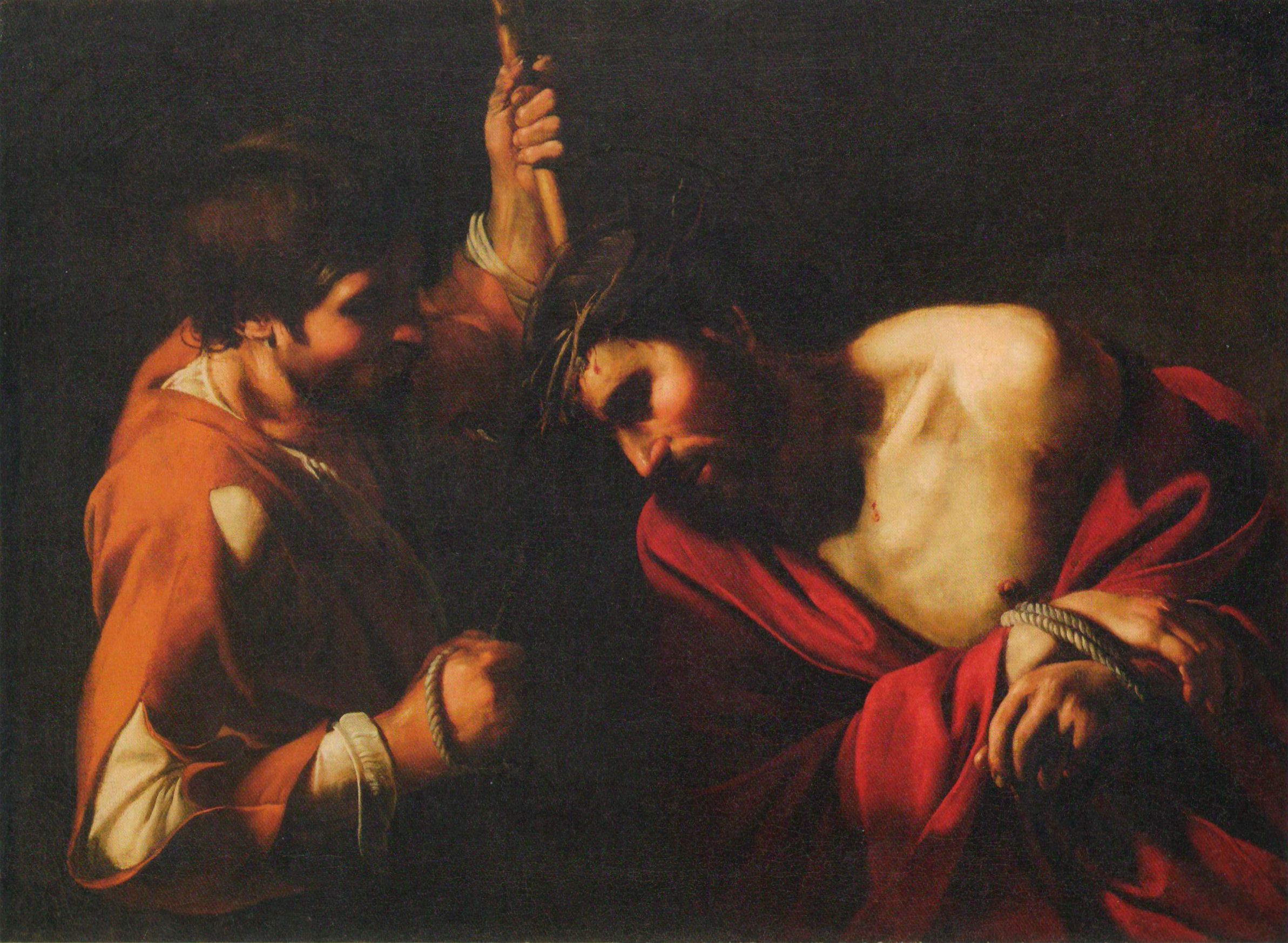


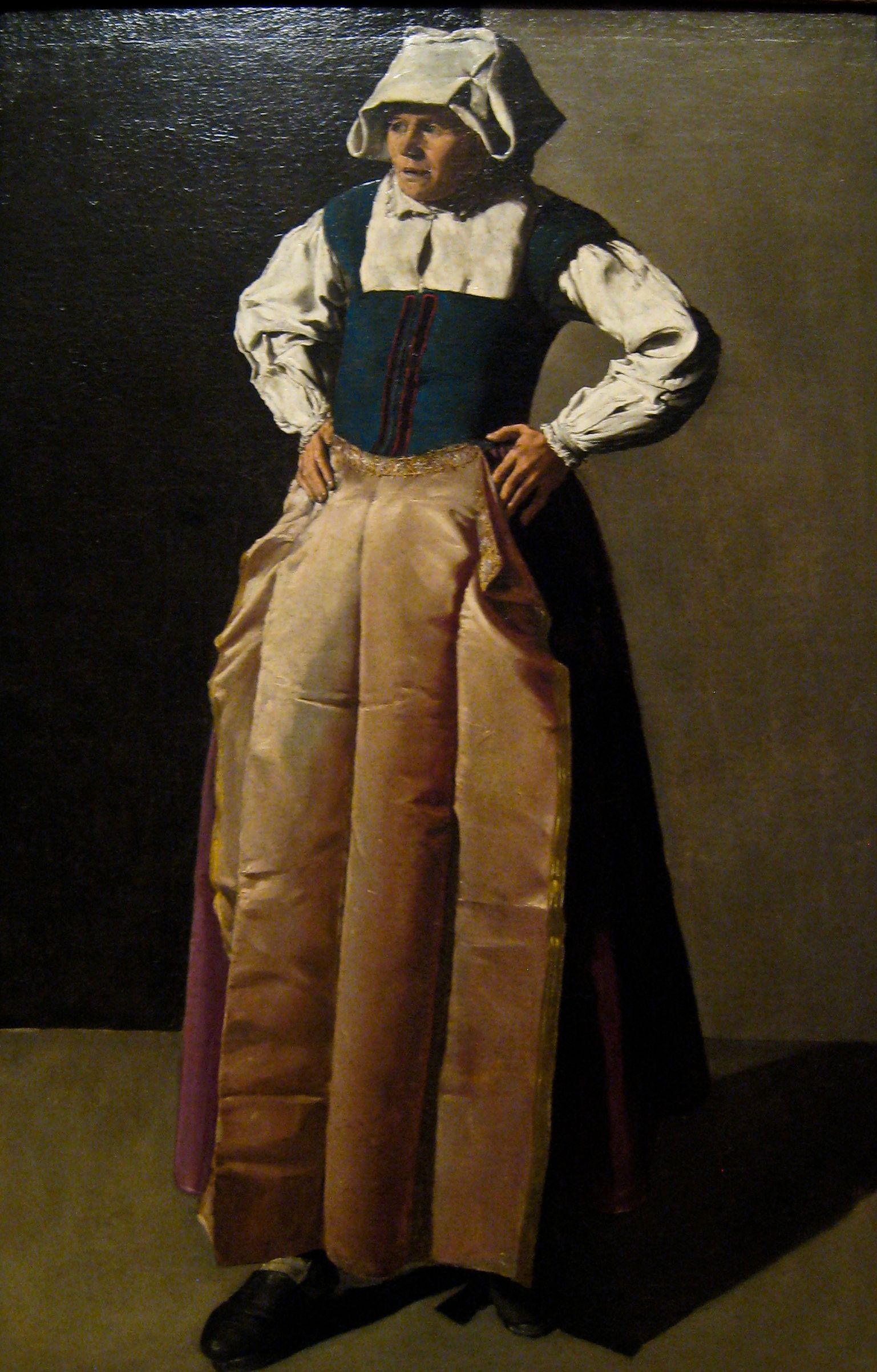


")

")


")


")


