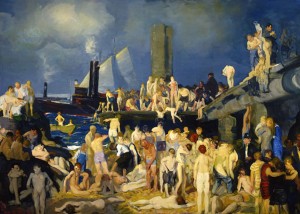
In Search of George Bellows

Self Portrait (1921, lithograph, 10½″ x 7⅞″ [26.67 x 20 cm]). Collection of Max and Heidi Berry. Courtesy Board of Trustees, National Gallery of Art, Washington. Photograph by Ric Blanc.
The 39-year-old Bellows of this self-portrait, concentrating intensely on the task at hand, had already achieved major recognition and can be forgiven for such self-aggrandizement. He shows off not just with his fancy clothes but also with the way he plays with space, from the mirror frame as picture frame and the placement of the artist in the viewer’s space to the background view of a terrace or window overlooking an outdoor scene–beyond the artist and behind the viewer.
This sophisticated urbanite, who in the following year would have the resources to build his own house in Woodstock, New York, began his career with far more earthy fare. Born in 18821 in Columbus, Ohio, Bellows dropped out of college there in 1904 and headed to New York City to pursue an art career. Checking into the YMCA and wandering around the city, he discovered a demimonde that became the subject of his art for a number of years. He was encouraged by his teacher, Robert Henri (pronounced hen-rye), who espoused a manner of working (practiced by a group of artists who came to be known as the Ashcan School) that began with the inner spirit and reached out to encompass the grit of life.
Turn-of-twentieth-century New York City provided abundant material for artists bored with classical subject matter. For Bellows, it was its teeming hoards. Children on the streets and in the rivers seeking relief from overcrowded tenements, crowds in Times Square waiting for results on election night, and spectators at sporting events and revival meetings, all came to life in his drawings, paintings and prints as he set out to establish his artistic identify.
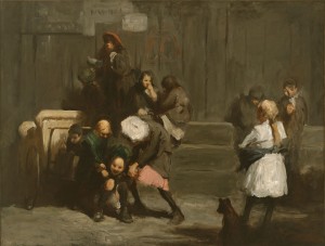
Kids (1906, oil on canvas, 32″ x 42″ [81.3 x 106.7]). James W. and Frances G. McGlothin. © Virginia Museum of Fine Arts. Photograph by Katherine Wetzel.
In Kids, Bellows quickly sketched a scene of children hanging around, tussling with each other, sharing some food, smoking and on the left–emphasized by highlighting on a street cart behind him, a boy painting a wooden object, perhaps destined to be a wagon. Bellows’s adept draftsmanship guides his sure application of paint as he craftily relates the two discreet groups by having the blond girl in the white dress and her canine companion stare at the action to their left. These are not portraits of individuals so much as they are portrayals of types engaged in defining activities.
In Bellow’s time, the New York waterfront–of which there is plenty–hosted large groups of swimmers from all socioeconomic classes depending on the level of amenities provided. For children looking to escape overcrowded Lower East Side tenements in the sweltering summer, the broken-down piers and under-development docks became their beaches. Where they went, Bellows followed.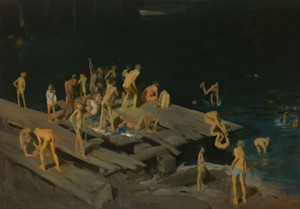
Forty-two Kids (1907, oil on canvas, 42¼″ x 60¼″ [106.7 x 153 cm]). Corcoran Gallery of Art, Washington. Photograph by Mark Gulezian.
With the boys indicated by just a few strokes of color, in Forty-two Kids Bellows massed the figures on the left side of the dilapidated dock to open up the space on the right, directing the eye through the diver to the swimmers, the dark river and the rowboat in the background. Were one to trace the strong diagonals of the wooden planks and draw the horizontal and vertical lines where they intersect, one would glimpse the underlying geometry that already had Bellows in its thrall.
Spontaneity in paint application would ultimately lose ground to a driving need for structure–and perhaps legitimacy–that eventually drained the life from much of this gifted artist’s work. Bellows succumbed to untreated appendicitis at age 42 when some of his work held hints that he might once again throw paint freely. Nonetheless, for connoisseurs of the less fettered work, the exhibit at The Met offered much to admire.
Chief among those paintings was a Ribera-like portrait of one of the street kids who posed for Bellows. Intentional or not, Paddy Flannigan (1908) pays homage to that old master’s portrayal of St. Jerome (1640) with its exposed flesh, semi-draped upper torso and elongated brushstrokes that follow the length of the arm. While Jusepe de Ribera’s saint–poised to pound his chest with the rock he grasps–turns his eyes heavenward, Bellows’s street urchin looks out at the viewer/painter from under almost-closed lids; with one hand on his hip and the other in his lap, this young model broadcasts both an invitation and a challenge.Bellows infused the face with sun-toned red and gave Paddy’s ear the same color as the drapery he holds. Here again, underlying what appears to be a free-wheeling application of paint reminiscent of other American portraitist of that time (think John Singer Sargent and Cecilia Beaux), a geometric system determined the placement of the arms and the cut of the torn shirt in relationship to the frame of the composition.
Robert Henri extolled the virtues of “a thorough knowledge of geometry” for “the artist whose ideas are to be expressed in apparently magical proportions.”2 Following his teacher’s suggestion probably came easily for Bellows, who seemed to find renewed inspiration from every freshly encountered scientific theory about color and composition, though after a while each new ideology proved insufficient to carry him through self-doubts and frustrations about his work.3
Regarding composition, Bellows drew from a long history of proportional schemes,4 including rebatment, the Golden Section and its close relative, the Fibonacci Spiral. Likewise, he could choose among a plethora of approaches on setting up the perfect palette, one guaranteed to insure repeated success.
In his early explorations of composition and color, Bellows’s inner vision remained paramount as he trawled the streets of his newly adopted city in search of subjects. He must have found irresistible the eight-acre pit covering more than two full blocks that began to appear in midtown the same year the artist arrived in New York. By 1909, the hole was occupied by Pennsylvania Station, a magnificent beaux-arts building later sacrificed for a succession of structures culminating in the current eyesore.
A major attraction for both complaint and celebration, the magnificent feat of engineering that became the first Penn Station served as the foundation for several oils in The Met’s exhibit, the best among them being Excavation at Night (1908). The image is a masterpiece of composition but like any fine painting, the thought behind it takes a back seat to its visual lushness.
Bellows masterfully uses light to direct the eye from the brightly illuminated wall–white on the right and steamy blue on the left–contrasting with and leading to the warmly lit tenements in the background, the orange and yellow of which brings the eye to the foreground and the fire where workers attempt to get warm. Once here, the gaze finds the other light spot in the front, a patch of snow on the left from which a track travels back to streaks of snow in the middle ground that lead right back to the cliffs.
In Excavation at Night, it’s easy enough to see the rebatted squares. Measure the horizontal length along the bottom from first one lower corner and then the other. Where each point falls imagine a vertical line ascending from it. Notice the way Bellows has arranged the composition to fit those vertical lines.
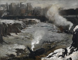
Pennsylvania Excavation (1907, oil on canvas, 33⅞″ x 44″ [86 x 111.8 cm]). Smith College Museum of Art, Northampton.
In both excavation canvases, Bellows seems to have reveled in the application of paint, with a variety of brush and palette-knife strokes. That same freedom was evident in his first fight paintings, one of the best–Stag at Sharkey’s (1907)–was featured in the publicity for the retrospective and on the catalog’s cover.
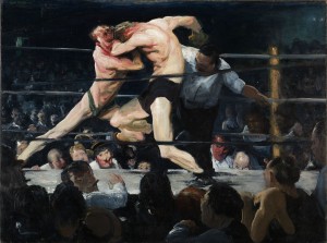
Stag at Sharkey’s (1909, oil on canvas, 36¼″ x 48¼″ [92 x 122.6 cm]). The Cleveland Museum of Art, Hinman B. Hurlbut Collection.
Peering over the ring’s canvas on the far side to the right might be Bellows looking up from his sketch pad,5 identified by his balding pate. To capture the action, he needed his expert drawing skills, quite apparent in the persuasive way the figures occupy space and interact. Notice especially the foreshortened raised legs and how each fighter balances perfectly on the limb that supports his weight.
Despite its appeal, Stag at Sharkey’s suffers from Bellows’s too heavy reliance on white; colors lose their intensity in the lights. Here as in his other crowd scenes, faces look more like caricatures than those of real folk. An image best viewed from a distance, this glimpse into the once not-quite-legal world of boxing still pulsates with the frenetic energy conveyed by Bellows’ brushstrokes and composition.
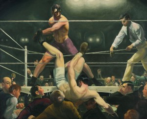
Dempsey and Firpo (1924, oil on canvas, 51″ x 63¼″ (129.5 x 160.7 cm]). Whitney Museum of American Art. Photograph by Sheldon C. Collins.
The same can’t be said for Dempsey and Firpo (1924), a late work completed in the year before Bellows died. With a drawing style evocative of comic book art, using formulaically applied colors in a compositional schema so obvious as to command more attention than the action (triangles galore, diagonals and verticals relating to rebatted squares), Bellows seems to have lost his way in pursuit of perfection in both art and life.
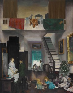
The Studio (1919, oil on canvas, 48″ x 38″ [121.9 x 96.5 cm]). Crystal Bridges Museum of American Art.
In the upper register, Bellows’s printmaker works a printing press on a balcony from which hang red and green drapery (the complementary colors of the season) and a spotted wildcat’s hide. In the background, Emma’s mother holds the phone to her ear while a dark-skinned servant looks on, as if awaiting instructions.
The organized mess of the earlier work has disappeared. Growing success and its attendant financial rewards couldn’t compete with Bellows’s feelings of inadequacy. He seemed driven to infuse his work with the gravitas he associated with great art, and many of the later paintings displayed in the last two galleries of the retrospective suffer from it. In trying too hard, Bellows only succeeded in producing deadeningly serious paintings.
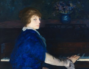
Emma at the Piano (1914, oil on panel, 28¾″ x 37″ [73 x 94 cm]). Chrysler Museum of Art, Norfolk. © Courtesy of the Bellows Trust.
The inclusion of Emma’s left hand in her lap and the tension inherent in the twist of her torso as she turns to face her husband belie the spontaneity that the setup implies of Bellows’s interrupting his wife in the middle of practicing; in fact she looks uncomfortable in that position. Although Emma might not be animated, the brushstrokes are–especially the ones vaguely defining the flowers in the vase that’s centered behind the music back.
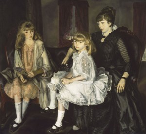
Emma and her Children (1923, oil on canvas, 59¼″ x 65⅜″ [150.5 x 166.1 cm]). Museum of Fine Arts, Boston. Photograph © 2012 Museum of Fine Arts, Boston.
Using an almost monochrome palette and reined-in brushstrokes, Bellows has done an exquisite job of rendering a variety of textures, including hair, fabric and the wood of the settee. Less successful is the placement of the figures in their respective seats. In particular, Jean’s legs, bent at right angles, are more indicative of the chair upon which she sat for the artist’s study than of a heavy eight-year-old’s sitting on her mother’s lap.
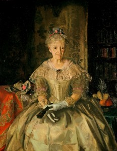
Mrs. T in Cream Silk, No. 1 (1919, oil on canvas, 48″ x 38″ [121.9 x 96.5 cm]). Hirshhorn Museum and Sculpture Garden, Smithsonian Institution, Washington.
Mrs. T maintained her wasp-waist figure but the aged skin on her face and neck offers stark contrast to the youthful dress she wears, the skirt of which still bears the fold marks from its time in storage. Looking off to the side, just short of eye contact with the artist, Mrs. T holds a fan in one of her white-gloved hands, the rendering of which is not entirely convincing. Bellows has smoothed over not just the now-concealed wrinkles of those hands but also almost all the creases in the gloves’ fabric, lavishing on them little of the brushstroke bravura so liberally distributed across the rest of the canvas.
The bowl of fruit on the sitter’s left includes a pineapple’s crown and perhaps a mango, both tropical in origin. On her other side, on a bright orange tablecloth, rests what looks to be the base of the corsage she would have held on her way to the altar. A bookcase and its contents blend into the dark background and a patterned gold-and-black cloth hanging behind her brings to mind those behind the Virgin in early Renaissance images. Bellows was clearly making a statement about the passage of time, though once again he might have overdone it.
The same can be said for a great deal of the art he created in 1918 in response to reports of atrocities committed by Germans during The Great War. Many of these–some paintings, but mostly drawings and lithographs–were part of this panoramic retrospective that demonstrated the wide array of subjects that Bellows tackled. Pieces like The Barricade (1918) are overwrought while others like the lithograph Murder of Edith Cavell (1918) show what Bellows could accomplish when he got out of his own way.
In other rooms the artist’s prodigious drawing skills and sensibilities were on view in several highly political pieces, including the lithograph Electrocution (1917) of a man being executed, and both the preparatory drawing and lithograph for The Law is Too Slow (1923) of a black man being burned alive by a lynch mob. These contrast dramatically with paintings in other rooms of tennis matches set among the well heeled.
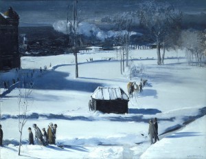
Blue Snow, The Battery (1910, oil on canvas, 34″ x 44″ [86.4 x 111.8 cm]). Columbus Museum of Art, Ohio.
The icy blue monochrome of the wintry scene is sparingly punctuated by the orange in the blankets on the horses and in the faces of the pedestrians in the foreground. With an economy of means, Bellows used color and form in Blue Snow, The Battery to create a sweeping view of shivering-cold lower Manhattan, peopled by passersby intent on reaching some destination or just out for a stroll.
In the shadow side of the structure in the visual center of the painting, the viewer gets a peek into Bellows’s working process. A thinly applied underpainting of brown (also evident in the shaded large building in the left background) was brushed away to denote the horizontal boards of the wall. Thick, opaque, high-value color was applied throughout to reflect the crystal-clear light of winter. The geometries that the artist certainly used in devising his composition dissolve in the wonder of how simple marks, placed expertly, can come together to form such a believable picture.
In his best work–from disheveled street urchins, New York’s dock workers and its resident poor, to well-dressed ladies and gents in other wintry settings, and landscapes of the city’s changing faces–George Bellows was at his best at the beginning of his career before the ordinary self-doubts inherent in the life of any artist overwhelmed him, compelling him to pursue techniques ill suited to his nature. He died in 1924 at the age of 42 before he could find his way back home.
__________________________________________
1 All biographical material comes from Quick, Michael, et al. The Paintings of George Bellows. (New York: Harry N. Abrams, Inc., 1992).
2 Henri, Robert. The Art Spirit (1923). (New York: Basic Books, 2007), 155.
3 Quick, Michael. “Technique and Theory: The Evolution of George Bellows’s Painting Style” in The Paintings of George Bellows.
4 See Bouleau, Charles. The Painter’s Secret Geometry: A Study of Composition in Art. (Harcourt, Brace & World, Inc., 1963).
5 Exhibit wall text.
6 Ibid.
George Bellows
The Metropolitan Museum of Art
1000 Fifth Avenue (at 82nd Street)
New York, NY 10028
(212)535-7710
Catalog available.


